vue-ssr-carousel
A performance focused Vue carousel designed for SSR/SSG environments.
Install
yarn add vue-ssr-carousel
Default
import SsrCarousel from 'vue-ssr-carousel'
import ssrCarouselCss from 'vue-ssr-carousel/index.css'
Vue.component 'ssr-carousel', SsrCarousel
Nuxt
// nuxt.config.js
export default {
  buildModules: [ 'vue-ssr-carousel/nuxt' ]
}
Usage
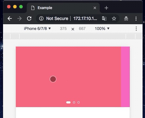
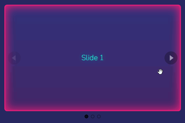
<ssr-carousel>
  <div class="slide">Slide 1</div>
  <div class="slide">Slide 2</div>
  <div class="slide">Slide 3</div>
</ssr-carousel>
For more examples, see the demo: https://vue-ssr-carousel.netlify.app.
API
Props
slides-per-page(1) - How many slides are shown per page.gutter(20) - The size of the space between slides. This can a number or any CSS resolvable string. See https://vue-ssr-carousel.netlify.app/gutters.paginate-by-slide(false) - Whenfalse, dragging the carousel or interacting with the arrows will advance a full page of slides at a time. Whentrue, the carousel will come to a rest at each slide.loop(false) - Boolean to enable looping / infinite scroll. See https://vue-ssr-carousel.netlify.app/looping.center(false) - Render the first slide in the middle of the carousel. Should only be used with odd numbers ofslides-per-page. This results in the slides being rendered visually in a different order than the DOM which is an accessibility concern. See https://vue-ssr-carousel.netlify.app/looping.peek(0) - A width value for how far adjacent cards should peek into the carousel canvas. This can a number or any CSS resolvable string. See https://vue-ssr-carousel.netlify.app/peeking. There are couple related properties:peek-left- Set peek value on just the left edge.peek-right- Set peek value on just the right edge.peek-gutter- Set peek value on to theguttervalue.
feather(false) - Fades out the left and right edges using a CSSmask-imagegradient. Set totrueto use the default20pxvalue or as number or any CSS resolvable string to set an explicit width. This is designed to be used withpeekproperties. See https://vue-ssr-carousel.netlify.app/peeking.show-arrows(false) - Whether to show back/forward arrows. See https://vue-ssr-carousel.netlify.app/ui.show-dots(false) - Whether to show dot style pagination dots. See https://vue-ssr-carousel.netlify.app/ui.responsive([]) - Adjust settings at breakpoints. See https://vue-ssr-carousel.netlify.app/responsive. Note,loopandpaginate-by-slidecannot be set responsively.
Slots
default- Where your slides get injected.back-arrow- Replace the default back icon. Slot props:disabled- True if at first page when not looping.
next-arrow- Replace the default next icon. Slot props:disabled- True if at first page when not looping.
dot- Replace the default pagination dots. Slot props:index- The page index that the dot represents.disabled- True if dot represents current page.
Methods
next()- Go forward a page or slide, depending on thepaginate-by-slidepropback()- Go back a page or slide, depending on thepaginate-by-slidepropgoto(index)- Go to an index. Ifpaginate-by-slideisfalse, this equates to a page offset. Iftrue, this equates to a slide offset.
Events
See https://vue-ssr-carousel.netlify.app/events
change({ index })- Fired when the internal index counter changespress- Fired on mouse or touch downrelease- Fired on mouse or touch updrag:start- Fired on start of draggingdrag:end- Fired on end of draggingtween:start({ index })- Fired when the carousel starts tweening to it's final positiontween:end({ index })- Fired when the carousel has finished tweening to it's destination.