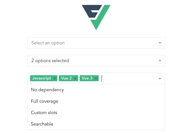
Vue 3 multiselect by @vueform
Vue 3 multiselect component with single select, multiselect and tagging options.
Features
- Vue 2 & 3 support
- No dependencies
- Lightweight (~4.5 kB gzipped)
- 100% coverage
- ESM support
- Single select options
- Multiple select options
- Tags
- Search & filtering
- Custom slots
- Events
- Fully configurable
Installation
npm install @vueform/multiselect
Usage with Vue 3
<template>
  <div>
    <Multiselect
      v-model="value"
      :options="options"
    />
  </div>
</template>

<script>
  import Multiselect from '@vueform/multiselect'

  export default {
    components: {
      Multiselect,
    },
    data() {
      return {
        value: null,
        options: [
          'Batman',
          'Robin',
          'Joker',
        ]
      }
    }
  }
</script>

<style src="@vueform/multiselect/themes/default.css"></style>
Usage with Vue 2
When using with Vue 2 make sure to install @vue/composition-api first and change the imported module to:
import Multiselect from '@vueform/multiselect/dist/multiselect.vue2.js'
Props
| Name | Type | Default | Description |
|---|---|---|---|
| appendNewTag | boolean |
true |
Whether should append new tag automatically to multiselect's options when using tags mode with createTag. If set to false you need to take care of appending a new tag to the :options list upon @tag event. |
| caret | boolean |
true |
Whether should display a caret (small triangle on the right). |
| createTag | boolean |
false |
Whether should allow creating new tag based on search query when using tags mode. |
| disabled | boolean |
false |
Whether the input should be disabled. |
| hideSelectedTag | boolean |
true |
Whether selected tags should be excluded from the list when using tags mode. |
| id | string |
'multiselect' |
The id of the multiselect container DOM. |
| label | string |
'label' |
If you provide an array of objects as options this property of those objects will be displayed for options and selected label. |
| limit | number |
-1 |
The maximum number of options that should be displayed. If -1 it won't be limited. |
| loading | boolean |
false |
Whether a loading spinner should be shown. |
| maxHeight | number |
160 |
The maximum height of options list. |
| mode | string |
single |
Possible values: single\|multiple\|tags. |
| modelValue | string\|number\|array |
null |
The variable that should store the select value when using Vue 3. If v-model is used it does not need to be set. |
| multipleLabel | function |
A function that should return how the label should be displayed when using multiple mode. It receives value as an argument. By default it renders 1 option selected and [n] options selected based on value length. |
|
| noOptionsText | string |
'The list is empty' |
The text that should be displayed when options list is empty. |
| noResultsText | string |
No results found |
The text that should be when there are no search results. |
| object | boolean |
false |
Whether the value should be stored as an object. If set to false while using an array of objects as :options the value property will be used as value. If set to true without using an array of objects as :options an object that contains value property along with :trackBy's and :label's value will be set as value. |
| options | array\|object |
[] |
List of options. Can be: - an array (eg. [1,2,3])- an object (eg. {a:1,b:2,c:3})- an array of objects [{value:1,label:'v1'},{value:2,label:'v2'},{value:3,label:'v3'}].When an array of objects is provided it must have a value property as well as properties that equal to :trackBy's and :label's value (both configurable and default to label). |
| placeholder | string |
null |
The text that should be displayed before an options are selected. |
| searchable | boolean |
false |
Whether the options should be searchable. |
| trackBy | string |
label |
The name of the property that should be searched when searchable is true and an array of objects are provided as :options. |
| value | string\|number\|array |
null |
The variable that should store the select value when using Vue 2. If v-model is used it does not need to be set. |
Events
| Event | Attributes | Description |
|---|---|---|
| @close | Emitted after closing the option list. | |
| @deselect | option |
Emitted after an option is deselected or a tag is removed. |
| @input | value |
Emitted after the value is changed. |
| @open | Emitted after opening the option list. | |
| @search-change | query |
Emitted after a character is typed. |
| @select | option |
Emitted after an option or tag is selected. |
| @tag | query |
Emitted after enter is hit when a new tag is being created. |
Slots
| Slot | Attributes | Description |
|---|---|---|
| afterList | Rendered after the options list. | |
| beforeList | Rendered before the options list. | |
| multipleLabel | values |
Rendered when using multiple mode and options are selected. By default it renders the return value of multipleLabel function. |
| noOptions | Rendered when the options list is empty. By default renders noOptionsText. |
|
| noResults | Rendered when there are no search results. By default renders noResultsText. |
|
| option | option, search |
Renders an option in options list. |
| singleLabel | value |
Rendered when using single mode and an option is selected. By default it renders the :label if the selected option. |
| tag | option, remove, disabled |
Renders a tag when using tags mode. When disabled the remove icon should not be displayed. The remove prop should be used to trigger the removal of the tag. |
Examples
Single select with array options
<template>
  <div>
    <Multiselect
      v-model="value"
      placeholder="Select your character"
      :options="options"
    />
  </div>
</template>

<script>
  import Multiselect from '@vueform/multiselect'

  export default {
    components: { Multiselect },
    data() {
      return {
        value: null,
        options: ['Batman', 'Robin', 'Joker']
      }
    }
  }
</script>

<style src="@vueform/multiselect/themes/default.css"></style>
Single select with object options
<template>
  <div>
    <Multiselect
      v-model="value"
      placeholder="Select your character"
      :options="options"
    />
  </div>
</template>

<script>
  import Multiselect from '@vueform/multiselect'

  export default {
    components: { Multiselect },
    data() {
      return {
        value: null,
        options: {
          batman: 'Batman',
          robin: 'Robin',
          joker: 'Joker'
        }
      }
    }
  }
</script>

<style src="@vueform/multiselect/themes/default.css"></style>
Single select with custom options
<template>
  <div>
    <Multiselect
      v-model="value"
      placeholder="Select your character"
      label="name"
      trackBy="name"
      :options="options"
      :searchable="true"
    >
      <template v-slot:singleLabel="{ value }">
        <div class="multiselect-single-label">
          <img height="26" style="margin: 0 6px 0 0;" :src="value.icon"> {{ value.name }}
        </div>
      </template>

      <template v-slot:option="{ option }">
        <img height="22" style="margin: 0 6px 0 0;" :src="option.icon">{{ option.name }}
      </template>
    </Multiselect>
  </div>
</template>

<script>
  import Multiselect from '@vueform/multiselect'

  export default {
    components: { Multiselect },
    data() {
      return {
        value: null,
        options: [
          { value: 'captainamerica', name: 'Captain America', icon: 'https://cdn2.iconfinder.com/data/icons/avengers-filled/48/03_-_Captain_America_-_infinity_war_-_end_game_-_marvel_-_avengers_-_super_hero-512.png' },
          { value: 'spiderman', name: 'Spiderman', icon: 'https://cdn2.iconfinder.com/data/icons/avengers-filled/48/12_-_Spiderman_-_infinity_war_-_end_game_-_marvel_-_avengers_-_super_hero-512.png' },
          { value: 'ironman', name: 'Iron Man', icon: 'https://cdn2.iconfinder.com/data/icons/avengers-filled/48/02_-_IRONMAN_-_infinity_war_-_end_game_-_marvel_-_avengers_-_super_hero-512.png' },
        ]
      }
    }
  }
</script>

<style src="@vueform/multiselect/themes/default.css"></style>
Multiselect
<template>
  <div>
    <Multiselect
      v-model="value"
      mode="multiple"
      placeholder="Select your characters"
      :options="options"
    />
  </div>
</template>

<script>
  import Multiselect from '@vueform/multiselect'

  export default {
    components: { Multiselect },
    data() {
      return {
        value: [],
        options: ['Batman', 'Robin', 'Joker']
      }
    }
  }
</script>

<style src="@vueform/multiselect/themes/default.css"></style>
Multiselect with custom label
<template>
  <div>
    <Multiselect
      v-model="value"
      mode="multiple"
      placeholder="Select your characters"
      :options="options"
    >
      <template v-slot:multipleLabel="{ values }">
        <div class="multiselect-multiple-label">
          {{ values.length }} characters selected
        </div>
      </template>
    </Multiselect>
  </div>
</template>

<script>
  import Multiselect from '@vueform/multiselect'

  export default {
    components: { Multiselect },
    data() {
      return {
        value: [],
        options: ['Batman', 'Robin', 'Joker']
      }
    }
  }
</script>

<style src="@vueform/multiselect/themes/default.css"></style>
Tags with search
<template>
  <div>
    <Multiselect
      v-model="value"
      mode="tags"
      placeholder="Select your characters"
      :options="options"
      :search="true"
    />
  </div>
</template>

<script>
  import Multiselect from '@vueform/multiselect'

  export default {
    components: { Multiselect },
    data() {
      return {
        value: [],
        options: ['Batman', 'Robin', 'Joker']
      }
    }
  }
</script>

<style src="@vueform/multiselect/themes/default.css"></style>
Tags with create option
<template>
  <div>
    <Multiselect
      v-model="value"
      mode="tags"
      placeholder="Select your characters"
      :options="options"
      :searchable="true"
      :createTag="true"
    />
  </div>
</template>

<script>
  import Multiselect from '@vueform/multiselect'

  export default {
    components: { Multiselect },
    data() {
      return {
        value: [],
        options: ['Batman', 'Robin', 'Joker']
      }
    }
  }
</script>

<style src="@vueform/multiselect/themes/default.css"></style>