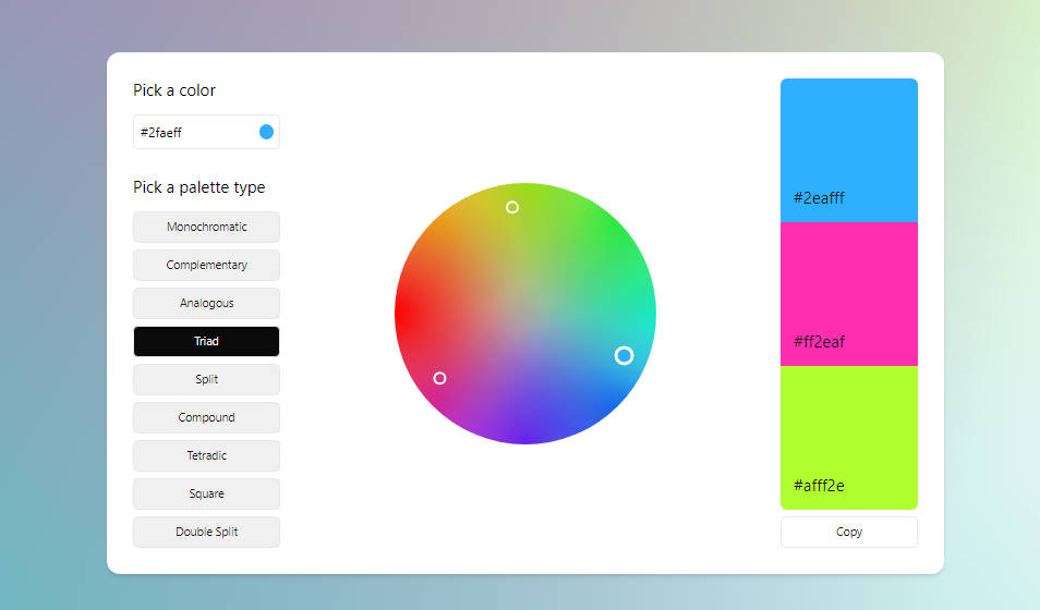
Vue Color Wheel
A Color Wheel Picker for Vue, built on top of Vite & Vue 3.
Concept
Why using color wheel picker? Color Wheel makes color combinations easy.
A color wheel picker is a helpful tool for selecting colors by visually showing relationships between different colors, aiding in choosing harmonious color schemes for designs. It allows adjusting parameters like hue, saturation, and brightness for more control over color selection, streamlining the process for creating visually appealing designs.
Usage
Install
> pnpm i vue-color-wheel
Add to Project
<template>
  ...
  <VueColorWheel
    wheel="aurora"
    harmony="analogous"
    :radius="160"
    :defaultColor="wheelColor"
    v-model:color="wheelColor"
    @change="handleChangeColors"
  />
  ...
</template>

<script lang="ts" setup>
import type { Harmony } from 'vue-color-wheel'
import { VueColorWheel } from 'vue-color-wheel'
import { useDebounce } from '@vueuse/core'

const wheelColor = useDebounce(ref('#40ffff'))
const colorList = ref<Harmony[]>()

const handleChangeColors = (harmonyColors: Harmony[]) => {
  colorList.value = harmonyColors
}
</script>
Color combinations
Complementary
Two colors that are on opposite sides of the color wheel. This combination provides a high contrast and high impact color combination – together, these colors will appear brighter and more prominent.
Monochromatic
Three shades, tones and tints of one base color. Provides a subtle and conservative color combination. This is a versatile color combination that is easy to apply to design projects for a harmonious look.
Analogous
Three colors that are side by side on the color wheel. This color combination is versatile, but can be overwhelming. To balance an analogous color scheme, choose one dominant color, and use the others as accents.
Triadic
Three colors that are evenly spaced on the color wheel. This provides a high contrast color scheme, but less so than the complementary color combination — making it more versatile. This combination creates bold, vibrant color palettes.
Tetradic (Square)
Four colors that are evenly spaced on the color wheel. Tetradic color schemes are bold and work best if you let one color be dominant, and use the others as accents. The more colors you have in your palette, the more difficult it is to balance.
License
MIT @xiaoluoboding


