Vue 3 Live Form
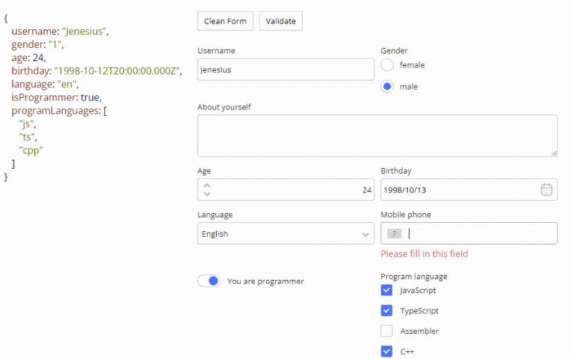
This component, written using TypeScript and the Vue 3 composition API, creates a schema-driven form that allows you to modify the state of an object. This component is currently a work in progress and is an early step in creating more flexible, open source versions of components I have developed in the past.
Features / Notes
- Each key on the object/model being modified can be targeted with a number of different input types.
- Input types that accept multiple options or values can be configured to use an array existing on the original object, or a custom array provided in the schema.
- Multiple rows in the form can be set to modify the same key of the master model object, as seen in the example below where multiple form inputs are modifying the value of the “select” key.
- A row type of “nested” allows you to selectively modify a nested array of objects, and selected keys within them. All of the form’s input types are compatible with this. Nesting multiple “nested” input types is possible allowing you to deeply modify a data structure, although the UI is not currently optimized for this. An example of a nested input within a nested input can bee seen below.
- The visibility of rows can be determined conditionally
Future features / To-Do list:
- Schema driven form validation
- Improved styling
- Expandable UI for deeply nested editors
- Additional & Custom field options
- Ability to re-order in the ‘nested’ input type
- Ability to target a deeply nested field/key using dot notation.
Installation
npm install vue3-live-form
Usage
Import the component:
import { Vue3LiveForm } from 'vue3-live-form';
Register the component if using the Vue options API (Not required if using the Vue 3 composition API with the setup tag):
export  default {
	name:  'MyComponent',
	components: { Vue3LiveForm},
}
Pass a schema parameter into the component and attach an object/model to it using v-model:
<Vue3LiveForm :schema="schema" v-model="data" />
Schema Guide
| Property | Type | Description |
|---|---|---|
| labelWidth | string |
Width of the label column. |
| rows | array |
An Array of Objects following the row schema below. |
Row Schema
| Property | Type | Description |
|---|---|---|
| type | String |
The type of input to be rendered. Accepted values: text password date number checkbox boolean textarea textbox select radio nested. The ‘select’ and radio input types require the options property to be configured. The ‘nested’ input type requires field be configured to reference an array of objects on the data source object/model. |
| readonly | Boolean |
optional Applies the “readonly” attribute to an input field. |
| field | String |
optional The key of the data source object/model you wish to modify. |
| options | String or Array |
Applies to select & radio input types. Enter an array of options for input types with multiple options. A string can also be entered representing an existing key with an array on the master object. The array values can be strings, numbers or objects with multiple keys. |
| optionLabel | String |
optional Allows you to specify which key will act as the label for the options property when objects are being used. If this value is not provided, the entire object structure will be rendered in the select or radio options. |
| optionValue | String |
optional Allows you to specify which key will act as the value for the options property when objects are being used. If this value is not provided, the entire object will be used in the source data object/model. |
| label | String |
optional Label for the input row. If no label is provided, the field name will be used. |
| columns | Array<RowSchema> |
optional Only used when the input type is ‘nested’. Allows you to define a schema for columns of the nested editor. The same schema used for rows can be applied to nested columns. |
| criteria | Array['field','operator','value'] |
optional Sets a condition for the row to be rendered. field represents the property/key of the model that will be compared against the value parameter of the array. Current valid operators are == and !=. |


