VueQuintable
VueQuintable is a table wrapper for Vue.js 2.x. It is build with bootstrap 5.x. High configurable, easy to use, flexible and responsive.
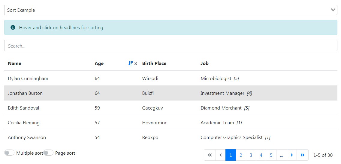
Getting Started
These instructions will get you running VueQuintable for your project for development purposes.
Prerequisites
VueQuintable is a vue.js package and uses bootstrap by default. Please install both before using the package. If you want to use ajax functionalities please install axios as it is used by VueQuintable.
npm:
npm install --save axios
yarn:
yarn add axios
Installing
npm:
npm install --save bootstrap
npm install --save @popperjs/core
npm install --save @quintet/vue-quintable
yarn:
yarn add bootstrap
yarn add @popperjs/core
yarn add @quintet/vue-quintable
Integration
import Vue from 'vue'

//use bootstrap
import 'bootstrap/dist/css/bootstrap.css'

import "@quintet/vue-quintable/dist/vue-quintable.css"
import VueTable from '@quintet/vue-quintable'
Vue.use(VueTable);
Use directly in browser
You can either install VueQuintable via bower
bower install --save https://github.com/Quintetio/vue-quintable
or just download the source and include the scripts and styles in dist folder to use VueQuintable for your browser page.
<script type="text/javascript" src="/path/to/vue/dist/vue.min.js"></script>

<script type="text/javascript" src="/path/to/project/dist/vue-quintable.umd.min.js"></script>

<link rel="stylesheet" href="/path/to/project/dist/vue-quintable.css"></link>
Vue.use(window["vue-quintable"]);
Features
These points will convince you that VueQuintable is the last table plugin you will ever need
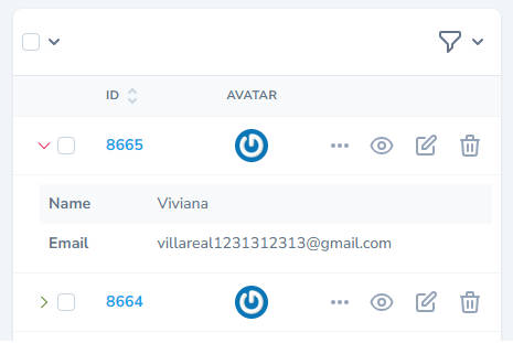
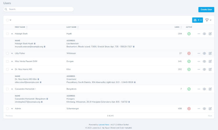
- Responsive columns which will be rendered as additional rows
- Pagination
- Sort/Multi-sort
- Search
- Custom Filters
- Recursive filter groups with relations
- Select rows
- Custom search keywords and filter values for rows
- Vue-binded values for columns and rows
- Nested VueQuintables
- Vue components inside tables
- Custom cell formatters
Slots
You can define some slots to customize the table as you want to.
- header
- footer
- no-results
- loading
- cell-complete
- cell-content
- generated-cell-complete
- generated-cell-content
- sticky-cell-complete
- sticky-cell-content
<template v-slot:header>Your HTML-Code</template>

<template v-slot:cell-content="{cell}">
    <button>
        {{cell.text}}
    </button>
</template>
If you want to use slots in nested table you should use the identifier option for the nested table. If done so (e.g. "nested-identifier") you can use slots like the following:
<template v-slot:cell-content-nested-identifier="{cell}">
    <button>
        {{cell.text}}
    </button>
</template>
Events
Add listeners for the following events to handle them as you want to.
-
click:row | passes row as first parameter, triggered when row is clicked
-
click:cell | passes cell as first parameter, triggered when cell is clicked
-
expand:row | passes row as first parameter, triggered when row is expanded
-
collapse:row | passes row as first parameter, triggered when row is collapsed
-
filtered:rows | passes filtered rows as first parameter, triggered when filter or search query affect rows
-
ajax:rows | passes an object with ajax rows and total count as first parameter, triggered when rows are updated from server
-
ajax:error | passes an error as first parameter, triggered when an server error occurs while loading rows via ajax
-
update:perPage | passes integer as first parameter, triggered when per page parameter changes
-
update:page | passes integer as first parameter, triggered when page is changed
-
update:search | passes string as first parameter, triggered when search query is entered
-
update:sort | passes object of sort group as first parameter, triggered when sort order is active/changes
-
component:event | generic event for passing data from child components
Configuration
The following will give you an overview how to configure the VueQuintable for your needs.
Table Properties
| Parameter | Type | Required | Description |
|---|---|---|---|
| config | Object | yes | The table configuration object. See details below. |
| rows | Array | yes (if no ajax url is set) | Table rows containing all cells. See details below. |
| preSelectedRows | Array | no | Array of objects{key,value} to set selection of rows from outside. You have to set the key to an unique property of the row e.g. an id and the value to the actual properties' value of the row. If done so, the row will be (pre-) selected. Note: This won't work initially, for initial select use config.defaultSelected or row.selected properties |
| dynamicConfig | Boolean | no | If set to true the Table wont be re-initialized and re-rendered if some values inside the config property are changed. This is useful to dynamically set config values for columns |
| filters | Object | no | The active filters for displaying rows. This has to be an object with filter name as key and filter value as value. Additionally a set of operators can be passed. See example below. |
| filter-groups | Array | no | Filter groups with relations. See example below. |
| sort-order | Object | no | Set sorting values and order by default or on the fly. See examples below. |
| axios | Object | no | Pass a configured axios instance to be used for ajax functionalities. Only relevant if ajax is used. Recommendation: set it to the current time using new Date() for update |
| updated | Boolean|Date | no | Property to trigger reload on current page. Only relevant if ajax is used. |
| verbose | Boolean | no | Default is false. Set to true to see debug informations on developer tools in your Browser. |
| identifier | String | no | Default is null, for nested tables default is a random string. Use for slots of nested tables |
Property config properties
| Key | Type | Required | Pre-condition | Description | Default | Example |
|---|---|---|---|---|---|---|
| columns | Array | yes | - | Contains the configuration for the table columns including headlines. | null | See below |
| hideEmptyColumns | Boolean | no | - | If set to true columns of visible rows which are empty for each row will be hidden. Will check text, html, component and quintable properties | false | true |
| ignoreSortEmptyColumns | String{"none"|"active"|"all"} | no | hideEmptyColumns enabled | Select if/how columns with sort enabled shall be hidden if they are empty for each row. "none": sorting columns keep always visible. "active": sorting columns will always keep visible if they are active. "all": empty sorting columns will be hidden as well | "none" | "all" |
| expandedAll | Boolean | no | Breakpoints for columns are set | If set to true, all columns will be expanded by default | false | true |
| hoverClass | Boolean|String | no | - | Class for rows on hover | "bg-muted" | "bg-success" |
| hideRowToggle | Boolean | no | Breakpoints for columns are set | If set to true, no plus symbols will be displayed for row toggle. | false | true |
| pagination | Boolean|Number | no | - | If set to true, the default page size will be 25. | false | 5 |
| pageRange | Number | no | pagination enabled | Displayed page range of pagination. | 5 | 3 |
| rowsSelect | Boolean | no | pagination enabled | If set to true, user will be allowed to set rows per page | false | true |
| disallowAllOption | Boolean | no | pagination enabled and rows select is enabled | If set to true, "all" option will not be displayed in rows per page select | false | true |
| rowsPlaceholder | String | no | pagination enabled and rows select is enabled | Text for rows per page selection | "Rows per page:" | "Rows:" |
| select | Boolean | no | - | If set to true rows can be selected by check boxes. Tables v-model can be used for selected row Array. | false | true |
| prettySelect | Boolean | no | select is enabled | If set to true, pretty checkboxes library will be used. | false | true |
| selectPosition | String{"pre"|"post"} | no | select is enabled | Position of the select check boxes, first or last column. | "post" | "pre" |
| selectAll | Boolean | no | select is enabled | If set to true, additional checkbox will appear to select all rows | false | true |
| selectAllRows | Boolean | no | select is enabled | If set to true, select all selects all rows allover the pages. Please keep in mind that this won't work with server side pagination. | false | true |
| defaultSelected | Boolean | no | select is enabled | If set to true, all rows will be selected initially. | false | true |
| search | Boolean | no | - | If set to true a filter search input will be displayed | false | true |
| searchLength | Number | no | search is enabled | Minimum length of query that triggers search. | 1 | 3 |
| searchPlaceholder | String | no | search is enabled | Placeholder if no search query is entered | "Search..." | "Search rows..." |
| emptyPlaceholder | String | no | search is enabled or filters are set | Placeholder if filtering rows has no results. | "No rows" | "No results" |
| filterRelation | String{"OR"|"AND"} | no | filters are set | Filter relation, if no filter group affected | "AND" | "OR" |
| filterGroupRelation | String{"OR"|"AND"} | no | filters are set | Default relation filter groups to each other | "AND" | "OR" |
| multiSort | Boolean | no | sort is enabled on at least one column | If set to true multi-key sorting is enabled | false | true |
| multiSortSelect | Boolean | no | sort is enabled on at least one column | If set to true user will be allowed to enable and disable multi sort | false | true |
| multiSortPlaceholder | String | no | sort is enabled on at least one column and multi sort select is enabled | Placeholder for multiple sort description | "Multiple sort" | "Toggle multiple" |
| pageSort | Boolean | no | sort is enabled on at least one column | If set to true sorting on current page enabled | false | true |
| pageSortSelect | Boolean | no | sort is enabled on at least one column | If set to true user will be allowed to enable and disable page sort | false | true |
| pageSortPlaceholder | String | no | sort is enabled on at least one column and page sort select is enabled | Placeholder for page sort description | "Page sort" | "Toggle page" |
| ajaxUrl | String|Boolean | no | - | If set ajax will be useed for search/filter/sort/pagination | false | "http://your.server.url/api/endpoint" |
Property columns for property config properties
| Key | Type | Options/Return | Pre-condition | Description |
|---|---|---|---|---|
| headline | String | - | - | Headline for column |
| title | String | - | - | Description, displayed on hover the headline |
| classes | String | - | - | Space separated css classes string. Will be applied for headlines, cells, generated rows and sticky rows. |
| hidden | Boolean | true|false | - | If set to true the column will not be displayed in any case. Highly recommended to use only when dynamicConfig is set to to true. |
| ignoreEmpty | Boolean | true|false | config property hideEmptyColumns enabled | The column will never be hidden automatically due to emptiness |
| sort | Boolean | true|false | - | If set to true, this column will be sortable |
| breakpoint | String | "xs"|"sm"|"md"|"lg"|"xl"|"all" | - | Bootstrap breakpoint from which descending the column will be displayed as additional row |
| showHeadlineBreakpoint | String | "xs"|"sm"|"md"|"lg"|"xl"|"all" | headline is set | Bootstrap breakpoint from which descending the columns headline will be shown |
| hideHeadlineBreakpoint | String | "xs"|"sm"|"md"|"lg"|"xl"|"all" | headline is set | Bootstrap breakpoint from which descending the columns headline will be hidden |
| align | String | "start"|"end"|"center" | - | Text alignment for whole column |
| alwaysExpanded | Boolean | true|false | breakpoint is set | If set to true, the additional columns row will be always expanded if the breakpoint is reached |
| sticky | Boolean | true|false | breakpoint is not set | If set to true, this column will be always displayed as additional row and will be expanded always |
| cellFormatter | Function | String|Object | - | Function for complex custom cell formatting. The cell will be passed as function parameter. Has to return a string handled as text or an object with String value and String type{"html","text"} |
Property rows properties
| Key | Type | Pre-condition | Description | Default |
|---|---|---|---|---|
| cells | Array | - | List of cells for the row | null |
| selected | Boolean | select is enabled | If set to true the row will be selected on default | false |
| disableSelect | Boolean | select is enabled | If set to true this row will be excluded from selection at all | false |
| expanded | Boolean | breakpoint of at least one column is affected | If set to true the row will be expanded on default | false |
| keywords | String[] | search is enabled | Additional keywords which will match a search query | null |
| classes | String | - | Additional CSS classes for row | null |
| filters | Object | filters are set | Filters with filter name(s) and value(s), which will match selected filter(s) | null |
| align | String{"start"|"end"|"center"} | - | Text alignment for whole row, this will be overwritten by columns align value | "start" |
Property cells for property rows properties
| Key | Type | Pre-condition | Description |
|---|---|---|---|
| text | String | non of the following are set: html, component, quintable | Content string |
| html | String | non of the following are set: text, component, quintable | HTML content string |
| component | String | non of the following are set: text, html, quintable | Custom component object, see code example below |
| quintable | String | non of the following are set: text, html, component | VueQuintable object component for nested table, see simple code example below |
| classes | String | - | Additional CSS classes for cell |
| align | String | - | Text alignment for whole column, this will overwrite columns and rows align values |
Lets have a look on a example for rows and cells
//Table with columns "Name","Age","Birth Place","Job"

[
    //simple row as array
    [
        {
            text:"John Doe"
        },
        {
            text:50
        },
        {
            text:"New York"
        },
        {
            text:"Trainee"
        },
    ],
    //advances row as object
    {
    	cells:[
            {
                html:"<b>Max</b> Mustermann",
                classes:"special-td",
                align:"end",
             },
            {
                component:{
                    name:"age-component",
                    props:{
                        age:20,
                    }
                },
            },
            {
                quintable: {
                    tableClasses:"text-center",
                    config: {
                        columns: [
                            {
                                headline: "State of birth",
                            }, {
                                headline: "City of birth",
                            }, {
                                headline: "Time of birth",
                            }
                        ],
                    },
                    rows: [
                        [
                            {text: "Bavaria"},
                            {text: "Augsburg"},
                            {text: "10:10 AM"}
                        ],
                        [
                            {text: "New York"},
                            {text: "New York"},
                            {text: "12:10 AM"}
                        ],
                        [
                            {text: "Texas"},
                            {text: "Houston"},
                            {text: "09:12 PM"}
                        ],
                    ],
            	},
            },
            {
                text:"Trainee"
            },
		]
    }
]
Component Definition
To use a custom component inside a VueQuintable you have to define it as the following:
<template>
    <div @click="check">
      Age: {{age}}
    </div>
</template>


<script>

    export default {
        props:["age"],
        methods: {
            check() {
                //emit the pre-defined event for component actions
                //handled from VueQuintable by "component:event"
                this.$emit("action",
                    {
                        age:this.age,
                    }
                )
            }
        }
    }

</script>
Import and use the Component in your Code:
import TestComponent from "./components/TestComponent.vue"

Vue.component(
    "test-component",
    TestComponent.default || TestComponent
);
Property filters properties
| Key | Type | Required | Description |
|---|---|---|---|
| values | Mixed|Array | Yes | Compare values. Can be single value or array of values which will match the filter values of rows. |
| operator | String | No | Operator for comparing. The defined operators are: equal, greater, less, greaterEqual, lessEqual, startsWith, endsWith, contains, notContains, matches |
| compare | Function | No | Custom compare function. See Below. |
This example shows selected values for active, printable, first_name, middle_name, and last_name filters. Operators can be:
{
   active:true,
   printable:false,
   first_name:
    {
        operator:"contains",
        values:["Jo","ja"],
    },
    middle_name:
    {
        compare:"matches",
        values:new RegExp("r.+a","g"),
    },
    last_name:
    {
        compare:(value,rowValue)=>{
        	return rowValue.indexOf(value) === 2;
        },
        values:"a",
    }

}
Property filter-groups properties
| Key | Type | Description |
|---|---|---|
| items | Object[] | List that contains Object of filter names or nested groups related to the group |
| relation | String{"OR"|"AND"} | Relation between the items |
This filter groups example will cause to show rows that have filter matching filter values for selected name OR active filter AND selected printable filter. This groups are infinitely nestable.
[
    {
        items:[
            {
                items:[
                    {
                        name:"name"
                    },
                    {
                        name:"active"
                    }
                ],
                relation:"OR",
            },
            {
                items:[
                    {
                        name:"printable"
                    }
                ],
            }
        ],
        relation:"AND"
    }
],
Property sort-order properties
These examples depict a sorting ordered second column (index=1) before first column (index=0). You can use Objects to set the ascending or descending order optionally. The Default will be asc=true, column index starts on zero.
//simple
[
   1,0
]

//advanced
[
    {
        index:1,
        asc:false
    },
    {
        index:0,
        asc:true
    },
]
Basic Example
A simple basic example to show the usage of VueQuintable. More examples are included in the project and can be started with:
npm run start
<template>
	<VueQuintable :config="config" :rows="rows"></VueQuintable>
</template>

<script>

    import VueQuintable from './components/VueQuintable.vue

    ...

  	data() {
        return {
            config: {
                columns: [
                    {
                        headline: "Name",
                    }, {
                        headline: "Age",
                    }, {
                        headline: "Birth Place",
                        breakpoint: "md"
                    }, {
                        headline: "Job",
                        sticky: true,
                    }
                ],
            },

            rows: [
                [
                    {
                        text: "Mia Wong"
                    },
                    {
                        text: 50
                    },
                    {
                        text: "Beijing"
                    },
                    {
                        text: "Trainee"
                    },
                ],
                [
                    {
                        text: "Peter Stanbridge"
                    },
                    {
                        text: 18
                    },
                    {
                        text: "London"
                    },
                    {
                        text: "Trainee"
                    },
                ],
                [
                    {
                        text: "Natalie Lee-Walsh"
                    },
                    {
                        text: 25
                    },
                    {
                        text: "Dublin"
                    },
                    {
                        text: "Trainee"
                    },
                ],
            ],
        }
    }

  ...
</script>
AJAX data example
<template>

...

<VueQuintable :loading="loading" :config="remoteConfig" :rows="remoteRows" />

...

</template>

<script>
	import axios from 'axios'

	...

  	data(){
        return {
            loading:false,
            remoteConfig:null,
            remoteRows:null

 	...

    mounted(){
        this.loading = true;
        axios.get("http://your.server.url/api/endpoint").then((response)=>{
            this.remoteRows = response.data.rows;
            this.remoteConfig = response.data.config;
            this.loading = false;
        });
    }
...

</script>
The request for the ajax handling on server has got the following structure:
{
    //String search query
    search:"some query",
    //Object Filters, see above
    filters:{},
    //Number etries per page
    perPage:12,
    //Number current page, starting at 1
    page:2,
    //Object sorting columns and
    sort:{
        //Array of sorting column indexes
        indexes:this.currentSortIndexes,
        //Object of column definitions keyed by column index
        columns:this.sortingColumns,
    },
};
The response has to be the following structure:
{
	//Array of all rows, structure see above
	rows:[]
    //Number of all matching rows, without paging
    all:240
}
Good to know
- Links won't trigger expanded rows to collapse. Also you can prevent collapse parent row by define an element with the class "prevent-toggle"
- VueQuintable uses v-model for selected rows
Authors
Quintet Consulting UG - Samuel Zeitler

