vue-universal-modal
A light Universal modal Component for Vue 3.
Introduction
vue-universal-modal plugin is based on the teleport.
It is very light and simple, but it provides essential features for modal use in applications.
(Such as Add & Remove, Visible & Hidden, Transition, Auto bind keyboard and mouse to close, Support SSR, A11Y...)
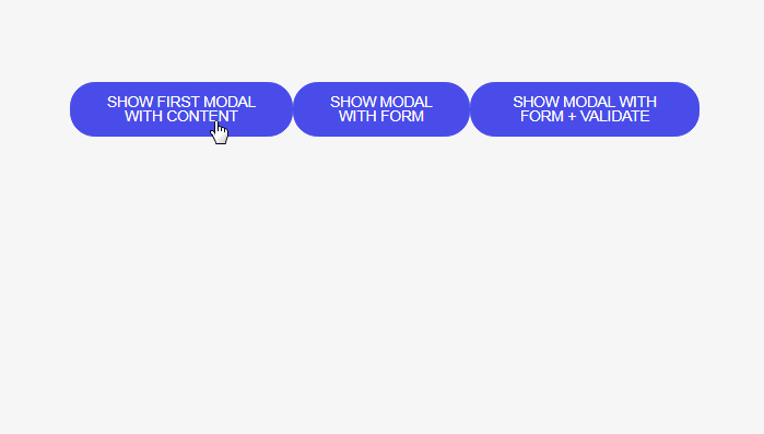
Here is the Demo
Features
- Based on the teleport
- Provides essential features for modal
- A11Y
- Support SSR (Insert rendering source into SSR context, Mount from Client-side)
Install plugin
npm install vue-universal-modal
Insert teleport element in your html
...
  <div id="app"></div>
  <!-- teleport target -->
  <div id="modals"></div>
...
Because SSR cannot be implemented by dynamically creating and ref referencing teleport elements, teleport targets must be inserted into html first.
And install plugin in vue application
import 'vue-universal-modal/dist/index.css'

import VueUniversalModal from 'vue-universal-modal'

app.use(VueUniversalModal, {
  teleportTarget: '#modals'
})
Options
app.use(VueUniversalModal, {
  teleportTarget: '#my-modals',
  modalComponent: 'MyModal',
})
| name | type | detault | description |
|---|---|---|---|
| teleportTarget (required) | string |
Teleport target | |
| modalComponent | string |
'Modal' |
Global modal component name |
Usage modal
Insert the component wrapped with the modal component. (Slot based)
<template>
  <p>
    <button @click="showModal">
      Show modal
    </button>
  </p>
  <!-- If the option changed modal component the name
  <MyModal>
  -->
  <Modal
    v-model="isShow"
    :close="closeModal"
  >
    <div class="modal">
      <p>
        Hello
      </p>
      <button @click="closeModal">
        close
      </button>
    </div>
  </Modal>
</template>

<script lang="ts">
import { defineComponent, ref } from 'vue'

export default defineComponent({
  setup () {
    const isShow = ref(false)

    function showModal () {
      isShow.value = true
    }

    function closeModal () {
      isShow.value = false
    }

    return {
      isShow,
      showModal,
      closeModal
    }
  }
})
</script>

<style scoped lang="scss">
.modal {
  width: 300px;
  padding: 30px;
  box-sizing: border-box;
  background-color: #fff;
  font-size: 20px;
  text-align: center;
}
</style>
v1.0.x -> v1.1.x change point
- Use
v-modelinstead of v-if for modal component insertion- If you control the insertion of components with v-if, the close animation will not work.
emitCloseslot argument was deprecated.
props
| name | type | detault | description |
|---|---|---|---|
| close | function |
() => {} |
Function to close a modal (apply when click dimmed) |
| disabled | boolean |
false |
Handle just visibility (as in v-show) |
| options | object |
{} |
props.options
| name | type | detault | description |
|---|---|---|---|
| transition | number | false |
300 |
transition duration |
| closeClickDimmed | boolean |
true |
Closes the modal when dimmed is clicked |
| closeKeyCode | number | false |
27 (esc) |
Closes the modal when press key |
| styleModalContent | object |
{} |
Inject modal content style (.vue-universal-modal-content) |
emit events
Supports emit properties for all transition events.
<template>
  <p>
    <button @click="showModal">
      Show modal
    </button>
  </p>
  <Modal
    v-model="isShow"
    :close="closeModal"
    @before-enter="beforeEnter"
    @after-enter="afterEnter"
    @before-leave="beforeLeave"
    @after-leave="afterLeave"
  >
    <div class="modal">
      <p>
        Hello
      </p>
      <button @click="closeModal">
        close
      </button>
    </div>
  </Modal>
</template>

<script lang="ts">
import { defineComponent, ref } from 'vue'

export default defineComponent({
  setup () {
    const isShow = ref(false)

    function showModal () {
      isShow.value = true
    }

    function closeModal () {
      isShow.value = false
    }

    function beforeEnter () {
      console.log('before enter')
    }

    function afterEnter () {
      console.log('after enter')
    }

    function beforeLeave () {
      console.log('before leave')
    }

    function afterLeave () {
      console.log('after leave')
    }

    return {
      isShow,
      showModal,
      closeModal,
      beforeEnter,
      afterEnter,
      beforeLeave,
      afterLeave
    }
  }
})
</script>
Handle global CSS
You can change it directly to your own style by referring to the source
.vue-universal-modal {
  /* Change dimmed color */
  background-color: rgba(255, 255, 0, 0.3);
}
.vue-universal-modal-content {
  /* Align to top (flex-direction property value is set to column) */
  justify-content: flex-start;
}