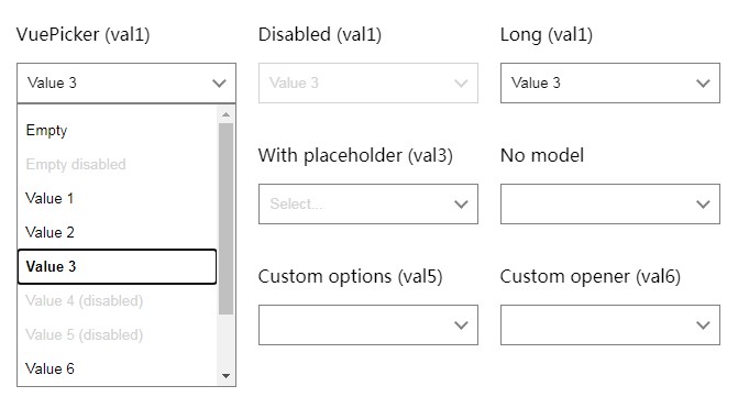
vue-picker
A native-like select field, but better.
Mostly behaves like native <select> but accepts custom
markup for the options and the opener button.
The options can be navigated from the keyboard, the opener text can be easily
customized, no annoying "options as arrays" props.
Installation
In browser:
<script src="https://unpkg.com/vue"></script>
<script src="https://unpkg.com/@invisiburu/vue-picker"></script>
<!-- optional css -->
<link rel="stylesheet" href="https://unpkg.com/@invisiburu/vue-picker/dist/vue-picker.min.css">
Using npm:
npm i --save @invisiburu/vue-picker
Import in your project:
import { VuePicker, VuePickerOption } from '@invisiburu/vue-picker'
// optional css
import '@invisiburu/vue-picker/dist/vue-picker.min.css'


Vue.component('VuePicker', VuePicker)
Vue.component('VuePickerOption', VuePickerOption)
Usage
Basic:
<vue-picker v-model="color" autofocus>
  <vue-picker-option value="">Empty</vue-picker-option>
  <vue-picker-option value="red">Red</vue-picker-option>
  <vue-picker-option value="green">Green</vue-picker-option>
  <vue-picker-option value="blue">Blue</vue-picker-option>
  <vue-picker-option value="yellow" disabled>Yellow</vue-picker-option>
  <vue-picker-option value="teal" text="Teal">
    How about teal (Teal will be shown instead)
  </vue-picker-option>
</vue-picker>
Custom options:
<template>
  <vue-picker v-model="variant">
    <vue-picker-option value="italic-bold">
      Some <i>italics</i> or <b>bold</b>?
    </vue-picker-option>

    <vue-picker-option value="special" text="Special! Yes!">
      <div class="grid">
        <span class="title">Or something more special?</span>
        <span class="subtitle">I am a subheading!</span>
      </div>
    </vue-picker-option>
  </vue-picker>
</template>

<style scoped>
.grid {
  display: grid;
  grid: auto-flow auto / auto;
  gap: 4px;
}

.title {
  font-size: 1.05em;
  font-weight: bold;
}

.subtitle {
  font-size: 0.9em;
  color: lightgray;
}
</style>
Custom opener:
<template>
  <vue-picker v-model="custom">
    <template #opener="{ opener }">
      <span>
        <i>{{ opener.value }}</i>
        <b>{{ opener.text }}</b>
      </span>
    </template>

    <vue-picker-option value="value-1">Value 1</vue-picker-option>
    <vue-picker-option value="value-2">Value 2</vue-picker-option>
  </vue-picker>
</template>
Api
VuePicker
Props:
autofocus- focus the opener on mount.disabled- disable the component.value- the value, should be a string. The behaviour is not defined for
values that do not exist within provided options.placeholder- a text to show whenvalueis null, undefined or an
empty string.
Emitted events:
input- an option selected. Carries the new value to assign.open- dropdown open.close- dropdown closed. Carriestrueif closed by the outer click.
Slots:
default- a picker option. Should be a<VuePickerOption>.opener- override the displayed opener text.
Provides theopenerscope var with{ value, text, opt }, where:value- the selected value.text- the text that was intended to display by the opener
(HTML stripped). Content of theplaceholderattribute prevails over
empty option values.opt- context of the current option.
openerIco- override the default expand arrowdropdownInner- use if you want a custom dropdown inner container
VuePickerOption
Props:
disabled- disable the option. Disabled options cannot be picked or
navigated.value- value to set on when the option selected.text- text to be displayed instead of the content of thedefaultslot.
Also overrides theoptHtmlandoptTxtcomputed properties of the
component.
Slots:
default- content to be displayed in the options list and in the opener
when the option is selected. Can contain any markup, the opener will
display it as is. Please consider using thetextprop if you plan complex
things in here.
Computed
You can use these computed properties within the opt param of the opener
slot.
optHtml- returns the HTML from thedefaultslot of the component.optTxt- returns the HTML from thedefaultslot of the component.
Mostly the same astextparam of theopenerslot but does not respect
placeholderattr of the picker.
TODO
- JSDoc generated docs
- Unit tests
- Search
- Handle keys: Page down, Page up
- Animation support
- Dropdown position switch if does not fit the screen
- Outer label[for=""] support
- Readonly attr - ?
- iOS, Android full screen style - ?