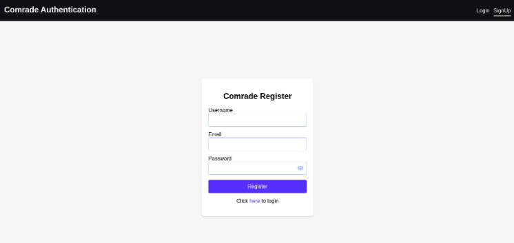
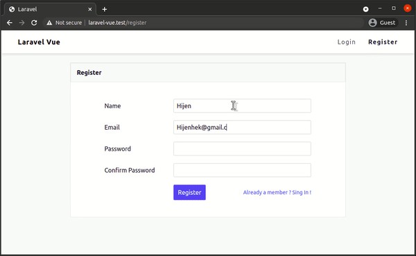
Vue Auth UI
Auth UI is a pre-built Vue component for authenticating users.
This started as a porting of Supabase Auth UI (React) to Vue. However, partly due to the fact that Vue encourages certain patterns, it ended up as a more generic Auth UI component that can be used with any authentication client and custom code.
That is because instead of passing the authentication client to the Auth UI component (like Supebase Auth UI), it’s the Auth UI component itself that just emits proper events that can be mapped to a client functions, as you can see in the following example:
<script setup>
import { createClient } from '@supabase/supabase-js'
import { Auth } from 'vue-auth-ui'

const supabase = createClient(
  'my-project-url',
  'my-anon-key'
)
</script>

<template>
  <Auth
    :providers="['google', 'apple']"
    @signInWithPassword="creds => supabase.auth.signInWithPassword(creds)"
    @signUp="creds => supabase.auth.signUp(creds)"
    @signInWithOAuth="provider => supabase.auth.signInWithOAuth(provider)"
  />
</template>
Installation
npm i vue-auth-ui
Quick start
The easiest way to actually use the library is to import the Auth component and a theme:
<script setup lang="ts">
import { createClient } from '@supabase/supabase-js'
import { Auth, ThemeBold, type Appereance, css } from 'vue-auth-ui'

const supabase = createClient(
  'my-project-url',
  'my-anon-key'
)

const appearance: Appereance = {
  theme: ThemeBold,
  themeVariant: 'dark',
  // In addition to theme and variant you can specify other preferences.
  // More on that in the "customization" section.
  prependedClassName: 'my-custom-class',
  className: {
    button: css({
      variants: {
        color: {
          primary: {
            backgroundColor: 'blue'
          }
        }
      }
    })
  }
}

let myError: string | undefined
const signIn = async (creds: any) => {
  myError = undefined
  const { data, error } = await supabase.auth.signInWithPassword(creds)
  myError = error?.message

  // Custom logic, like `router.push('/')` etc.
}
</script>

<template>
  <Auth
    :providers="['google', 'apple']"
    socialLayout="col"
    :appearance="appearance"
    :error="myError"
    @signInWithPassword="creds => signIn(creds)"
    @signUp="creds => supabase.auth.signUp(creds)"
    @signInWithOAuth="provider => supabase.auth.signInWithOAuth(provider)"
  />
</template>
Alternatively, atomic components such as SignIn, SignUp, MagicLink, etc. can be used. Example of a page with MagicLink:
<script setup lang="ts">
import { createClient } from '@supabase/supabase-js'
import { MagicLink, Anchor, ThemeBold, type Appereance } from 'vue-auth-ui'

const supabase = createClient(
  'my-project-url',
  'my-anon-key'
)

const appearance: Appereance = {
  theme: ThemeBold,
  themeVariant: 'dark'
}

const signInWithOtp = async (email: {[key: string]: any}) => {
  const { data, error } = await supabase.auth.signInWithOtp(email)

  // ...
}
</script>

<template>
  <MagicLink
    :appearance="appearance"
    @signInWithOtp="signInWithOtp"
  />
  <!--
    Anchor component, styled according to the provided theme + prefs.
    Renders an `<a>` tag by default, but can be customized within the `is` prop.
   -->
  <Anchor
    is="router-link"
    to="/signin-with-password"
    :appearance="appearance"
  >
    Sign in with password
  </Anchor>
</template>
Customization
The customization is pretty much the same as that of Supabase Auth UI, except for one difference:
in Supabase Auth UI, a theme variant can be specified by passing a
themeprop directly to the Auth component; in Vue Auth UI a theme variant can be passed within theappearanceobject, in thethemeVariantproperty.
That being said, you can refer to Supabase Auth UI docs for more information on customization: https://supabase.com/docs/guides/auth/auth-helpers/auth-ui


