? What’s improved
This is a replica, replacement & alternative website to ChocoLatte’s carrd.co with better improvements and better tech stack. Here is some lists what’s improved in this version.
? Performance
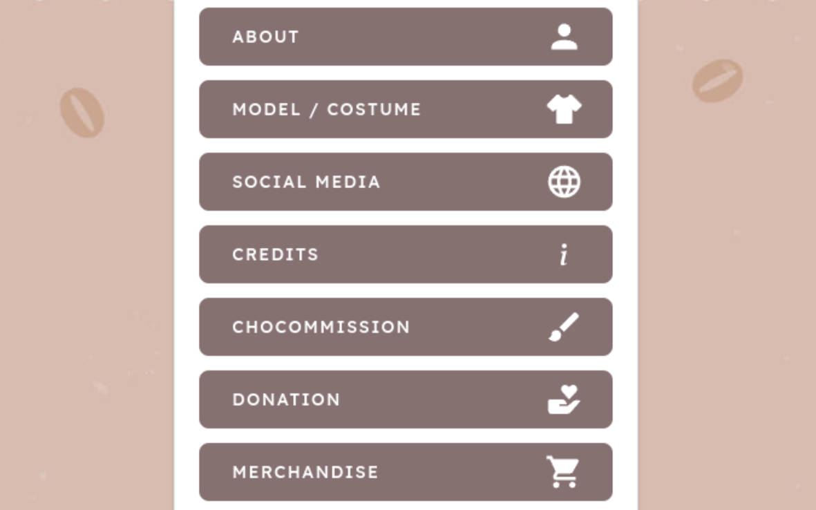
Performance is important things in website. I saw carrd.co still using old way for routing, such as making new request to the server when routing to another page. In this version, I already fixed it and now it has nice way for routing. It won’t make a new request to the server again, and this will speed up user’s experience when visiting the website. With progress bar and spinner included when you navigating through pages to improve user interface.
| carrd.co version | This version |
|---|---|
 |
 |
? Contrast Ratio
Low-contrast text is difficult or impossible for many users to read. When background and text color having low-contrast, this impact many users. Users may difficult to read the text. This version was better and has nice contrast.
| carrd.co version | This version |
|---|---|
 |
 |
? Readability
The most impacting things in accessibility is readability. If you have a sharp eyes, you may find the differences between this website and carrd.co version. Typography and readability. This website has bigger font size and have nice font type. In desktop with larger screen, when you visiting carrd.co version, you may can’t read some text such as footer section, because the font size is set to 0.625em. This font size is too small.
| carrd.co version | This version |
|---|---|
 |
 |
? Better grammar
I found that the carrd.co version has a slighty messed up grammar and using extravagant sentences. With double checking the content, I am now fixed this so users can better understand the aims and objectives conveyed on the website.
| carrd.co version | This version |
|---|---|
 |
 |
? Better layout
You may find too, in carrd.co version, padding and margins are not consistent. Like, it can be 1px, 2px, or 4px in some elements. It’s not fixed and same, so the website’s appearance may messed up. In this version, with TailwindCSS help, I can make this more consistent.
| carrd.co version | This version |
|---|---|
 |
 |
? and more…
You better tell me.
?️ Roadmap
I will put this here because I know well I won’t do them. Things that can be added or improved, priority, and the reason why I didn’t do it:
| Task name | Priority | Reason |
|---|---|---|
| ? Version 1 with major concept changes | High | I was planning to made a different concept from carrd.co-like concept. This will be a major changes in concepts, structures, and styles. I will only do this when announcing this project & got noticed. |
| ? Complete waiting list page | Mid | I’m giving up with creating responsive table in html. It’s so scary so i decided to put it here. |
| ? Progressive Web App (PWA) | Low | Too lazy to create a service-workers, serving lots of 64×64, 128×128, 256×256 icons, and there is a lot additional meta for PWA (apple-touch-icon, etc). |
??️ Developing
To get this running on your machine, you could try these steps below:
?️ Clone the repository
$ git clone https://github.com/gifaldyazkaa/chocolattech.git
$ cd chocolattech
?️ Install dependencies
$ pnpm install
?️ Run it on development server
$ pnpm run dev
# ...
⚡️ Optimizing for production
# Static deployment (Vercel, GH Pages, etc.)
$ pnpm run build
? License
I do not claim any assets here, credits are to the rightful owner. Source code distributed under MIT License. See LICENSE file for more information.
