vue-cute-modal
A simple and easy to use Modal component for Vue applications.
Features
- Simple API
- Customizable modal classes
- Customizable Vue transition name
- Name component whatever you like!
Install
npm i vue-cute-modal

yarn add vue-cute-modal
For In-DOM templates include the JS CDN and optionally the CSS in your project:
CDN:
https://unpkg.com/[email protected]/dist/vue-cute-modal.min.js

https://unpkg.com/[email protected]/dist/vue-cute-modal.min.css
Usage
Setup
Include the plugin at the root of your application
import CuteModal from 'vue-cute-modal'

Vue.use(CuteModal)
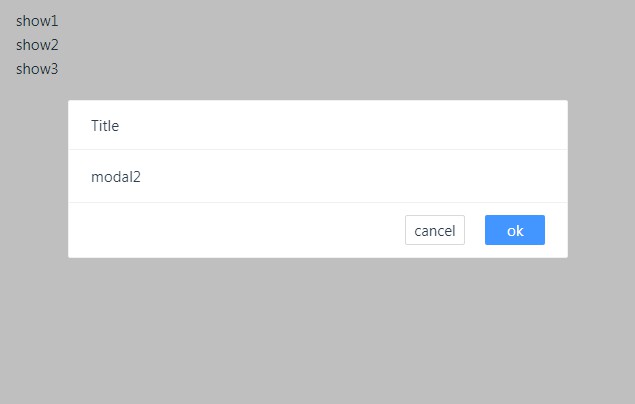
Creating a Modal
Simply create your modal in your Vue app:
<cute-modal name="example">
  Your modal content.
</cute-modal>
Then open/hide the modal within the app:
// Opens the modal
this.$cuteModal.open('example')

// Hides the modal
this.$cuteModal.hide('example')
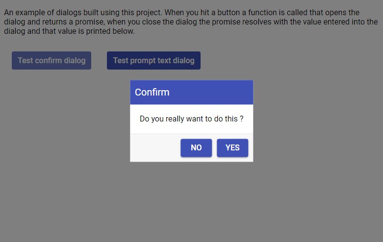
Basic Example
<template>
  <div>
    <button @click="open">Open Modal</button>
    <cute-modal name="hello">
      Hello World!
    </cute-modal>
  </div>
</template>

<script>
export default {
  methods: {
    open () {
      this.$cuteModal.open('hello')
    }
  }
}
</script>

<!-- import CSS through SCSS or Link to compiled CSS whichever you prefer -->
<!-- or use your own custom styles! -->
<style>
/* ... */
</style>
Customizing the Component
The plugin comes with some base styles and classes. These may not fit your project and you may wish to override. We can do this via global settings or props.
To override defaults globally pass in the configuration object when you register the component to Vue.use():
/** Default Settings */
const DEFAULT_OPTIONS = {
  body: 'cute-modal__body',
  container: 'cute-modal__container',
  footer: 'cute-modal__footer',
  header: 'cute-modal__header',
  height: 'auto',
  overlay: 'cute-modal__overlay',
  transition: 'modal',
  width: '600px',
  onOpen: null, // available in 1.1
  onClose: null // available in 1.1
}

Vue.use(CuteModal, {
  // Override the component's name to match your app's
  // Default 'cute-modal' = <cute-modal>
  component: '',

  // Override the component's base classes to match your app's
  body: '',
  container: '',
  footer: '',
  header: '',
  overlay: ''

  // Set default width and heights for all your modals
  height: '',
  width: '',

  // Set the transition name to use custom Vue transitions
  // This will be set as the transition's name <transition name="...">
  transition: '',

  // Setup callbacks to be executed globally when Modal is closed/opened.
  onClose: () => {
    // ...
  },
  onOpen: () => {
    // ...
  }
})
Alternatively, you could pass props separately to each component. Note that these will override the globally set options.
<cute-modal width="350px" headerClass="is-header">
  <!-- -->
</cute-modal>
API
Props
Full prop list
| Name | Required | Type | Description |
|---|---|---|---|
| name | true | String | Name of your modal |
| containerClass | false | String | Class name for container of modal |
| footerClass | false | String | Modal footer class name |
| headerClass | false | String | Modal header class name |
| height | false | String | Set the height of the modal |
| overlayClass | false | String | Overlay class name |
| transition | false | String | Name for Vue transition |
| wdith | false | String | Set the width of the modal |
Methods
// Open a Modal
this.$cuteModal.open(/* modal name */)

// Close a Modal
this.$cuteModal.hide(/* modal name */)
1.1 Updates
In 1.1 a built in hide method is made available within the header and footer slots. It will be available on the slot-scope as a method named $hide. It takes no parameters.
<cute-modal name="myModal">
  Some content

  <template slot="footer" slot-scope="{ $hide }">
    <button @click="$hide">Hide Me</button>
  </template>
</cute-modal>
Futhermore, in 1.1 you can globally set a callback function to be ran when a modal is opened or closed using the onOpen and onClose keys on your configuration object.
Vue.use({
  onClose: () => {
    document.body.style.overflow = 'auto'
  },
  onOpen: () => {
    document.body.style.overflow = 'hidden'
  }
})
Development Setup
# install dependencies
npm install

# serve with hot reload at localhost:8080
npm run dev

# build for production with minification
npm run build

# run unit tests
npm run unit

# run all tests
npm test