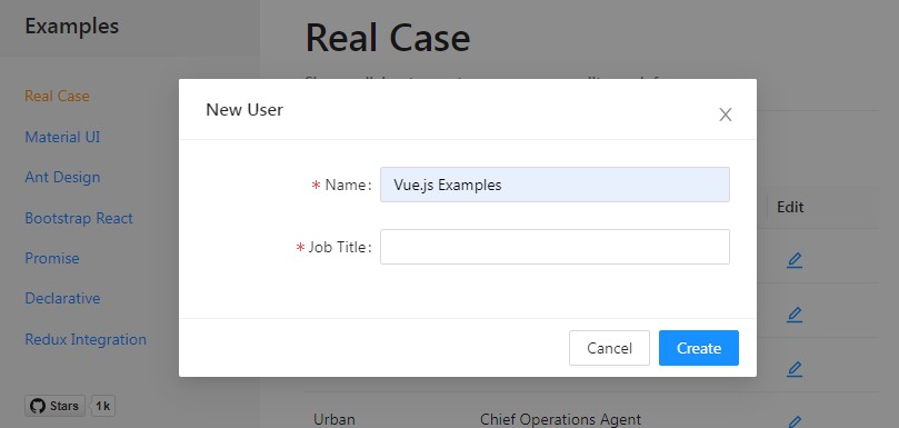
v-modal-backdrop
A generic backdrop component for vue
Installation
With NPM:
npm install v-modal-backdrop
With Yarn:
yarn add v-modal-backdrop
With a script tag:
<script src="https://unpkg.com/[email protected]/dist/modal-backdrop.js"></script>
Then you have to include basic style for the modal in your html (or write your own):
.modal {
  z-index: 1050;
  position: fixed;
  top: 0;
  right: 0;
  bottom: 0;
  left: 0;
  outline: 0;
  overflow: hidden;
  -webkit-overflow-scrolling: touch;
}

.modal-backdrop {
  position: absolute;
  top: 0;
  right: 0;
  bottom: 0;
  left: 0;
  background-color: #000;
  opacity: 0;
  transition: all 0.15s;
}
.modal-backdrop.modal-opened {
  opacity: 0.4;
}
Usage
Call Vue.use to install the ModalBackdrop plugin (it will add a v-modal-backdrop component globally) or use it directly.
Then:
<!-- When someProperty is truthy, the modal will be appended at the end of the body tag (customizable), otherwise the modal will not appear in the DOM -->
<v-modal-backdrop v-model="someProperty">
  <!-- Slot contents here -->
</v-modal-backdrop>
Programmatically
const modal = window.ModalBackdrop.show({
  // props you want to pass to the modal here.
  // (`parent:this` === the current context)
}, ...children)
// `children` is an array of slots. Each slot is either a string or a VNode (see this.$createElement at https://vuejs.org/v2/api/#render)

// Later
modal.hide()
Component props
{
  clickOnBackdrop: {
    type: Boolean,
    default: true // if true, modal is closed when backdrop is clicked
  },
  transition: {
    type: String,
    default: '' // transition name for modal content
  },
  transitionDuration: {
    type: Number,
    default: 150
  },
  escKey: {
    type: Boolean,
    default: true // if true, hitting esc key closes the modal
  },
  beforeClose: {type: Function, default: ()=>{}}, // you can return false to prevent modal from closing
  zOffset: {
    type: Number,
    default: 20 // z-index offset between each nested modal
  },
  mdlClass: {type: String, default: ''},
  mdlContentClass: {type: String, default: ''},
  mdlBackdropClass: {type: String, default: ''},
  embedElement: {
    type: null,
    default: 'body' // String or HTMLElement
  }
}
Contributing (running locally)
# clone project
git clone https://github.com/nash403/v-modal-backdrop

# install dependencies
npm install

# build lib for production with minification
npm run build

# serve demo with hot reload at localhost:8080 (see comments in ./src/demo.js for tips)
npm run dev

# same as above but runs `npm run build` first to build the lib for prod
npm start

# make your changes and submit a PR
For a detailed explanation on how things work, check out the guide and docs for vue-loader.
Licence
MIT License
Copyright (c) 2018-present Honoré Nintunze
Permission is hereby granted, free of charge, to any person obtaining a copy
of this software and associated documentation files (the "Software"), to deal
in the Software without restriction, including without limitation the rights
to use, copy, modify, merge, publish, distribute, sublicense, and/or sell
copies of the Software, and to permit persons to whom the Software is
furnished to do so, subject to the following conditions:
The above copyright notice and this permission notice shall be included in all
copies or substantial portions of the Software.
THE SOFTWARE IS PROVIDED "AS IS", WITHOUT WARRANTY OF ANY KIND, EXPRESS OR
IMPLIED, INCLUDING BUT NOT LIMITED TO THE WARRANTIES OF MERCHANTABILITY,
FITNESS FOR A PARTICULAR PURPOSE AND NONINFRINGEMENT. IN NO EVENT SHALL THE
AUTHORS OR COPYRIGHT HOLDERS BE LIABLE FOR ANY CLAIM, DAMAGES OR OTHER
LIABILITY, WHETHER IN AN ACTION OF CONTRACT, TORT OR OTHERWISE, ARISING FROM,
OUT OF OR IN CONNECTION WITH THE SOFTWARE OR THE USE OR OTHER DEALINGS IN THE
SOFTWARE.

