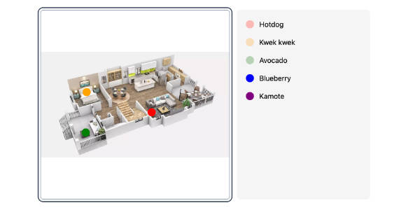
Vue-Draggable

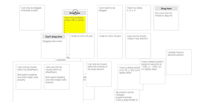
A simple component for making elements draggable.
<Draggable>
  <div>I can now be moved around!</div>
</Draggable>
Installing
$ npm install @marsio/vue-draggable
If you aren’t using browserify/webpack, a UMD version of vue-draggable is available. It is updated per-release only. This bundle is also what is loaded when installing from npm. It expects external Vue3.
If you want a UMD version of the latest master revision, you can generate it yourself from master by cloning this
repository and running $ make. This will create umd dist files in the build/ folder.
Exports
The default export is <Draggable>. At the .DraggableCore property is <DraggableCore>.
Here’s how to use it:
// ES6
import Draggable from '@marsio/vue-draggable'; // The default
import {DraggableCore} from '@marsio/vue-draggable'; // <DraggableCore>
import Draggable, {DraggableCore} from '@marsio/vue-draggable'; // Both at the same time

// CommonJS
let Draggable = require('@marsio/vue-draggable');
let DraggableCore = Draggable.DraggableCore;
<Draggable>
A <Draggable> element wraps an existing element and extends it with new event handlers and styles.
It does not create a wrapper element in the DOM.
Draggable items are moved using CSS Transforms. This allows items to be dragged regardless of their current positioning (relative, absolute, or static). Elements can also be moved between drags without incident.
If the item you are dragging already has a CSS Transform applied, it will be overwritten by <Draggable>. Use
an intermediate wrapper (<Draggable><span>...</span></Draggable>) in this case.
Draggable Usage
<template>
  <div>
    <h1>Vue Draggable</h1>
    <Draggable>
      <div class="box">I can be dragged anywhere</div>
    </Draggable>
  </div>
</template>
<script>
import Draggable from '@marsio/vue-draggable'
export default {
  components: {
    Draggable
  }
}
</script>
<style>
  html, body {
    height: 100%;
  }
  .vue-draggable, .cursor {
    cursor: move;
  }
  .box {
    background: #fff;
    border: 1px solid #999;
    border-radius: 3px;
    width: 180px;
    height: 180px;
    margin: 10px;
    padding: 10px;
    float: left;
  }
</style>
Draggable API
The <Draggable/> component transparently adds draggability to its children.
Note: Only a single child is allowed or an Error will be thrown.
For the <Draggable/> component to correctly attach itself to its child, the child element must provide support
for the following props:
styleis used to give the transform css to the child.classis used to apply the proper classes to the object being dragged.onMousedown,onMouseup,onTouchstart, andonTouchendare used to keep track of dragging state.
<Draggable> Props:
type DraggableEventHandler = (e: Event, data: DraggableData) => void | false;
type DraggableData = {
  node: HTMLElement,
  x: number, y: number,
  deltaX: number, deltaY: number,
  lastX: number, lastY: number
};

/*
 * Props:
 */
{
// If set to `true`, will allow dragging on non left-button clicks.
allowAnyClick: boolean,

// Determines which axis the draggable can move. This only affects
// flushing to the DOM. Callbacks will still include all values.
// Accepted values:
// - `both` allows movement horizontally and vertically (default).
// - `x` limits movement to horizontal axis.
// - `y` limits movement to vertical axis.
// - 'none' stops all movement.
axis: string,

// Specifies movement boundaries. Accepted values:
// - `parent` restricts movement within the node's offsetParent
//    (nearest node with position relative or absolute), or
// - a selector, restricts movement within the targeted node
// - An object with `left, top, right, and bottom` properties.
//   These indicate how far in each direction the draggable
//   can be moved.
bounds: {left?: number, top?: number, right?: number, bottom?: number} | string,

// Specifies a selector to be used to prevent drag initialization. The string is passed to
// Element.matches, so it's possible to use multiple selectors like `.first, .second`.
// Example: '.body'
cancel: string,

// Class names for draggable UI.
// Default to 'vue-draggable', 'vue-draggable-dragging', and 'vue-draggable-dragged'
defaultClassName: string,
defaultClassNameDragging: string,
defaultClassNameDragged: string,

// Specifies the `x` and `y` that the dragged item should start at.
// This is generally not necessary to use (you can use absolute or relative
// positioning of the child directly), but can be helpful for uniformity in
// your callbacks and with css transforms.
defaultPosition: {x: number, y: number},

// If true, will not call any drag handlers.
disabled: boolean,

// Specifies the x and y that dragging should snap to.
grid: [number, number],

// Specifies a selector to be used as the handle that initiates drag.
// Example: '.handle'
handle: string,

// If desired, you can provide your own offsetParent for drag calculations.
// By default, we use the Draggable's offsetParent. This can be useful for elements
// with odd display types or floats.
offsetParent: HTMLElement,

// Called whenever the user mouses down. Called regardless of handle or
// disabled status.
onMousedown: (e: MouseEvent) => void,

// Called when dragging starts. If `false` is returned any handler,
// the action will cancel.
startFn: DraggableEventHandler,

// Called while dragging.
dragFn: DraggableEventHandler,

// Called when dragging stops.
stopFn: DraggableEventHandler,

// import { defineComponent, ref } from 'vue';
// import Draggable from 'vue-draggable'

// const Component1 = defineComponent({
//   props: {
//     title: String
//   },
//   setup(props) {
//     return { title };
//   }
// });

// export default defineComponent({
//   setup(props) {
//     const nodeRef = ref(null)
//     return () => (
//       <DraggableCore dragFn={onDrag} nodeRef={nodeRef}>
//         <Component1 ref={nodeRef} />
//       </DraggableCore>
//     )
//   }
// });
// `nodeRef` is also available on <DraggableCore>.
nodeRef: Ref<HTMLElement | null>,

// if you need to have direct control of the element.
position: {x: number, y: number}

// A position offset to start with. Useful for giving an initial position
// to the element. Differs from `defaultPosition` in that it does not
// affect the position returned in draggable callbacks, and in that it
// accepts strings, like `{x: '10%', y: '10%'}`.
positionOffset: {x: number | string, y: number | string},

// Specifies the scale of the canvas your are dragging this element on. This allows
// you to, for example, get the correct drag deltas while you are zoomed in or out via
// a transform or matrix in the parent of this element.
scale: number
}
Note that sending class, style, or transform as properties will error – set them on the child element
directly.
Controlled vs. Uncontrolled
<Draggable> is a ‘batteries-included’ component that manages its own state. If you want to completely
control the lifecycle of the component, use <DraggableCore>.
For some users, they may want the nice state management that <Draggable> provides, but occasionally want
to programmatically reposition their components.
If the prop position: {x: number, y: number} is defined, the <Draggable> will ignore its internal state and use
the provided position instead. Alternatively, you can seed the position using defaultPosition. Technically, since
<Draggable> works only on position deltas, you could also seed the initial position using CSS top/left.
We then expect you to use at least an dragFn or stopFn handler to synchronize state.
To disable dragging while controlled, send the prop disabled={true} – at this point the <Draggable> will operate
like a completely static component.
<DraggableCore>
For users that require absolute control, a <DraggableCore> element is available. This is useful as an abstraction
over touch and mouse events, but with full control. <DraggableCore> has no internal state.
<DraggableCore> is a useful building block for other libraries that simply want to abstract browser-specific
quirks and receive callbacks when a user attempts to move an element. It does not set styles or transforms
on itself and thus must have callbacks attached to be useful.
DraggableCore API
<DraggableCore> takes a limited subset of options:
{
  allowAnyClick: boolean,
  cancel: string,
  disabled: boolean,
  enableUserSelectHack: boolean,
  offsetParent: HTMLElement,
  grid: [number, number],
  handle: string,
  startFn: DraggableEventHandler,
  dragFn: DraggableEventHandler,
  stopFn: DraggableEventHandler,
  onMousedown: (e: MouseEvent) => void,
  scale: number
}
Note that there is no start position. <DraggableCore> simply calls drag handlers with the below parameters,
indicating its position (as inferred from the underlying MouseEvent) and deltas. It is up to the parent
to set actual positions on <DraggableCore>.
Drag callbacks (startFn, dragFn, stopFn) are called with the same arguments as <Draggable>.
Contributing
- Fork the project
- Run the project in development mode:
$ npm run dev - Make changes.
- Update README with appropriate docs.
- Commit and PR
Release checklist
- Update CHANGELOG
make release-patchmake publish
License
MIT
