nav-image-comp
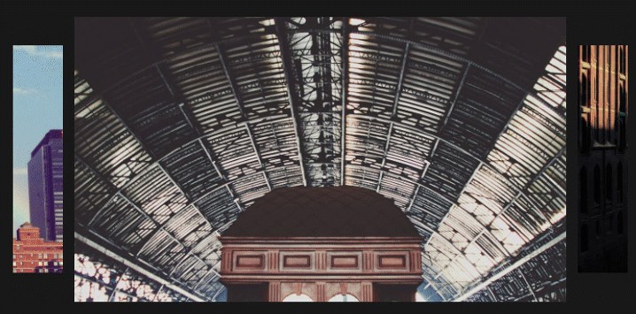
nav-image-comp is a Vue.js (>=3.2) that provides navigation and display of a list of submitted images. Thumbnails of the images are displayed across the top with a horizontal scroll bar appearing below if necessary. By simply hovering over a thumbnail, a large preview rendition of the image is displayed. Images can be quickly reviewed with the combination of horizontal scrolling and hovering over the thumbnails.
nav-image-comp can be installed via with the included package.json file for a local installation via the npm install command. nav-image-comp depends on the vue.js framework. A demo folder is provided that used Parcel together with its associated package.json file to bundle together nav-image-comp along with its vue.js dependency for a simple application. Further details are provided below for running the demo.
Props
A prop in Vue.js is a custom attribute for passing information from a parent component hosting nav-image-comp instance(s) to an nav-image-comp as a child component. nav-image-comp has the following props for a parent to bind and send information to:
heading — a heading to be displayed above the thumbnail horizontal image list (string,default: null)
sources — an array of file paths to set the component’s image sources (array,default: null)
containerWidth — a number that defines the overall width dimension of the component (Number, default: 900)
cssVariables — defines the css variables for nav-image-comp (object, default: null)
Styling
The cssVariables prop is a javascript object that contains any combination of css variable names as keys and associated values. The following list are the css variable names along with their default values for a quick styling of nav-image-comp:
{
  navimage_comp_font_family: 'Verdana,serif',
  navimage_comp_background_color: '#222',

  navimage_comp_heading_color: 'white',
  navimage_comp_heading_font_size: '1.5rem',
  navimage_comp_heading_font_weight: 'bold',

  navimage_comp_thumbnail_selected_border: '4px solid gold'
}
Events
nav-image-comp has one event that notifies the parent component of the current selected image source:
'navImageCompCurrentSource' --- returns the current selected image's source
The parent component can listen to the above event and provide a callback for further processing. Events emitted from a child component back to the parent is explained at Vue Custom Events.
The demonstration shows how the event can be incorporated.
Demonstration
One demonstration of nav-image-comp is provided in the folder named demo/dist-prod and can be viewed by hosting the index.htmlfile. The demo (templated in the App.vue file) sets the sources of 10 jpeg image files.
As a suggestion, install http-server locally/globally via npm then enter the command http-serverin the nav-image-comp dist-prod directory. From a browser enter the url: localhost:8080/ to view the demo.
Here is some example code for using nav-image-comp taken from the App.vue file:
    <div class='demo_container'>
      <nav-image-comp
        :sources="sources"
        heading="Favorite Pictures"
        @navImageCompCurrentSource="show_current_source">
      </nav-image-comp>
    </div>
And the supporting data references:
  data: function() {
    return {
      sources:[
        'images/img1.jpg',
          'images/img2.jpg',
          'images/img3.jpg',
          'images/img4.jpg',
          'images/img5.jpg',
          'images/img6.jpg',
          'images/img7.jpg',
          'images/img8.jpg',
          'images/img9.jpg',
          'images/img10.jpg'
      ]
    }
  },
  methods: {
    show_current_source: function(source){
      console.log(`Current Source: ${source}`)
    }
  }
