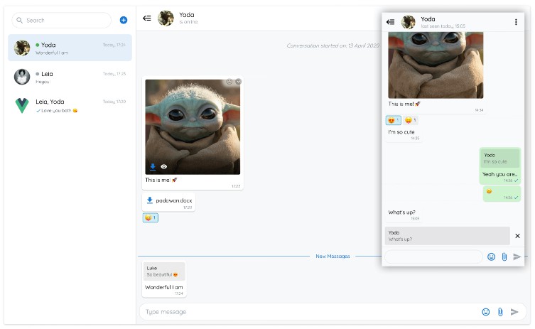
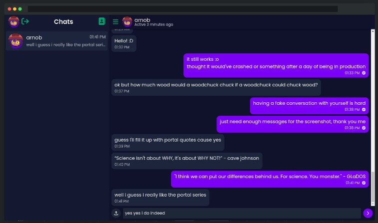
vue-advanced-chat
Vue 3 compatibility ?
Features
- Vue, Angular & React compatibility
- Customizeable realtime chat messaging
- Backend agnostic
- Images, videos, files, voice messages & emojis
- Edit messages & reply to other messages
- Tag users & emojis shortcut suggestions
- UI elements for seen, new, deleted, typing and system messages
- Text formatting – bold, italic, strikethrough, underline, code, multiline
- Online / Offline users status
- Flexible options and slots
- Light and dark theme modes
- Firestore example
- Typescript, PWA, Web Component support
Demo
Enjoy ?
Real World Example
A Progressive Web Application showcasing all the features of vue-advanced-chat component.
Built with Firestore, Vuetify, and Push Notifications.
If you wish to get premium access to the real world example source code, please contact me by email.
You will get a fully working chat application for web and mobile:
- UI and backend integration
- Email, Facebook and Google authentication
- Real-time messaging, browser push notifications, images optimization (Firebase Cloud Functions to compress avatars)
- UI/UX components for alerts (errors, information), dialogs, etc.
- Add existing users to a room using their email
- Send email invitations to non-existing users
- Edition of profile and rooms
- Addition and deletion of room users
- Optimised firestore implementation to reduce bandwidth and costs as much as possible
- State management using vuex
- Internationalisation (i18n)
- Google Analytics
- Support to help you get the chat up and running
Table of Contents
- Installation
- Usage
- Props API
- Props data structure
- Events API
- Named Slots
- Using with Firestore
- Use as a Web Component with React and Angular
Installation
This component is only compatible with Vue 2.6.14 and above.
# Using npm
npm install --save vue-advanced-chat

# Using yarn
yarn add vue-advanced-chat

# Using CDN
<script src="https://cdn.jsdelivr.net/npm/[email protected]"></script>
<script src="https://cdn.jsdelivr.net/npm/[email protected]/dist/vue-advanced-chat.min.js"></script>
If you want to send mp3 audio messages, you may need to install lamejs inside your project:
npm install lamejs --save
Installation with React & Angular
Usage
You can import it as a custom component:
<template>
  <chat-window
    :current-user-id="currentUserId"
    :rooms="rooms"
    :messages="messages"
  />
</template>

<script>
  import ChatWindow from 'vue-advanced-chat'
  import 'vue-advanced-chat/dist/vue-advanced-chat.css'

  export default {
    components: {
      ChatWindow
    },
    data() {
      return {
        rooms: [],
        messages: [],
        currentUserId: 1234
      }
    }
  }
</script>
Or if you used CDN import:
<template>
  <vue-advanced-chat/>
</template>

<script>
export default {
  data() {
    return {
      rooms: [],
      messages: [],
      currentUserId: 1234
    }
  },
  mounted() {
    document.querySelector('vue-advanced-chat').currentUserId = this.currentUserId
    document.querySelector('vue-advanced-chat').rooms = this.rooms
    document.querySelector('vue-advanced-chat').messages = this.messages
  }
}
</script>
Important notes
vue-advanced-chat component is performance oriented, hence you have to follow specific rules to make it work properly.
- Use array assignement instead of
pushmethod
// DO THIS
const rooms = []
for (let i = 0; i < res.length; i++) {
  rooms.push(res)
}
this.rooms = rooms

// DON'T DO THIS
for (let i = 0; i < res.length; i++) {
  this.rooms.push(res)
}
// DO THIS
this.rooms[i].typingUsers = [...this.rooms[i].typingUsers, typingUserId]

// DON'T DO THIS
this.rooms[i].typingUsers.push(typingUserId)
- To add or replace an item inside an array, use spread operator
// DO THIS
this.rooms[roomIndex] = room
this.rooms = [...this.rooms]

// DON'T DO THIS
this.rooms[roomIndex] = room

// AND DON'T DO THIS
this.rooms.push(room)
- Follow the UI loading pattern by updating
messagesLoadedprop every time a new room is fetched
fetchMessages({ room, options }) {
  this.messagesLoaded = false

  // use timeout to imitate async server fetched data
  setTimeout(() => {
    this.messages = []
    this.messagesLoaded = true
  })
}
Props API
|
Prop
|
Type | Required | Default |
|---|---|---|---|
height |
String | – | 600px |
current-user-id(1) |
[String, Number] | true |
– |
rooms |
Array | – | [] |
rooms-order |
String | – | desc |
loading-rooms(2) |
Boolean | – | false |
rooms-loaded(3) |
Boolean | – | false |
room-id(4) |
[String, Number] | – | null |
load-first-room(5) |
Boolean | – | true |
rooms-list-opened |
Boolean | – | true |
messages |
Array | – | [] |
room-message(6) |
String | – | null |
username-options (7) |
Object | – | {minUsers: 3, currentUser: false} |
messages-loaded(8) |
Boolean | – | false |
room-actions(9) |
Array | – | [] |
menu-actions(10) |
Array | – | [] |
message-actions(11) |
Array | – | (11) |
message-selection-actions(12) |
Array | – | (12) |
templates-text(13) |
Array | – | null |
auto-scroll(14) |
Object | – | { send: { new: true, newAfterScrollUp: true }, receive: { new: true, newAfterScrollUp: false } } |
show-search |
Boolean | – | true |
show-add-room |
Boolean | – | true |
show-send-icon |
Boolean | – | true |
show-files |
Boolean | – | true |
show-audio |
Boolean | – | true |
audio-bit-rate |
Number | – | 128 |
audio-sample-rate |
Number | – | 44100 |
show-emojis |
Boolean | – | true |
show-reaction-emojis |
Boolean | – | true |
show-new-messages-divider(15) |
Boolean | – | true |
show-footer(16) |
Boolean | – | true |
text-messages(17) |
Object | – | null |
text-formatting(18) |
Object | – | {disabled: false, italic: '_', bold: '*', strike: '~', underline: '°', multilineCode: '```', inlineCode: '‘}` |
link-options(19) |
Object | – | { disabled: false, target: '_blank', rel: null } |
room-info-enabled (20) |
Boolean | – | false |
textarea-action-enabled(21) |
Boolean | – | false |
user-tags-enabled |
Boolean | – | true |
emojis-suggestion-enabled |
Boolean | – | true |
media-preview-enabled |
Boolean | – | true |
responsive-breakpoint(22) |
Number | – | 900 |
single-room(23) |
Boolean | – | false |
scroll-distance(24) |
Number | – | 60 |
theme(25) |
Sring | – | light |
accepted-files(26) |
String | – | * |
styles(27) |
Object | – | (25) |
(1) current-user-id is required to display UI and trigger actions according to the user using the chat (ex: messages position on the right, etc.)
(2) loading-rooms can be used to show/hide a spinner icon while rooms are loading
(3) rooms-loaded must be set to true when all rooms have been loaded. Meaning the user cannot scroll to load more paginated rooms
(4) room-id can be used to load a specific room at any time
(5) load-first-room can be used to remove the default behaviour of opening the first room at initialization
(6) room-message can be used to add a default textarea value
(7) username-options can be used to show/hide room messages username according to the minimum number of users minUsers inside a room, and if the message user is the current user currentUser
(8) messages-loaded must be set to true when all messages of a conversation have been loaded. Meaning the user cannot scroll on top to load more paginated messages
(9) room-actions can be used to display your own buttons when clicking the dropdown icon of each room inside the rooms list.
You can then use the room-action-handler event to call your own action after clicking a button. Ex:
room-actions="[
  {
    name: 'archiveRoom',
    title: 'Archive Room'
  }
]"
(10) menu-actions can be used to display your own buttons when clicking the vertical dots icon inside a room.
You can then use the menu-action-handler event to call your own action after clicking a button. Ex:
menu-actions="[
  {
    name: 'inviteUser',
    title: 'Invite User'
  },
  {
    name: 'removeUser',
    title: 'Remove User'
  },
  {
    name: 'deleteRoom',
    title: 'Delete Room'
  }
]"
(11) message-actions can be used to display your own buttons when clicking the dropdown icon inside a message.
You can then use the message-action-handler event to call your own action after clicking a button. Ex:
message-actions="[
  {
    name: 'addMessageToFavorite',
    title: 'Add To Favorite'
  },
  {
    name: 'shareMessage',
    title: 'Share Message'
  }
]"
You can use built-in message-actions names to trigger specific UI modifications when clicked.
Currently, replyMessage, editMessage and deleteMessage action names are available.
If messageActions is not set, it will use the default values below.
If you don’t want to display this messageActions menu, you can pass it an empty array.
messageActions="[
  {
    name: 'replyMessage',
    title: 'Reply'
  },
  {
    name: 'editMessage',
    title: 'Edit Message',
    onlyMe: true
  },
  {
    name: 'deleteMessage',
    title: 'Delete Message',
    onlyMe: true
  },
  {
    name: 'selectMessages',
    title: 'Select'
  }
]"
(12) message-selection-actions is related to the above selectMessages message action. You can use it to display custom action buttons in the room header when selecting a message. Ex:
messageActions="[
  {
    name: 'deleteMessages',
    title: 'Delete'
  },
  {
    name: 'forwardMessages',
    title: 'Forward'
  }
]"
(13) templates-text can be used to add autocomplete templates text when typing / in the room textarea. Ex:
templatesText="[
  {
    tag: 'help',
    text: 'This is the help'
  },
  {
    tag: 'action',
    text: 'This is the action'
  }
]"
(14) auto-scroll can be used to change the auto scroll behaviour when sending/receiving a message. Ex:
auto-scroll="{
  send: {
    new: true, // will scroll down after sending a message
    newAfterScrollUp: false // will not scroll down after sending a message when scrolled up
  },
  receive: {
    new: false, // will not scroll down when receiving a message
    newAfterScrollUp: true // will scroll down when receiving a message when scrolled up
  }
}"
(15) show-new-messages-divider can be used to show/hide the blue line divider between seen and unseen messages.
(16) show-footer can be used to hide the room footer. For example to prevent users to send any message or media.
(17) text-messages can be used to replace default i18n texts. Ex:
text-messages="{
  ROOMS_EMPTY: 'Aucune conversation',
  ROOM_EMPTY: 'Aucune conversation sélectionnée',
  NEW_MESSAGES: 'Nouveaux messages',
  MESSAGE_DELETED: 'Ce message a été supprimé',
  MESSAGES_EMPTY: 'Aucun message',
  CONVERSATION_STARTED: 'La conversation a commencée le :',
  TYPE_MESSAGE: 'Tapez votre message',
  SEARCH: 'Rechercher',
  IS_ONLINE: 'est en ligne',
  LAST_SEEN: 'dernière connexion ',
  IS_TYPING: 'est en train de taper...',
  CANCEL_SELECT_MESSAGE: 'Annuler Sélection'
}"
(18) text-formatting can be used to add text formatting. Bold, italic, strikethrough, underline, inline code and multiline code formatting are currently available and can be used in conjonction.
- You can disable text formatting by passing the prop
:text-formatting="{disabled: true}". - You can change markdown characters, for example:
:text-formatting="{italic: '^'}" - You can disable a specific markdown character, for example:
:text-formatting="{bold: null}"
| Style | Syntax | Example | Output |
|---|---|---|---|
| Bold | * * |
*This is bold text* |
This is bold text |
| Italic | _ _ |
_This text is italicized_ |
This text is italicized |
| Strikethrough | ~ ~ |
~This was mistaken text~ |
|
| Underline | ° ° |
°This text is underlined° |
This text is underlined |
| Nested formatting | * * and _ _ |
*This text is _extremely_ important* |
This text is extremely important |
Inline Code
Example: `This is inline code`
Output: This is inline code
Multiline Code
Example: “`This is multiline code“`
Output:
This is
multiline code
(19) link-options can be used to disable url links in messages, or change urls target. Ex:
:link-options="{ disabled: true, target: '_self', rel: null }"
(20) room-info-enabled can be used to trigger an event after clicking the room header component.
You can then use the room-info event to call your own action after clicking the header.
(21) textarea-action-enabled can be used to add an extra icon on the right of the textarea
You can then use the textarea-action-handler event to call your own action after clicking the icon.
(22) responsive-breakpoint can be used to collapse the rooms list on the left when then viewport size goes below the specified width.
(23) single-room can be used if you never want to show the rooms list on the left. You still need to pass the rooms prop as an array with a single element.
(24) scroll-distance can be used to change the number of pixels before fetchMessages event is triggered when scrolling up to load more messages, or fetchMoreRooms event is triggered when scrolling down to load more rooms.
(25) theme can be used to change the chat theme. Currently, only light and dark are available.
(26) accepted-files can be used to set specifics file types allowed in chat. By default, all file types are allowed: "*".
Example: set "accepted-files="image/png, image/jpeg, application/pdf" to allow JPG PNG and PDF files only
(27) styles can be used to customize your own theme. You can find the full list here
styles="{
  general: {
    color: '#0a0a0a',
    colorSpinner: '#333',
    borderStyle: '1px solid #e1e4e8'
  },

  footer: {
    background: '#f8f9fa',
    backgroundReply: 'rgba(0, 0, 0, 0.08)'
  },

  icons: {
    search: '#9ca6af'
  }
}"
Props data structure
Your props must follow a specific structure to display rooms and messages correctly:
Rooms prop
rooms="[
  {
    roomId: 1,
    roomName: 'Room 1',
    avatar: 'assets/imgs/people.png',
    unreadCount: 4,
    index: 3,
    lastMessage: {
      content: 'Last message received',
      senderId: 1234,
      username: 'John Doe',
      timestamp: '10:20',
      saved: true,
      distributed: false,
      seen: false,
      new: true
    },
    users: [
      {
        _id: 1234,
        username: 'John Doe',
        avatar: 'assets/imgs/doe.png',
        status: {
          state: 'online',
          lastChanged: 'today, 14:30'
        }
      },
      {
        _id: 4321,
        username: 'John Snow',
        avatar: 'assets/imgs/snow.png',
        status: {
          state: 'offline',
          lastChanged: '14 July, 20:00'
        }
      }
    ],
    typingUsers: [ 4321 ]
  }
]"
-
If you add the
indexproperty, your rooms will be ordered using this value.indexcan be any sortable value, like astring,datetime,timestamp, etc. -
For each room user, you can add the
statusproperty, which can hold thestateandlastChangedproperties:statecan be'online'or'offline'lastChangedis the date whenstatewas last modified.
-
typingUsersis an array of all the users who are currently writing a message
Messages prop
Message objects are rendered differently depending on their type. Text, emoji, image, video and file types are supported.
Each message object has a senderId field which holds the id of the corresponding agent. If senderId matches the currentUserId prop, specific UI and actions will be implemented.
Notes:
usernamewill be displayed on each message of corresponding agents if at least 3 users are in the roomsystemis used to show messages with a specific centered displayindexIdcan be used if you need to change a message ID that is already displayed in a room, this preventing an animation glitch. For example, when you don’t know in advance the message ID your backend will create.
Message states:
saved: trueone checkmarkdistributed: truetwo checkmarksseen: truetwo blue checkmarksdeleted: truegrey background with deleted message textfailure: truered clickable failure icon
messages="[
  {
    _id: 7890,
    indexId: 12092,
    content: 'Message 1',
    senderId: 1234,
    username: 'John Doe',
    avatar: 'assets/imgs/doe.png',
    date: '13 November',
    timestamp: '10:20',
    system: false,
    saved: true,
    distributed: true,
    seen: true,
    deleted: false,
    failure: true,
    disableActions: false,
    disableReactions: false,
    files: [
      {
        name: 'My File',
        size: 67351,
        type: 'png',
        audio: true,
        duration: 14.4,
        url: 'https://firebasestorage.googleapis.com/...',
        preview: 'data:image/png;base64,iVBORw0KGgoAA...',
        progress: 88
      }
    ],
    reactions: {
      ?: [
        1234, // USER_ID
        4321
      ],
      ?: [
        1234
      ]
    },
    replyMessage: {
      content: 'Reply Message',
      senderId: 4321,
      files: [
        {
          name: 'My Replied File',
          size: 67351,
          type: 'png',
          audio: true,
          duration: 14.4,
          url: 'https://firebasestorage.googleapis.com/...',
          preview: 'data:image/png;base64,iVBORw0KGgoAA...'
        }
      ]
    },
  }
]"
Events API
|
Event
|
Params | Fires when a user |
|---|---|---|
fetch-messages(1) |
{ room, options } |
Scrolled on top to load more messages |
fetch-more-rooms(2) |
– | Scrolled to load more rooms |
send-message |
{ roomId, content, files(10), replyMessage(11), usersTag } |
Sent a message |
edit-message |
{ roomId, messageId, newContent, files(9), replyMessage(11) ,usersTag } |
Edited a message |
delete-message |
{ roomId, message } |
Deleted a message |
open-file |
{ message, file } |
Clicked to view or download a file |
open-user-tag(3) |
{ user } |
Clicked on a user tag inside a message |
open-failed-message |
{ roomId, message } |
Clicked on the failure icon next to a message |
add-room |
– | Clicked on the plus icon next to searchbar |
room-action-handler(4) |
{ roomId, action } |
Clicked on the vertical dots icon inside a room |
menu-action-handler(5) |
{ roomId, action } |
Clicked on the vertical dots icon inside a room |
message-action-handler(6) |
{ roomId, action, message } |
Clicked on the dropdown icon inside a message |
message-selection-action-handler(7) |
{ roomId, action, messages } |
Clicked on the select button inside a message |
send-message-reaction |
{ roomId, messageId, reaction, remove } |
Clicked on the emoji icon inside a message |
room-info (8) |
room |
Clicked the room header bar |
toggle-rooms-list |
{ opened } |
Clicked on the toggle icon inside a room header |
textarea-action-handler(9) |
{ roomId, message } |
Clicked on custom icon inside the footer |
typing-message |
{ roomId, message } |
Started typing a message |
(1) fetch-messages is triggered every time a room is opened. If the room is opened for the first time, the options param will hold reset: true.
(1) fetch-messages should be a method implementing a pagination system. Its purpose is to load older messages of a conversation when the user scroll on top.
(2) fetch-more-rooms is triggered when scrolling down the rooms list, and should be a method implementing a pagination system.
(3) open-user-tag is triggered when clicking a user tag inside a message. When creating a user tag by typing @ in the footer textarea and sending the message, the tag will be identified with the below pattern:
<usertag>TAGGED_USER_ID</usertag>
This will make the tag clickable inside a message. Ex: message tag content
send-message and edit-message events will handle that pattern for you and pass it in the content param.
(4) room-action-handler is the result of the room-actions prop.
When clicking a button from your room-actions array, room-action-handler will give you the name of the button that was click.
Then you can do anything you want with it. Ex:
menuActionHandler({ roomId, action }) {
  switch (action.name) {
    case 'archiveRoom':
      // call a method to archive the room
  }
}
(5) menu-action-handler is the result of the menu-actions prop.
When clicking a button from your menu-actions array, menu-action-handler will give you the name of the button that was click.
Then you can do anything you want with it. Ex:
menuActionHandler({ roomId, action }) {
  switch (action.name) {
    case 'inviteUser':
      // call a method to invite a user to the room
    case 'removeUser':
      // call a method to remove a user from the room
    case 'deleteRoom':
      // call a method to delete the room
  }
}
(6) message-action-handler is the result of the message-actions prop.
When clicking a button from your message-actions array, message-action-handler will give you the name of the button that was click and the corresponding message data.
Then you can do anything you want with it. Ex:
messageActionHandler({ roomId, action, message }) {
  switch (action.name) {
    case 'addMessageToFavorite':
      // call a method to add a message to the favorite list
    case 'shareMessage':
      // call a method to share the message with another user
  }
}
(7) message-selection-action-handler is the result of the message-selection-actions prop.
When clicking a button from your message-selection-actions array, message-selection-action-handler will give you the name of the button that was click and the corresponding selected messages data.
Then you can do anything you want with it. Ex:
messageActionHandler({ roomId, action, message }) {
  switch (action.name) {
    case 'deleteMessages':
      // call a method to delete selected messaged
    case 'shareMessage':
      // call a method to share selected messaged with another user
  }
}
(8) room-info is the result of the room-info-enabled prop.
(9) textarea-action-handler is the result of the textarea-action-enabled prop.
(10) Array of files where each file contain: { blob, localURL, name, size, type, extension }
(11) replyMessage object is available when the user replied to another message by clicking the corresponding icon, and contains the message information that was clicked.
Named Slots
Example:
<template #room-header="{ room, userStatus }">
  {{ room.roomName }} - {{ userStatus }}
</template>
|
Slot
|
Action | Data | Overridden slots |
|---|---|---|---|
custom-action-icon |
Add a custom icon inside the footer | – | – |
room-list-item |
Replace the template of the room list items | room |
room-list-avatar, room-list-options |
room-list-avatar |
Replace the avatar of room list items | room |
|
room-list-options |
Replace the template of the list room options | room |
room-list-options-icon |
rooms-header |
Replace the content above the search bar | – | – |
rooms-list-search |
Replace the search bar | – | – |
room-header |
Replace the template of the room header | room, typingUsers, userStatus |
room-options, menu-icon, toggle-icon |
room-header-avatar |
Replace the template of the room header avatar | room |
|
room-header-info |
Replace the template of the room header text | room, typingUsers, userStatus |
|
room-options |
Replace the template of the room options | – | menu-icon |
message |
Replace the template of the message box | message |
deleted-icon, eye-icon, document-icon, pencil-icon, checkmark-icon, dropdown-icon, emoji-picker-icon |
message-failure |
Replace the message failure icon | – | – |
messages-empty |
Replace the empty message template | – | – |
rooms-empty |
Replace the empty rooms template | – | – |
no-room-selected |
Replace the no room selected template | – | – |
menu-icon |
Replace the room menu icon | – | – |
toggle-icon |
Replace the toggle room list icon | – | – |
spinner-icon |
Replace the loading spinner icon | show, infinite |
– |
scroll-icon |
Replace the scroll to newest message icon | – | – |
reply-close-icon |
Replace the reply close icon | – | – |
image-close-icon |
Replace the image close icon | – | – |
file-icon |
Replace the file icon | – | – |
file-close-icon |
Replace the file close icon | – | – |
edit-close-icon |
Replace the edit close icon | – | – |
preview-close-icon |
Replace the media preview close icon | – | – |
emoji-picker-icon |
Replace the emoji picker icon | – | – |
emoji-picker-reaction-icon |
Replace the emoji picker reaction icon (in the message box) | – | – |
paperclip-icon |
Replace the paperclip icon | – | – |
send-icon |
Replace the message send icon | – | – |
eye-icon |
Replace the eye icon (image message) | – | – |
document-icon |
Replace the document icon | – | – |
pencil-icon |
Replace the pencil icon | – | – |
checkmark-icon |
Replace the checkmark icon | message |
– |
deleted-icon |
Replace the deleted icon | deleted |
– |
microphone-icon |
Replace the microphone icon | – | |
dropdown-icon |
Replace the dropdown icon | – | – |
room-list-options-icon |
Replace the room list options dropdown icon | – | – |
search-icon |
Replace the search icon | – | – |
add-icon |
Replace the add room icon | – | – |
audio-pause-icon |
Replace the message audio pause icon | – | – |
audio-play-icon |
Replace the message audio play icon | – | – |
emoji-picker |
Replace the emoji picker component | emojiOpened, addEmoji({ unicode: ? }) |
emoji-picker-reaction-icon |
Using with Firestore
Source code
You can find the source code to implement a full featured chat app using Firebase/Firestore inside the demo folder.
To test it using your own Firebase project:
- Setup Cloud Firestore (to store users and rooms) and Realtime Database (to store users online status)
- Clone this repository:
git clone https://github.com/antoine92190/vue-advanced-chat.git - Inside
demo/src/firestore/index.jsfile, replace the lineconst config = ...by your own Firebase config - Go inside
demofolder and runnpm run serve
Data structure
If you decide to use the same code as in the demo folder to create your chat app, you need to have a specific Firestore data structure.
To help you get started, I added in demo/src/App.vue a method addData to initialize some data on your Firestore database.
Users collection
users: {
  USER_ID_1: {
    _id: 1,
    username: 'User 1'
  },
  USER_ID_2: {
    _id: 2,
    username: 'User 2'
  },
  USER_ID_3: {
    _id: 3,
    username: 'User 2'
  }
}
Rooms collection
chatRooms: {
  ROOM_ID_1: {
    users: [1, 3]
  },
  ROOM_ID_2: {
    users: [1, 2, 3]
  }
}
Messages collection inside a room document
messages: {
  MESSAGE_ID_1: {
    content: 'My first message to <usertag>John</usertag>',
    senderId: 2,
    timestamp: 'December 11, 2019 at 4:00:00 PM',
    seen: true
  }
}
Notes
- You need to create a composite index to order rooms by last message received. The easiest way to do it is to create a room, then click the error message url in the browser debugging console.
Use as a Web Component with React and Angular
Install vue-advance-chat component
- Follow Installation steps
Install Vue.js
# Using npm
npm install --save vue

# Using yarn
yarn add --save vue
React Setup
See demo repository: https://github.com/antoine92190/vue-advanced-chat-sandbox/tree/react
Angular Setup
See demo repository: https://github.com/antoine92190/vue-advanced-chat-sandbox/tree/angular
// angular.json

"build": {
  "scripts": [
    "./node_modules/vue/dist/vue.min.js",
    "./node_modules/vue-advanced-chat/dist/vue-advanced-chat.min.js"
  ]
}
// page.module.ts

@NgModule({
  ...
  schemas: [CUSTOM_ELEMENTS_SCHEMA],
})
<!-- page.html -->

<vue-advanced-chat
  height="100vh"
  [currentUserId]="currentUserId"
  [roomId]="roomId"
  [rooms]="rooms"
  [roomsLoaded]="true"
  [messages]="messages"
  [messagesLoaded]="messagesLoaded"
  [showFiles]="true"
  [showEmojis]="true"
  [showReactionEmojis]="true"
  [showFooter]="true"
  (fetch-messages)="fetchMessages($event.detail[0])"
  (send-message)="sendMessage($event.detail[0])"
  ...
>
</vue-advanced-chat>
Use in a Vue 3 project
Install vue-advance-chat component (next branch)
# Using npm
npm install --save https://github.com/antoine92190/vue-advanced-chat/tarball/next
Contributing
Your help is always appreciated ?
License
This project is licensed under MIT License
