usemodal-vue3
An easy-to-use Modal for Vue 3. Multiple modals can pop up orderly.
Install
npm i usemodal-vue3
CDN
https://www.unpkg.com/usemodal-vue3
Usage
import { ref } from 'vue';
import { Modal } from 'usemodal-vue3';

let isVisible = ref(false);

<Modal v-model:visible="isVisible">
    <div>your content...</div>
</Modal>
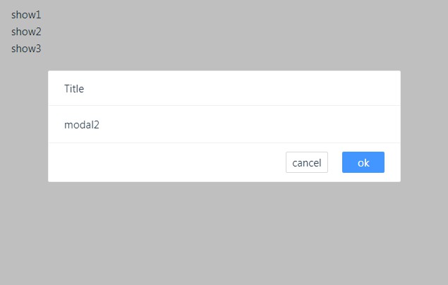
Your page may need to pop up multiple modals, and different modals may depend on different data sources, sometimes even asynchronously, you can easily manage their popup order.
import { reactive } from 'vue';
import { useModal, Modal } from 'usemodal-vue3';

let setModal = useModal({
    m1: 2, // The larger the number, the later in the order
    m2: 1 // Smaller numbers, first in order
});

let modalVisible = reactive({});

modalVisible = setModal('m1', true);

setTimeout(() => {
    // or  modalVisible = setModal('m2', false)
    modalVisible = setModal('m2', true); // either true or false, you have to define a state.
}, 2000)

function myCancel() {
    // do something....
     modalVisible = setModal('m2', false); // m1 is closed, while the other states are true in order
}

// m1 order is 2
<Modal name="m1" v-model:visible="modalVisible">
    <div>This modal will be displayed according to the status when the previous one is closed or the display status is fasle</div>
</Modal>
// m2 order is 1, will go first
<Modal name="m2" v-model:visible="modalVisible">
    <div>This modal will be displayed first</div>
</Modal>
Documentation
api
| params | Description | Type | Default |
|---|---|---|---|
| visible(v-model) | Is the modal visible ? | boolean | |
| name | Required if there are multiple modals and there is an order problem | string | |
| mask | Whether the mask is visible | boolean | true |
| maskClosable | Whether clicking on the mask can close the modal | boolean | true |
| type | Type of the modal . ‘clean’ is custom | string | ” |
| modalClass | When you need to customize the style, you can modify the outermost class | string | ” |
| width | Width of the modal. When the value is a number, the unit is px | string|number | 500 |
| offsetTop | Position from top. When the value is a number, the unit is px | string|number | 100 |
| zIndex | z-index | number | 1000 |
| title | Title of the modal | string | ‘Title’ |
| animation | Whether the animation pops up | boolean | true |
| closable | Whether the close icon is visible or not | boolean | true |
| cancelButton | Cancel button’s text configuration and click callback | object | {text: ‘cancel’, onclick: null} |
| okButton | ok button’s text configuration and click callback | object | {text: ‘ok’, onclick: null} |
event
| event | Description | callback params |
|---|---|---|
| onVisible | When the modal is displayed | |
| onUnVisible | When the modal is hidden |
