Hi There ?
In this article, we will build a custom modal component with Nuxt.js. We will build this Modal component from scratch without using any CSS framework.
Introduction
First, we must understand what a Modal is.
A modal is a component that displays in front of a page content and makes the page content inaccessible till it is closed. To return to the main content, the user must engage with the modal by completing an action or by closing it. Modals are often used to direct users’ attention to an important action or piece of information on a website or application.
If you are a frontend developer, I think you should know that modals are ubiquitous UI elements on the web.
Prerequisites
To complete this tutorial, you will need:
- A basic understanding of Vue or Nuxt before starting this tutorial.
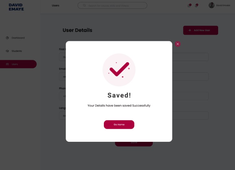
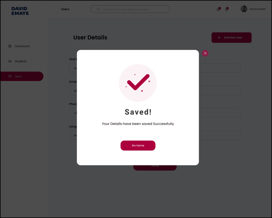
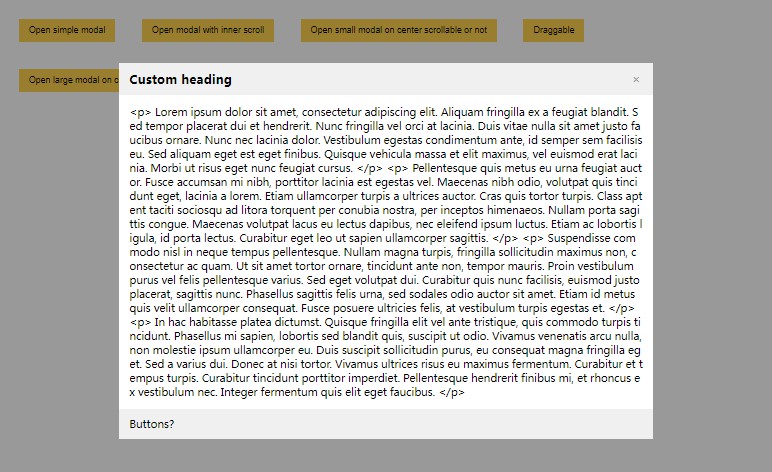
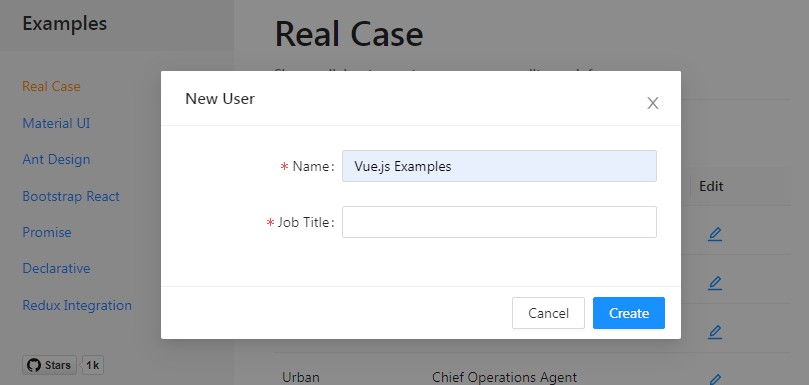
We are going to implement the modal component shown above in our Nuxt project through the following steps.
- Creating a modal component
- Add styling
- Handle show/hide modal
- Implement the Close event
- Close modal by clicking outside the modal
Based on the requirement of understanding of Vue or Nuxt which I made mention of above, I’m assuming that we are familiar with how to create a Nuxt app and basic styling with CSS.
Let’s get started
1. Creating our modal component.
Basically, we would be working on what is important to this article and that is implementing the modal, so we won’t be styling the main page.
Let’s start by creating our modal component on /components/SavedModal.vue that is, we are creating SavedModal.vue inside the components folder.
Here we have our code for SavedModal.vue
<template>
  <div class="modal-overlay">
    <div class="modal">
      <img class="check" src="~/assets/check-icon.png" alt="" />
      <h6>Saved!</h6>
      <p>Your Details have been saved Successfully</p>
      <button>Go Home</button>
    </div>
    <div class="close">
      <img class="close-img" src="~/assets/close-icon.svg" alt="" />
    </div>
  </div>
</template>

<script>
  export default {
}
</script>
Code explanation
A class of modal-overlay i.e class="modal-overlay" was given to the root div which acts as the background overlay when the modal appears.
Then a class of modal i.e class="modal" was given to the second div element after the root element. This acts as the main modal.
2. Adding Style to our code.
<style scoped>

.modal-overlay {
  position: fixed;
  top: 0;
  bottom: 0;
  left: 0;
  right: 0;
  display: flex;
  justify-content: center;
  background-color: #000000da;
}

.modal {
  text-align: center;
  background-color: white;
  height: 500px;
  width: 500px;
  margin-top: 10%;
  padding: 60px 0;
  border-radius: 20px;
}
.close {
  margin: 10% 0 0 16px;
  cursor: pointer;
}

.close-img {
  width: 25px;
}

.check {
  width: 150px;
}

h6 {
  font-weight: 500;
  font-size: 28px;
  margin: 20px 0;
}

p {
  font-size: 16px;
  margin: 20px 0;
}

button {
  background-color: #ac003e;
  width: 150px;
  height: 40px;
  color: white;
  font-size: 14px;
  border-radius: 16px;
  margin-top: 50px;
}
</style>
3. Handle show/hide modal
To make our modal show, we are going to work on the main page which is index.vue.
We won’t be implementing the whole page, but only the sections important to our aim, which is to make the modal function well
Here we have our code for index.vue
First, let’s import our modal component to index.vue.
      </div>
    </div>
    <SavedModal v-show="showModal" />
  </div>
</template>

<script>
import SavedModal from '~/components/SavedModal.vue'

export default {
  components: { SavedModal },
  data() {
    return {
      showModal: false,
    }
  },
}
</script>
What did we do up here?
We imported the SaveModal component and then added a v-show directive with a data property of showModal to conditionally display the <SavedModal/>element. i.e v-show="showModal".
Then we returned the data property of showModal with a value of false.
This means <SavedModal /> modal would only display if the returned value becomes true.
Let’s now work on how to change the returned value from false to true
We would be adding an @click event to the Save button which would change the returned value from false to true and would trigger the modal to appear.
<div class="save-btn">
    <button @click="showModal = true">Save</button>
</div>
In the code above we made showModal have a value of true and added it to the @click event.
This means anytime the Save button is clicked the @clicked event changes showModal‘s value from false to true and triggers the modal to appear.
Now that our modal can appear when the save button is clicked, let’s go to the next step.
4. Implementing the Close event
We would be modifying SavedModal.vue to implement the close event.
<template>
  <div class="modal-overlay">
    <div class="modal">
      <img class="check" src="~/assets/check-icon.png" alt="" />
      <h6>Saved!</h6>
      <p>Your Details have been saved Successfully</p>
      <button>Go Home</button>
    </div>
    <div class="close" @click="$emit('close-modal')">
      <img class="close-img" src="~/assets/close-icon.svg" alt="" />
    </div>
  </div>
</template>
Why did we add @click="$emit('close-modal')" to the close button?
We added an @click event which sends a 'close-modal' event using $emit to the parent component which is the index.vue page.
$emit in Vue is primarily used for sending custom events between child components upwards to parent components.
Since we are sending a 'close-modal' event to the modal element on the index.vue page, we would also need to modify it, to make our close button function the way it should.
      </div>
    </div>
    <SavedModal v-show="showModal" @close-modal="showModal = false" />
  </div>
</template>
Since 'close-modal' is a custom event sent from the @click event on the child component which is the SavedModal.vue page, it automatically acts as an @click event here on the parent component (index.vue page).
So we made showModal have a value of false and added it to the @close-modal event.
Therefore when the close button is clicked on the SavedModal.vue page, it sends an event to the index.vue page that triggers the @close-modal event which changes showModal‘s value from true to false and makes the modal to close.
Now to the last step
5. Close modal by clicking outside the modal
We would be modifying the SavedModal.vue page to also implement this.
<template>
  <div class="modal-overlay" @click="$emit('close-modal')">
    <div class="modal" @click.stop>
      <img class="check" src="~/assets/check-icon.png" alt="" />
      <h6>Saved!</h6>
      <p>Your Details have been saved Successfully</p>
      <button>Go Home</button>
    </div>
    <div class="close" @click="$emit('close-modal')">
      <img class="close-img" src="~/assets/close-icon.svg" alt="" />
    </div>
  </div>
</template>
We added @click="$emit('close-modal')" to the root div with the class of class="modal-overlay" so as to trigger the close event when the overlay is clicked.
When @click="$emit('close-modal')" is added to the root div, every other element inside the root div would be affected by the event. So we added @click.stop to the div with class="modal" class to stop the event from affecting it or any other element inside the div.
Here is a visual of our result.
So we’ve achieved our aim which was creating a modal component and making it function the way it should.
I hope this article gives a clear understanding of how modals function and how to implement them.
Here is a link to the complete code https://github.com/Emodot/Creating-Modal-Components
Please leave a comment below to ask me anything! I’m always happy to talk and help.
Kindly Connect with me on Twitter and on Linkedin
Thanks for Reading!!! ?
Author: David Emaye
