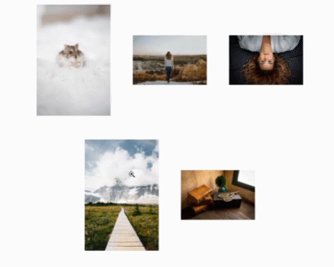
vue-enlargeable-image
A Vue component that, when clicked, will enlarge an image from thumbnail to full version using a smooth animation.
Features
- Specify both a thumbnail source and a full size source
- Thumbnail version will load immediately
- Full version will load upon enlargement and is transformed seamlessly from the thumbnail version
- Specify the duration of the animation
- Nest any component or HTML element within - doesn't have to be just an img element (keep reading to learn more)
- Style the component however you want with your own CSS class definitions (keep reading to learn more)
Requirements
Installation
npm
$ npm install @diracleo/vue-enlargeable-image
external script
<script src="https://unpkg.com/@diracleo/vue-enlargeable-image/dist/vue-enlargeable-image.min.js"></script>
Usage
main.js:
import Vue from 'vue'
import App from './App.vue'
import EnlargeableImage from '@diracleo/vue-enlargeable-image';

Vue.use(EnlargeableImage)

new Vue({
  el: 'body',
  components: {
    App
  }
})
template:
<enlargeable-image src="/path/to/thumbnail.jpg" src_large="/path/to/fullsize.jpg" />
nesting an HTML element instead of the default img:
<enlargeable-image src="/path/to/thumbnail.jpg" src_large="/path/to/fullsize.jpg">
  <span>Click me to see the image</span>
</enlargeable-image>
nesting another component instead of the default img (and setting the animation duration):
<enlargeable-image src="/path/to/thumbnail.jpg" src_large="/path/to/fullsize.jpg" animation_duration="2000">
  <v-lazy-image src="/path/to/thumbnail.jpg" />
</enlargeable-image>
Properties
| Property | Type | Default | Required | Description |
|---|---|---|---|---|
| src | String | N/A | yes | Relative path or absolute URL to the thumbnail image |
| src_large | String | N/A | yes | Relative path or absolute URL to the full size image |
| animation_duration | String | 700 | no | How many milliseconds that the enlarging and delarging animation will take (0 for no animation) |
Events
| Name | Arguments | Description |
|---|---|---|
| enlarging | None | Fired when image starts to get bigger |
| enlarged | None | Fired when image has reached full size |
| delarging | None | Fired when image starts to get smaller |
| delarged | None | Fired when image is back to original size |
Styling the component
.enlargeable-image .enlargeable-image-slot {
  display:inline-block;
}
.enlargeable-image .enlargeable-image-slot > img {
  max-width:100%;
}
.enlargeable-image > .enlargeable-image-slot {
  max-width:100%;
  max-height:100%;
  cursor:zoom-in;
}
.enlargeable-image > .enlargeable-image-slot.active {
  opacity:0.3;
  filter:grayscale(100%);
}
.enlargeable-image .enlargeable-image-full {
  cursor:zoom-out;
  background-color:transparent;
  align-items:center;
  justify-content:center;
  background-position: center center;
  background-repeat:no-repeat;
  background-size:contain;
  z-index:2000;
  display:none;
}
.enlargeable-image .enlargeable-image-full > img {
  object-fit:contain;
  width:100%;
  height:100%;
}
.enlargeable-image .enlargeable-image-full.enlarging {
  display:flex;
  position:fixed;
  left:0px;
  top:0px;
  width:100%;
  height:100%;
  background-color:transparent;
  cursor:zoom-out;
}
.enlargeable-image .enlargeable-image-full.delarging {
  display:flex;
  position:fixed;
  left:0px;
  top:0px;
  width:100%;
  height:100%;
  background-color:transparent;
  cursor:zoom-in;
}
.enlargeable-image .enlargeable-image-full.enlarged {
  display:flex;
}