vue-validation-input
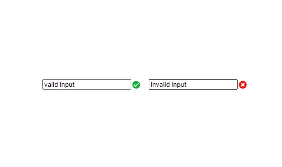
This is just a simple extension to the default input element which shows an SVG icon if valid or not.
Installation
$ npm install vue-validation-input
Usage
<template>
  <div id="app">
    <vue-validation-input :readonly="true" :placeholder="'Placeholder text'"></vue-validation-input>
    <vue-validation-input :minlength="5" maxlength="10"></vue-validation-input>
    <vue-validation-input :class="'customClass'" :pattern="Hello\nworld"></vue-validation-input>
    <vue-validation-input :class="['customClass', 'customClass2']" valid-color="'green'"></vue-validation-input>
  </div>
</template>

<script>
import VueValidationInput from 'vue-validation-input'

export default {
  components: {
    VueValidationInput
  },
}
</script>
Prop
| Prop | Type | Default | Description |
|---|---|---|---|
| container-class | String, Array, Object | "" | Binding class for input container |
| input-class | String, Array, Object | "" | Binding class for input |
| icon-class | String, Array, Object | "" | Binding class for SVG icon |
| placeholder | String | "" | Placeholder text |
| pattern | String | "" | A regular expression the input's contents must match in order to be valid |
| readonly | Boolean | false | Boolean controller if input is read-only |
| minlength | Number | 1 | The minimum length of input to be considered as valid |
| maxlength | Number | -1 | The maximum allowed number of characters |
| valid-color | String | #33AF28 | Valid SVG icon color |
| invalid-color | String | #EE0202 | Invalid SVG icon color |
Event
| Event | Type | Output |
|---|---|---|
| vue-validation-output | Object | { value: String, valid: Boolean } |