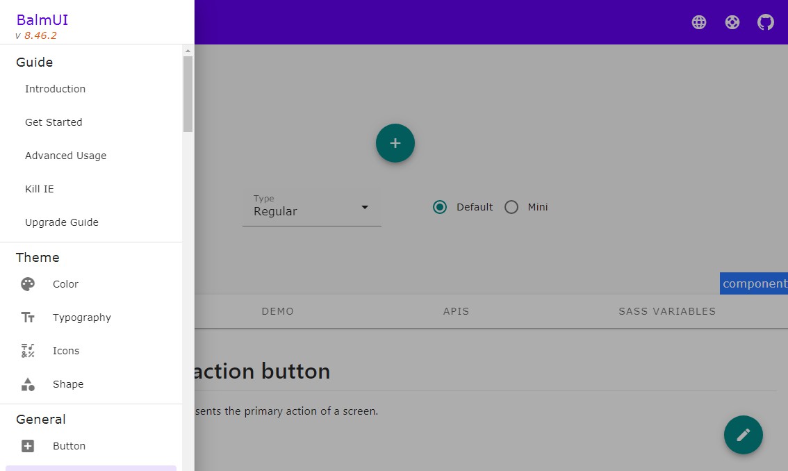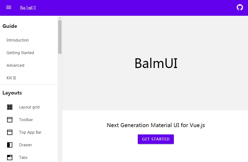
BalmUI
Next Generation Material UI for Vue.js
Following the Material Design UI components for the web specification, we developed a BalmUI library antd that contains a set of high quality components and demos for building rich, interactive user interfaces.
Quick Start
0. Requirement
1. Install
npm install --save balm-ui
// OR
yarn add balm-ui
2. Config
Edit my-project/app/styles/global/_vendor.scss
/* Add BalmUI styles */
@import 'node_modules/balm-ui/src/styles/balm-ui.scss';
Download Material Design Icons and extract to /path/to/my-project/app/fonts.
3. Usage
Edit my-project/app/scripts/main.js
3.1 Default Usage
import Vue from 'vue';
import BalmUI from 'balm-ui'; // Mandatory
import BalmUIPlus from 'balm-ui/dist/balm-ui-plus'; // Optional

Vue.use(BalmUI); // Mandatory
Vue.use(BalmUIPlus); // Optional
3.2 Standalone Usage
import Vue from 'vue';
import UiButtonComponents from 'balm-ui/components/button';

// (Recommended) Splitting CSS out from the main application, see BalmUI advanced usage.
import 'balm-ui/components/core.css';
import 'balm-ui/components/button.css';
import 'balm-ui/components/icon.css'; // Optional.

Vue.use(UiButtonComponents);
Enjoy ?
Reusability & Composition
Components
- Layouts
- Layout Grid
- Toolbar (:skull:)
- Top App Bar (migrate from Toolbar)
- Drawer
- Tabs
- Buttons
- Button
- Floating Action
- Icon Toggle (:skull:)
- Icon Button (migrate from Icon Toggle)
- Icon
- Data View
- List
- Grid List (:skull:)
- Image List (migrate from Grid List)
- Card
- Chips
- Linear Progress
- Inputs and Controls
- Text Field
- Checkbox
- Radio
- Select
- Switch
- Slider
- Dropdown (:bulb:)
- Autocomplete (:bulb:)
- Modal
- Dialog
- Snackbar
- Menu
Plugins
- Event
- Grid
- Typography
- Theme
- Validator (:bulb:)
- Alert (:bulb:)
- Confirm (:bulb:)
- Toast (:bulb:)
Directives
- Ripple
- Elevation
- Shape
Utilities
- Type Detections
- Helper Functions
- IE Detection
:bulb:: Plus UI, :skull:: Deprecated
Contributing
We'd love for you to contribute and make BalmUI even better than it is today!
Welcome to help us improve BalmUI, and issues here.
Browser support
We officially support the last two versions of every major browser. Specifically, we test on the following browsers:
- Chrome on Android, Windows, macOS, and Linux
- Firefox on Windows, macOS, and Linux
- Safari on iOS and macOS
- Edge on Windows
- IE 11 on Windows