vue-responsive-video-background-player
Play your own videos in background responsively in different resolutions.
Installation in 2 Steps
1: Add with npm ?
npm install vue-responsive-video-background-player
2a: Install as a component
 import VideoBackground from 'vue-responsive-video-background-player'

 Vue.component('video-background', VideoBackground);
2b: Install as a plugin
 import { Plugin } from 'vue-responsive-video-background-player'

 Vue.use(Plugin);
Usage - (or to make it runnable ?♂️)
Easiest version ?
 <video-background
    src="<your-video-path>.mp4"
    style="max-height: 400px; height: 100vh;"
 >
    <h1 style="color: white;">Hello welcome!</h1>
 </video-background>
Advanced version ?
 <video-background
    src="<your-default-video-path>.mp4"
    poster="/images/mainfoto.jpg"
    :sources="[
        {src: '<your-tablet-video-path>.mp4', res: 900, autoplay: true},
        {src: '<your-mobile-video-path>.mp4', res: 638, autoplay: true, poster: '<your-mobile-background-image-path>.png'}
    ]"
    style="max-height: 400px; height: 100vh;"
    overlay="linear-gradient(45deg,#2a4ae430,#fb949e6b)"
>
    <h1 style="color: white;">Hallo welcome!</h1>
</video-background>
Props
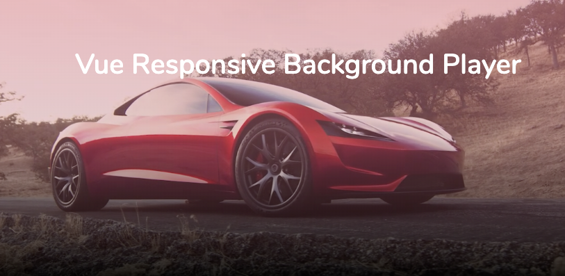
This package is for responsive videos depicting different video resolution. Have you ever visited my favorite car company Tesla? Have a look, they use a lot of video background videos and are using different resolutions for each device.
Props values
src(required:true)
This is your path to your video. You can just use this value for showing your video in every resolution.
poster(default:'')
This is your first background image that is shown before the video is loaded.
sources(default:[])
This is the main reason for this package. I wanted to have the possibility to change the resolution of the video when the resize event is fired.
To make it work, sources is an array that contains objects. For example:
[{src: '<your-mobile-video-path>.mp4', res: 638, autoplay: true, poster: '<your-mobile-background-image-path>.png'}]
To make it work you need at least src, res, autoplay.
poster is optional.
res stand for resolution. This example means that between 0px and 638px of the window's width only the mobile video will be shown. After that your default src.
autoplay(default:true)
The video is going to be played immediately when the video is ready. If you are setting it to false, you can start the video just by this.$refs.videobackground.player.play(). But remember to set ref=videobackground to the HTML tag <video-background>, so that it can work.
-
overlay(default:'')
If you love overlays, then copy the overlay from the advanced example. -
muted(default:true)
Warning. Videos are perhaps not played when unmuted.
loop(default:true)
Loops through the video. You can catch the event ended to show only the poster.
preload(default:auto)
https://www.w3schools.com/tags/att_video_preload.asp
objectFit(default:cover)
So the video fits perfectly in the container
playsWhen(default:canplay)
This is important, if you know that you might have users with bad internet speed, you should definetly use canplaythrough. Learn more in video events.
playbackRate(default:1.0)
The playbackRate property sets the current playback speed of the video. Example but negative values didn't work for me?
Events
ready: Video is loadedplaying: Video is playingerror: Video errorloading: Video is loadingended: Video finished, only whenloopis set to false
Methods
If you happen to need more control over the player, you can use the internal methods. For that, you need to set ref=videobackground to the HTML tag <video-background>. After that you can call all methods like this this.$refs.videobackground.player.play().
play(): Video is playingpause(): Video is pausedshow(): Video is shownhide(): Video is hidden, the poster is shownload(): Video is loaded
Security
If you discover any security related issues, please don't email me. I'm afraid ?. [email protected]
