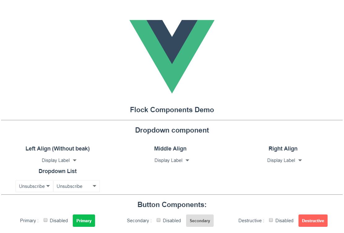
Flock Components for VueJS
Reusable components adhering to the Flock Design written in VueJS.
Installation and Usage:
- Just use
npm install --save @flockos/vue-components - Now you can include the scripts by using following snippet:
import Components from '@flockos/vue-components';

// Global registration in your main.js/App.vue file
Object.entried(Components).forEach((name, component) => {
    Vue.component(name, component);
});
List of components:
All components are registered with the Vue global and are available for use. You do not need to re-register them.
Event Bus
You can use the Flock Component's own event bus to pass data around.
Events:
focusChanged: Whenever the document is clicked, this event is fired. The only parameter is element which was clicked.
Usage:
import { eventBus } from '@flockos/vue-components';

eventBus.$on('focusChanged', (element) => {
    // Do a few things if focus changes.
});
More events will be supported as needed.
Flock Button
Usage:
<flock-button type="primary">Submit</flock-button>
Events:
click: Emits the click event when clicked.
Props:
styles: Custom styles for your button.
shape: Default is default. Options are default and flat. Flat means that there's no hover state.
size: Size of the button. Possible values: full, half & auto. Default is auto.
small: Reduce padding and makes a smaller styled button. Default is false.
loading: To show asynchronous operations, a loader circle shows up whenever this is set to true.
disabled: Disables the button and applies an opacity to it.
type: The style of the button. Possible values are primary, secondary & destructive. Default is primary.
invert: Replaces the color & background with each other.
Flock Radio
Usage:
<flock-radio>
    name="radio-demo"
    label="Is this the value!"
    v-model="radio"
    optionValue="Yes"
    :disabled="false"
>
</flock-radio>
<flock-radio>
    name="radio-demo"
    label="Or is this the value!"
    v-model="radio"
    optionValue="No"
    :disabled="false"
>
</flock-radio>
Flock Select
Usage:
<flock-select
    :width="150"
    :options="listOptions"
    v-model="selectedOption"
/>
Events:
change: Whenever the FlockSelect changes value, this event is fired with the new value as a parameter.
Props:
open: Initial state of the FlockSelect dropdown.
options: Array of options. Every option needs to be in the { label: 'Some Visible Text', value: String|Object|Number } format.
width: The width of the FlockSelect component, if it needs to be constant.
v-model: The value that will dynamically change just like normal models in Vue.js.
Flock Modal
Usage:
<FlockModal @close="showModal = false" v-if="showModal" title="Settings">
    List of devices!
</FlockModal>
Events:
close: Fired whenever the modal is closed. User has to handle the close themselves using a v-if.
Props:
closeOnBgClick: When set to true, the modal will automatically emit the close event whenever the background is clicked.
background: This sets the backdrop of th modal. Default is none.
title: The title of the Modal.
Flock Banner
Usage:
<FlockBanner>
    This is a banner.
</FlockBanner>
Props:
position: Position of the toast. Can be either top or bottom. Default is bottom.
styles: A styles object to customize background, color etc. of your banner. By default, the banner will occupy 100% of the total width of the page.
Flock Toast
Usage:
<FlockToast v-if="showToast" @toasthidden="doSomething">
    Let's make a toast!
</FlockToast>
Events:
toasthidden: Gets triggered when the toast is hidden, automatically or manually.
Props:
time: The time duration of the toast in milliseconds. Default duration is 5000ms.
position: Position of the toast. Can be either top or bottom. Default is bottom.
styles: A styles object to customize background and color of your toast.
Gotchas:
You need to control the visibility of the toast by supplying a v-if conditional.
TODO: Make Toast better so that a user can directly use it like: eventBus.showToast(Some Text, 4000)
