vue-info-card
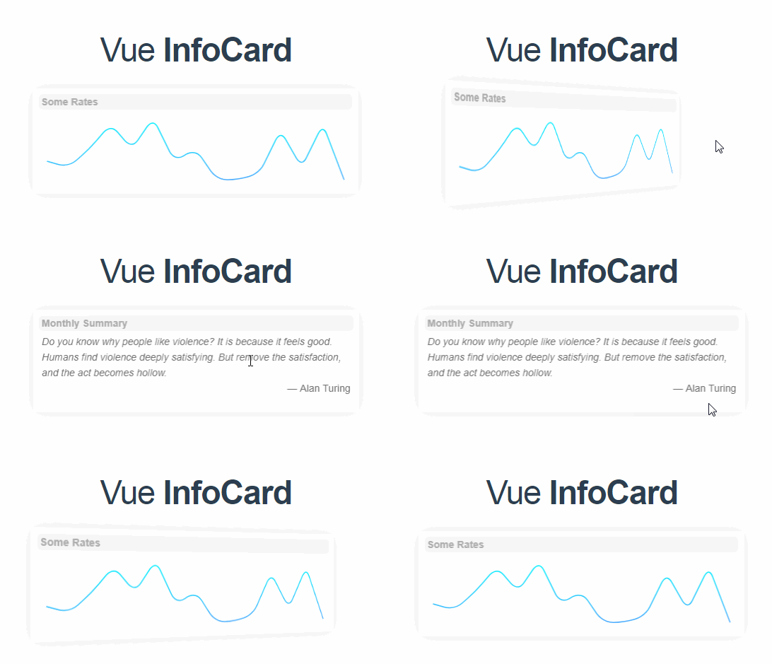
Simple and beautiful card component with an elegant spark line, for VueJS.
Installation
npm i -S vue-info-card
Usage
After the installation, the component can be used by passing the appropriate props for displaying the data and messages. A sample usage within a single file component is as follows:
<template>
  <div>
    <info-card :frontType="'graph'"
      :frontTitle="front.title"
      :frontData="front.graphData"
      :backTitle="back.title"
      :backData="back.message" />
  </div>
</template>

<script>
import InfoCard from 'vue-info-card';

export default {
  components: {
    InfoCard,
  },
  data() {
    return {
      front: {
        title: 'Daily Conversion Value',
        graphData: [3, 2, 5, 9, 5, 10, 3, 5, 0, 0, 1, 8, 2, 9, 0],
      },
      back: {
        title: 'Monthly Summary',
        message: 'Your average daily conversion value for this month is <b>50.4$</b>. It is below the average of the last six months.',
      },
    };
  },
};
</script>
Props
There are basically three different props for each faces of the card. A face requires a type, such as graph or text, a title, and a data to display in the body of the card.
The props are as follows:
| prop | Type | Optional? | Default | Description |
|---|---|---|---|---|
frontType |
String |
:white_check_mark: | 'text' |
Type of the front face of the card. Available options are graph or text. |
frontTitle |
String |
:white_check_mark: | 'Default Card Title' |
Title of the front face of the card. |
frontData |
String or Array |
:x: | Data that will be displayed on the front face of the card. If frontType is set to graph, this must be an array; otherwise, a string. |
|
frontTrendGradients |
Array |
:white_check_mark: | ['#4facfe', '#00f2fe'] |
Gradient that will be used on the spark line, expected to be an array of color hexas as strings. |
backType |
String |
:white_check_mark: | 'text' |
Type of the back face of the card. Available options are graph or text. |
backTitle |
String |
:white_check_mark: | 'Default Card Title' |
Title of the back face of the card. |
backData |
String or Array |
:x: | Data that will be displayed on the back face of the card. If frontType is set to graph, this must be an array; otherwise, a string. |
|
backTrendGradients |
Array |
:white_check_mark: | ['#4facfe', '#00f2fe'] |
Gradient that will be used on the spark line, expected to be an array of color hexas as strings. |
Note that both frontData and backData props accept HTML as input, which means you can inject elements to the card body directly.


