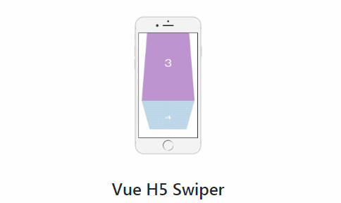
Vue H5 Swiper
Slight vue slider component for H5 applications.
Features
- Slight, only has better-scroll dependency.
- Support long content page.
- A great diversity of paging animations.
- Without fake element at
loopmode. - Optimized displayed
SwiperItemcount.
Demos
yarn dev
Installation
npm install vue-h5-swiper --save

# or use yarn
yarn add vue-h5-swiper
<template>
  <swiper>
    <swiper-item>
      ...
      Content Slot
      ...
    </swiper-item>
  </swiper>
</template>

<script>
import { Swiper, SwiperItem } from 'vue-h5-swiper';

export default {
  components: {
    Swiper,
    SwiperItem
  }
};
</script>
Documentation
Swiper
Props
| Prop | Default | Description |
|---|---|---|
loop |
false |
Enable loop mode. |
show-indicator |
true |
Display indicators. |
page-transition |
'move' |
Paging animation. Available animations: ['move', 'fade', 'cover', 'carousel', 'scale', 'glue', 'cube', 'push', 'three'] |
autoplay |
false |
Auto slide. |
interval |
3000 |
Auto slide interval. |
Events
| Event | Params | Description |
|---|---|---|
beforeChange |
activeIndex, oldIndex |
Before paging hook. |
afterChange |
activeIndex, oldIndex |
After paging hook. |
Methods
| Method | Description |
|---|---|
moveTo(index) |
Move to the specified page. |
next() |
Move to next page. |
prev() |
Move to previous page. |
Slots
| Slot | Description |
|---|---|
| default--------- | For SwiperItem. |
| indicator------- | Custom swiper indicator. |
SwiperItem
Slots
| Slot | Description |
|---|---|
| default--------- | For display content. |