Frontend Mentor – Social Proof Section Solution
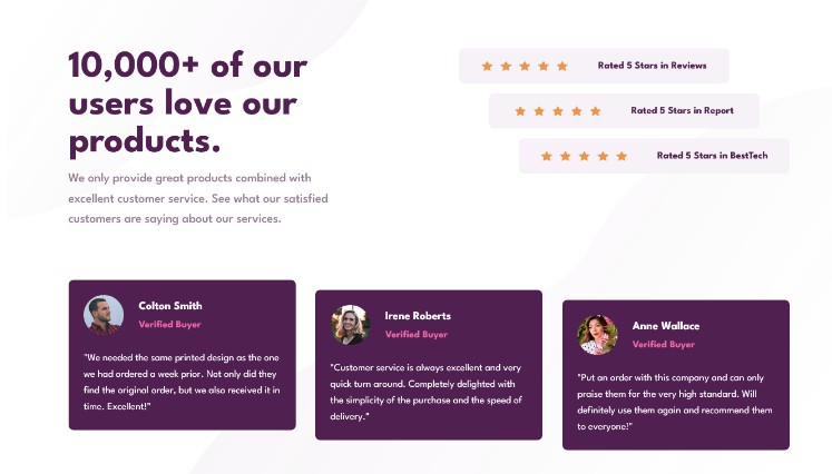
This is a solution to the Social proof section challenge on Frontend Mentor. Frontend Mentor challenges help you improve your coding skills by building realistic projects.
Overview
The challenge
Users should be able to:
- View the optimal layout for the section depending on their device’s screen size
Screenshot
My process
Built with
- Semantic HTML5 markup
- UnoCSS + Flexbox + CSS Grid
- Mobile-first workflow
- Vue 3
- Vite
What I learned
I wanted to use Vue again for a long time and for this project I finally did.
Vue 3 is really cool with the setup script and TypeScrip, it feels more like Svelte and well that will always be awesome! I had to Google how props work and I also tried to find a way to define a default value but didn’t find a clear way so I had to use computed properties instead.
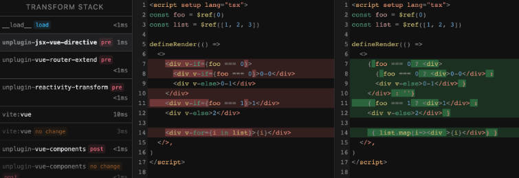
The devtools are also incredible! Didn’t know they were this amazing!
const finalAlt = computed(() => props.fullName + ' Profile');
const finalTitle = computed(() => props.title || 'Verified Buyer');
The reason that made me decide to try Vue again was UnoCSS. It is a fantastic tool for taking CSS to the next level! Just look at this!
<template>
  <div :class="transformClass" w-full ml-auto bg-magenta-100 rounded-lg lg="max-w-fit">
    <div p-4 flex flex-col items-center gap-3 lg="w-96" xl="w-108 flex-row justify-center gap-12">
      <div flex gap-3>
        <template v-for="index in finalAmount" :key="index">
          <img :src="iconStar" alt="" width="18" height="18" />
        </template>
      </div>
      <strong text="base magenta-700" font-semibold>
        <slot />
      </strong>
    </div>
  </div>
</template>
Continued development
Vue 3 with Composition API along with UnoCSS and the Devtools provide a fantastic developer experience that is really hard to resist. Definitely going to use Vue more in the future.
Author
- Frontend Mentor – @Shawn Lee
