V-Image
Tiny little component for input type=file (< 1kb, gzipped)
:white_check_mark: Install :ok_hand:
npm i v-image
// or
yarn add v-image
:white_check_mark: Usage :mortar_board:
Register the component globally:
Vue.component('vImage', require('v-image'));
Or use locally
import vImage from 'v-image';
:white_check_mark: Example :four_leaf_clover:
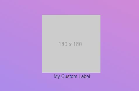
<v-image alt="Alt Text for the Image" name="name" @load-image="localVariable" :add-label="'My Custom Label'" :remove-label="'My Custom Remove Label'"></v-image>
import vImage from 'v-image';
export default {
  components: { vImage },
  methods: {
    localVariable(imageSentFromComponent) {
      this.image = imageSentFromComponent;
    },
  },
  data() {
    return {
      image: '',
      style: {
        height: '200px',
        width: '200px',
      },
    };
  },
};
:white_check_mark: :book: Props:
| Name | Type | Required? | Default | Description |
|---|---|---|---|---|
name |
String | Yes | -- | For name attribute for the input field. |
alt |
String | No | Very Interesting Image |
For alt attribute for the input field, mostly for proper SEO. |
imgStyle |
Object | No | -- | Styling for the img tag. |
add-label |
String | No | Select Image |
Label text shown to user where he clicks and select image popup is shown. |
buttonStyle |
Object | No | -- | Styling for the button & label tag. |
remove-label |
String | No | Remove Image |
Button text shown to user where he clicks and image data is cleared. |
placeholder |
String | No | https://placehold.it/180x180 |
The src attribute for a placeholder image. |
:white_check_mark: :ear: Events:
load-image(load the base64 to your custom component's variable (see example)) [default: ""]removeImage(let the parent know the remove label was clicked)
NPM :octocat: