Tree component based on Vue implementation
- Support drag, check, multiple check, bigData virtual scroll, lazy load, checkStrictly, add and delete node, etc.
Simple usage
npm install light-vue-tree
<template>
    <div class="base">
        <VueTree
        ref="tree1"
        draggable
        :treeData="treeData"
        @on-drop="dropNode"
        @on-selected-change="clickNode"
        />
    </div>
</template>
<script>
import { treeData } from '../../assets/treeData'
export default {
    name: 'Base',
    data () {
        return {
            treeData
        }
    },
    methods: {
        dropNode({ parentNode, targetNode, callback }) {
            console.log("dropNode", parentNode, targetNode);
            callback(targetNode);
        },
        clickNode (node) {
            console.log('clickNode', node)
        }
    }
}
</script>
Live Demo
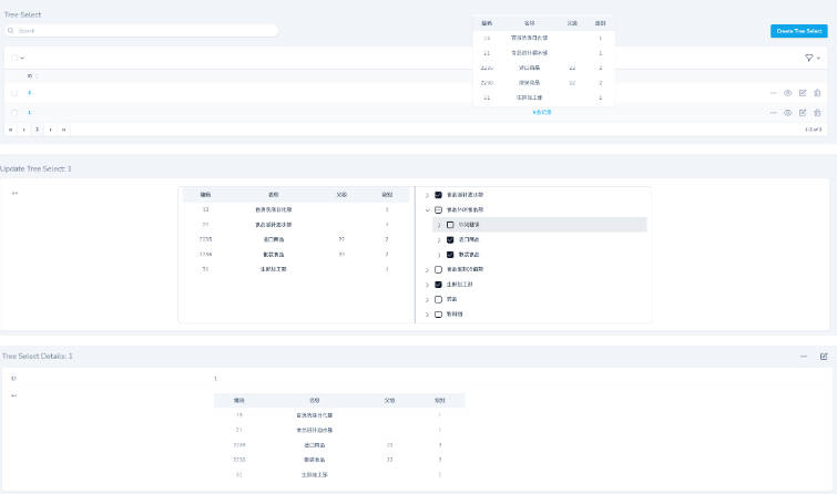
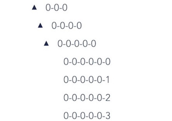
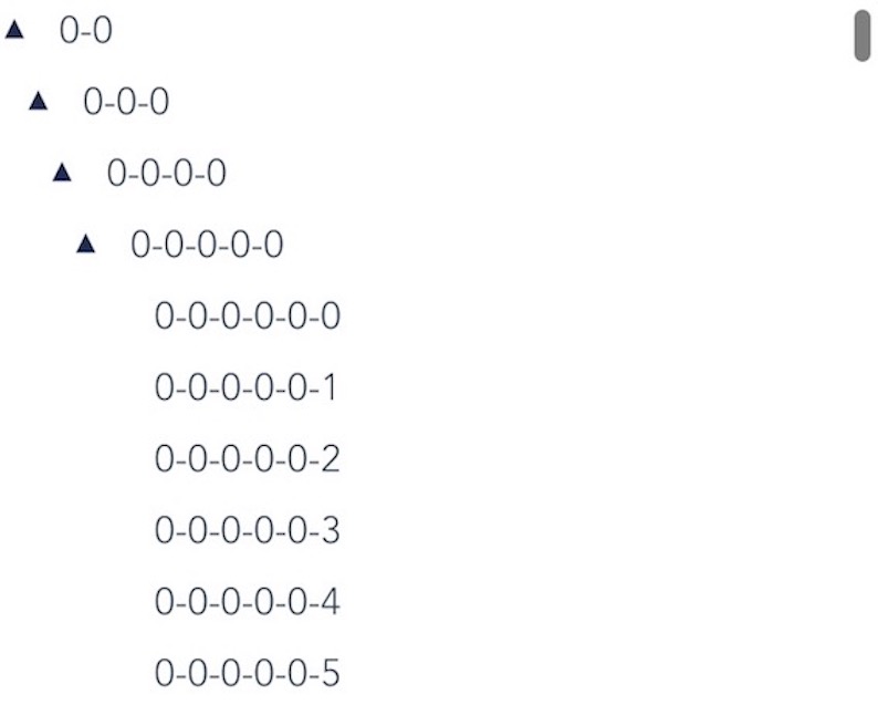
Screenshots
Virtual tree render big data (100000 node):
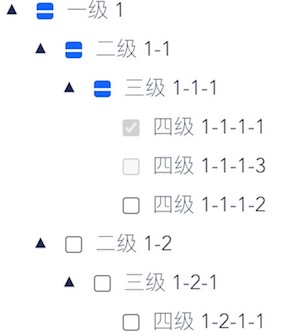
checkbox:
Advantages
-
Simple and very easy to use.
-
Big data list with high render performance and efficient.
-
Can Customize following components (e.g. checkbox, expand icon, loading)
Api
props
| Property | Type | Description | Default |
|---|---|---|---|
| treeData | Array[Object] | The treeNodes data Array,if set it then you need not to construct children TreeNode.(key should be unique across the whole array) |
- |
| showCheckbox | boolean | Add a Checkbox before the treeNodes | false |
| draggable | boolean | Whether to allow dropping on the node | false |
| checkStrictly | boolean | Check treeNode precisely; parent treeNode and children treeNodes are not associated |
false |
| lazy | boolean | Lazy load node data | false |
| load | function | Load data asynchronously | function(node) |
| immediatelyLoad | boolean | First load data when lazy load | false |
| virtual | boolean | Disable virtual scroll when set to false | false |
| height | number | When virtual scroll must set | - |
| expandedAll | boolean | Whether to expand all treeNodes by default | - |
| keeps | number | How many items you are expecting the virtual list to keep rendering in the real dom. |
30 |
| searchVal | String | Search keywords | - |
Events
| Property | Type | Description | Params |
|---|---|---|---|
| on-selected-change | function | Callback function for when the user right clicks a treeNode |
function(node) |
| on-drop | function | Callback function for when the user drag node | function({ parentNode, targetNode, callback }) |
| on-checked-item | function | Callback function for when the user check node | function({ node, vNode }) |
| on-checked-change | function | Callback function for when checkbox change | function({ node, selectedData }) |
Scoped Slot
| name | Description |
|---|---|
| loading | customize loading component, params({loading}) |
| check | customize check component, params({handleClickCheckBox, selectToggle, node}) |
| expandIcon | customize expand icon and unexpanded icon, params({ expanded, toggleFold }) |