Vue Slide Bar
Very Simple Vue Slider Bar Component.
Install
npm install vue-slide-bar --save
Usage
Simple
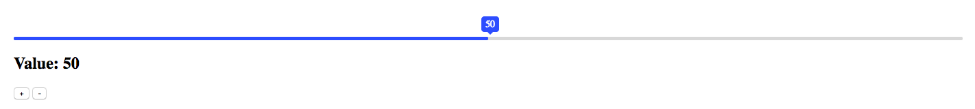
<template>
  <div>
    <VueSlideBar v-model="value1"/>
    <h2>Value: {{ value }}</h2>
    <button type="button" name="button" @click="value = 90">
      +
    </button>
    <button type="button" name="button" @click="value = 20">
      -
    </button>
  </div>
</template>

<script>
import VueSlideBar from 'vue-slide-bar'

export default {
  data () {
    return {
      value: 50
    }
  },
  components: {
    VueSlideBar
  }
}
</script>
With Label
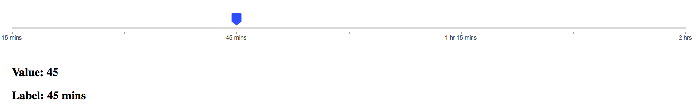
<template>
  <div>
    <VueSlideBar
      v-model="slider.value"
      :data="slider.data"
      :range="slider.range"
      :processStyle="{ backgroundColor: '#d8d8d8' }"
      @callbackRange="callbackRange">
      <template slot="tooltip" slot-scope="tooltip">
        <img src="static/images/rectangle-slider.svg">
      </template>
    </VueSlideBar>
    <h2>Value: {{slider.value}}</h2>
    <h2>Label: {{rangeValue.label}}</h2>
  </div>
</template>

<script>
import VueSlideBar from 'vue-slide-bar'

export default {
  data () {
    return {
      rangeValue: {},
      slider: {
        value: 45,
        data: [
          15,
          30,
          45,
          60,
          75,
          90,
          120
        ],
        range: [
          {
            label: '15 mins'
          },
          {
            label: '30 mins',
            isHide: true
          },
          {
            label: '45 mins'
          },
          {
            label: '1 hr',
            isHide: true
          },
          {
            label: '1 hr 15 mins'
          },
          {
            label: '1 hr 30 mins',
            isHide: true
          },
          {
            label: '2 hrs'
          }
        ]
      }
    }
  },
  methods: {
    callbackRange (val) {
      this.rangeValue = val
    }
  },
  components: {
    VueSlideBar
  }
}
</script>
Custom Style && Min-Max
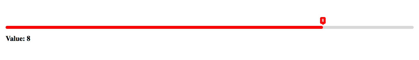
<template>
  <div>
    <V<VueSlideBar
      v-model="value2"
      :min="1"
      :max="10"
      :processStyle="slider.processStyle"
      :lineHeight="slider.lineHeight"
      :tooltipStyles="{ backgroundColor: 'red', borderColor: 'red' }">
    </VueSlideBar>
    <h2>Value: {{value2}}</h2>
  </div>
</template>

<script>
import VueSlideBar from 'vue-slide-bar'

export default {
  data () {
    return {
      value2: 8,
      slider: {
        lineHeight: 10,
        processStyle: {
          backgroundColor: 'red'
        }
      }
    }
  },
  components: {
    VueSlideBar
  }
}
</script>
Loading
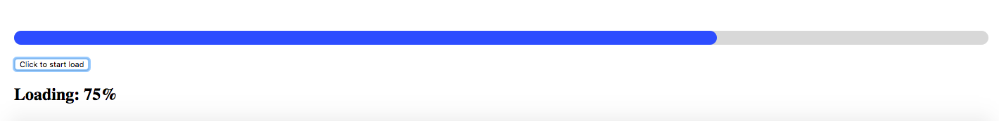
<template>
  <div>
    <VueSlideBar
      v-model="loading"
      :showTooltip="false"
      :lineHeight="20"
      :isDisabled="true"/>
    <br>
    <button type="button" name="button" @click="startLoad()">
      Click to start load
    </button>
    <h2>Loading: {{loading}}%</h2>
  </div>
</template>

<script>
import VueSlideBar from 'vue-slide-bar'

export default {
  data () {
    return {
      loader: null,
      loading: 0
    }
  },
  methods: {
    startLoad () {
      this.loader = setInterval(() => {
        this.loading++
        if (this.loading === 100) {
          console.log('clear', this.loading)
          clearInterval(this.loader)
        }
      }, 100)
    }
  }
  components: {
    VueSlideBar
  }
}
</script>
Options
Props
| Props | Type | Default | Description |
|---|---|---|---|
| min | Number | 0 | Minimum value |
| max | Number | 100 | Maximum value |
| process-style* | Object | null | Process bar style. |
| tooltip-style* | Object[,Array(in range model), Function<Value, Index>] | null | Tooltip style. |
| value | Number,Array | 0 | Initial value (v-model) |
| data | Array | null | Custom data. |
| is-disabled | Boolean | false | Flag for disable slider bar |
| show-tooltip | Boolean | true | Flag display tooltip |
| icon-width | Number | 20 | Icon width |
| line-height | Number | 5 | Line height |
| speed | Number | 0.5 | Transition time |
Events
| Name | Type | Description |
|---|---|---|
| callbackRange | Params: function(range) | when values change return range data. |
Slot
| Name | Description |
|---|---|
| tooltip | Customize the tooltip slot. |
When using the template element as a slot, can add special properties slot-scope to get the value.
Run example
# install dependencies
npm install

# Your application is running here: http://localhost:8080
npm run dev