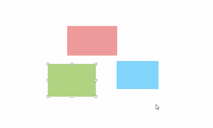
Vue-drag-resize
Vue Component for resize and drag elements.
Features
- A lightweight, no-dependency
- Use draggable, resizable or both
- Define sticks for resizing
- Save aspect ratio for resizable components
- Restrict size and movement to parent element
- Restrict drag to vertical or horizontal axis
Install and basic usage
$ npm i -s vue-drag-resize
Register the component:
import Vue from 'vue'
import VueDragResize from 'vue-drag-resize'

Vue.component('vue-drag-resize', VueDragResize)
Use the component:
<template>
    <div id="app">
        <VueDragResize :isActive="true" :w="200" :h="200" v-on:resizing="resize" v-on:dragging="resize">
            <h3>Hello World!</h3>
            <p>{{ top }} х {{ left }} </p>
            <p>{{ width }} х {{ height }}</p>
        </VueDragResize>
    </div>
</template>

<script>
    import VueDragResize from 'vue-drag-resize';

    export default {
        name: 'app',

        components: {
            VueDragResize
        },

        data() {
            return {
                width: 0,
                height: 0,
                top: 0,
                left: 0
            }
        },

        methods: {
            resize(newRect) {
                this.width = newRect.width;
                this.height = newRect.height;
                this.top = newRect.top;
                this.left = newRect.left;
            }
        }
    }
</script>
Props
isActive
Type: Boolean
Required: false
Default: false
Determines whether the component should be active.
<vue-drag-resize :isActive="true">
isDraggable
Type: Boolean
Required: false
Default: true
Determines whether the component should draggable.
<vue-drag-resize :isDraggable="false">
isResizable
Type: Boolean
Required: false
Default: true
Determines whether the component should resize.
<vue-drag-resize :isResizable="false">
parentLimitation
Type: Boolean
Required: false
Default: false
Limits the scope of the component's change to its parent size.
<vue-drag-resize :parentLimitation="true">
aspectRatio
Type: Boolean
Required: false
Default: false
Determines whether the component should retain its proportions.
<vue-drag-resize :aspectRatio="false">
w
Type: Number
Required: false
Default: 200
Define the initial width of the component.
<vue-drag-resize :w="200">
h
Type: Number
Required: false
Default: 200
Define the initial height of the component.
<vue-drag-resize :h="200">
minw
Type: Number
Required: false
Default: 50
Define the minimal width of the component.
<vue-drag-resize :minw="50">
minh
Type: Number
Required: false
Default: 50
Define the minimal height of the component.
<vue-drag-resize :minh="50">
x
Type: Number
Required: false
Default: 0
Define the initial x position of the component.
<vue-drag-resize :x="0">
y
Type: Number
Required: false
Default: 0
Define the initial y position of the component.
<vue-drag-resize :y="0">
z
Type: Number|String
Required: false
Default: auto
Define the zIndex of the component.
<vue-drag-resize :z="999">
sticks
Type: Array
Required: false
Default: ['tl', 'tm', 'tr', 'mr', 'br', 'bm', 'bl', 'ml']
Define the array of handles to restrict the element resizing:
tl- Top lefttm- Top middletr- Top rightmr- Middle rightbr- Bottom rightbm- Bottom middlebl- Bottom leftml- Middle left
<vue-drag-resize :sticks="['tm','bm','ml','mr']">
axis
Type: String
Required: false
Default: both
Define the axis on which the element is draggable. Available values are x, y, both or none.
<vue-drag-resize axis="x">
Events
activated
Required: false
Parameters: -
Called whenever the component gets clicked, in order to show handles.
<vue-drag-resize @activated="onActivated">
deactivated
Required: false
Parameters: -
Called whenever the user clicks anywhere outside the component, in order to deactivate it.
<vue-drag-resize @deactivated="onDeactivated">
resizing
Required: false
Parameters: object
{
    left: Number, //the X position of the component
    top: Number, //the Y position of the component
    width: Number, //the width of the component
    height: Number //the height of the component
}
Called whenever the component gets resized.
<vue-drag-resize @resizing="onResizing">
resizestop
Required: false
Parameters: object
{
    left: Number, //the X position of the component
    top: Number, //the Y position of the component
    width: Number, //the width of the component
    height: Number //the height of the component
}
Called whenever the component stops getting resized.
<vue-drag-resize @resizestop="onResizstop">
dragging
Required: false
Parameters: object
{
    left: Number, //the X position of the component
    top: Number, //the Y position of the component
    width: Number, //the width of the component
    height: Number //the height of the component
}
Called whenever the component gets dragged.
<vue-drag-resize @dragging="onDragging">
dragstop
Required: false
Parameters: object
{
    left: Number, //the X position of the component
    top: Number, //the Y position of the component
    width: Number, //the width of the component
    height: Number //the height of the component
}
Called whenever the component stops getting dragged.
<vue-drag-resize @dragstop="onDragstop">
Contributing
Any contribution to the code or any part of the documentation and any idea and/or suggestion are very welcome.
# serve with hot reload at localhost:8081
npm run start

# distribution build
npm run build