vue-graph
A vue component library based on the JUI charts available in vuejs.
Installation
NPM
npm install --save vue-graph
Browser
Just download dist/vue-graph.js and include it in your HTML file:
<script src="https://cdnjs.cloudflare.com/ajax/libs/vue/2.5.16/vue.js"></script>
<script src="https://cdn.rawgit.com/juijs/vue-graph/2216ae2f/dist/vue-graph.js"></script>
ES Modules
Plug-In
import Vue from 'vue'
import VueGraph from 'vue-graph'

Vue.use(VueGraph)
Components
import Vue from 'vue'
import GraphLine3D from 'node_modules/vue-graph/src/components/line3d.js'
import NoteWidget from 'node_modules/vue-graph/src/components/widgets/note.js'
import LegendWidget from 'node_modules/vue-graph/src/components/widgets/legends.js'

Vue.component(GraphLine3D.name, GraphLine3D);
Vue.component(NoteWidget.name, NoteWidget);
Vue.component(LegendWidget.name, LegendWidget);
Usage
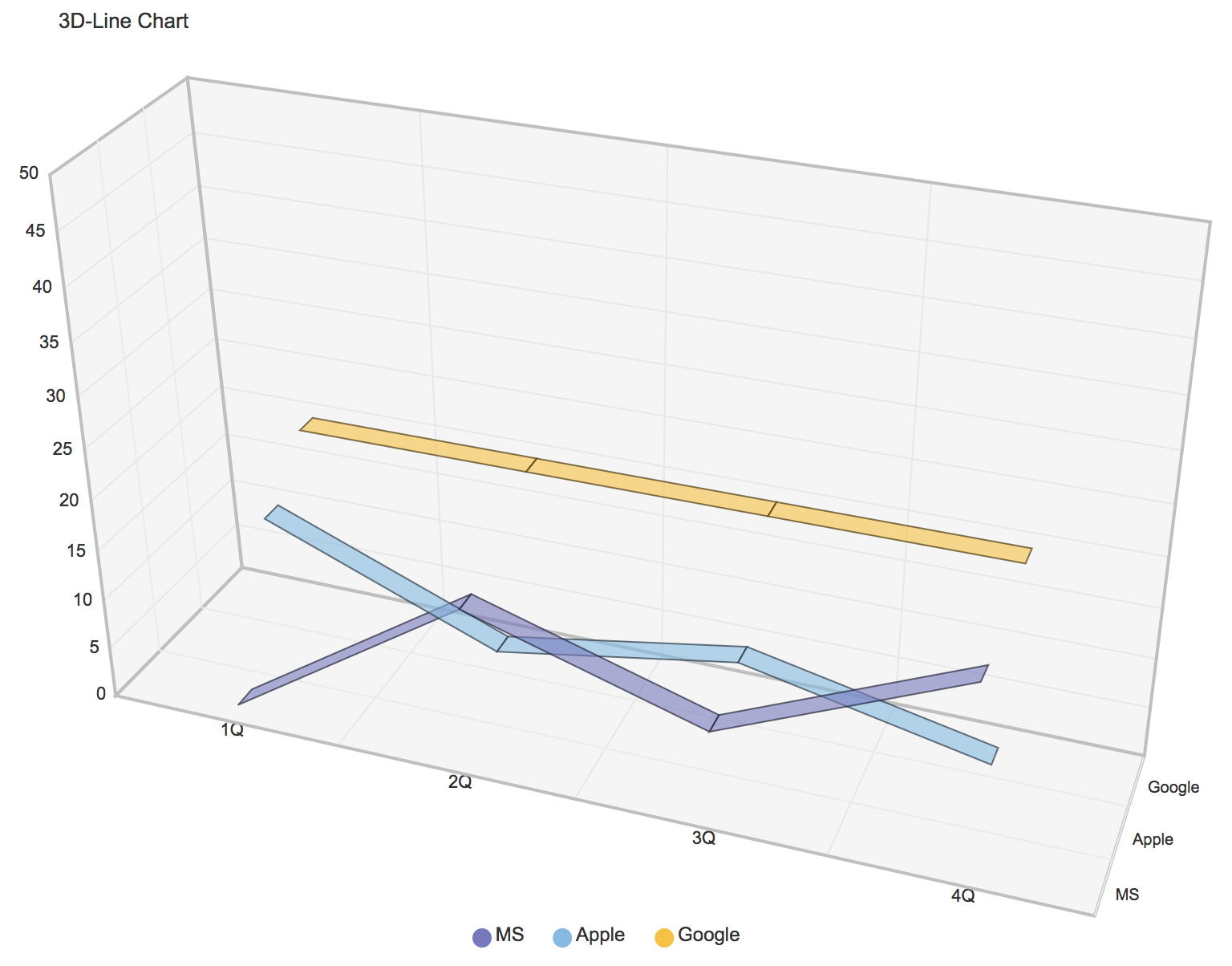
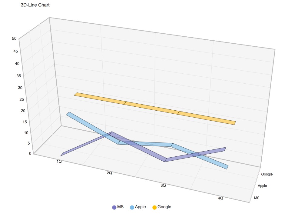
Unlike other chart components, vue-graph have child nodes in the chart called widgets. The widget is used as an additional function of charts such as chart title, legend, tooltip.
The following is a link you can test with CodePen.

<div id="app">
    <graph-line3d
            :width="800"
            :height="600"
            :axis-min="0"
            :axis-max="50"
            :padding-top="100"
            :padding-bottom="100"
            :depth="180"
            :labels="[ '1Q', '2Q', '3Q', '4Q' ]"
            :names="names"
            :values="values">
        <note :text="'3D-Line Chart'" :align="'left'"></note>
        <legends :names="names"></legends>
    </graph-line3d>
</div>
In the following code, the chart is prefixed with 'graph-' for each type. The widget can be added as a child node of the chart, unlike a chart, was named without a prefix.
The vue-graph can be combined with charts and widgets for a variety of visualizations. This is a very flexible and scalable structure.
var vm = new Vue({
    el: "#app",
    data: {
        names: [ "MS", "Apple", "Google" ],
        values: [
            [ 0, 15, 8, 18 ],
            [ 15, 6, 10, 5 ],
            [ 20, 20, 20, 20 ]
        ]
    }
});
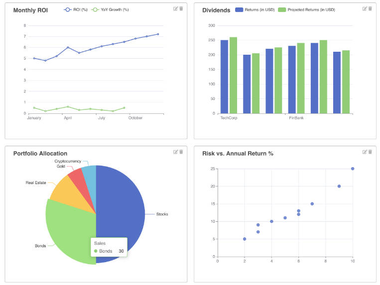
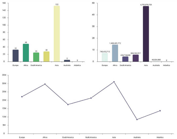
Implemented chart list
There are many charts that have not yet been migrated. We are going to continue.
Props
Common
| Name |
Type |
Required |
Watch |
Default |
Description |
| theme |
String |
false |
false |
jennifer |
Supports a total of five themes (jennifer, dark, pastel, gradient, pattern) |
| styles |
Object |
false |
false |
undefined |
Options to customize chart theme properties (Style Tab) |
| colors |
Array, Function |
false |
false |
undefined |
Options to change the list of colors defined by chart theme (Style Tab) |
| clip |
Boolean |
false |
false |
false |
Option to cut if the drawing element is out of the chart range |
| format |
Function |
false |
true |
undefined |
A callback function that allows you to customize the axis values of the chart |
| width |
Number |
true |
true |
undefined |
The width of the chart |
| height |
Number |
true |
true |
undefined |
The height of the chart |
| paddingTop |
Number |
false |
false |
50 |
Top padding of the chart |
| paddingRight |
Number |
false |
false |
50 |
Right padding of the chart |
| paddingBottom |
Number |
false |
false |
50 |
Bottom padding of the chart |
| paddingLeft |
Number |
false |
false |
50 |
Left padding of the chart |
| labels |
Array |
false |
true |
undefined |
Label of chart data |
| values |
Array |
false |
true |
undefined |
It is a chart data value, and the format may be different for each chart type |
Common (X-Y Axis)
| Name |
Type |
Required |
Watch |
Default |
Description |
| axisMin |
Number |
false |
false |
0 |
Miniimum value for the chart axis |
| axisMax |
Number |
false |
false |
0 |
Maximum value for the chart axis |
| axisStep |
Number |
false |
false |
10 |
Display interval of chart axis value |
| axisXStyle |
String |
false |
false |
solid |
Line style for chart x-axis area (solid, dotted, gradient, hidden) |
| axisYStyle |
String |
false |
false |
solid |
Line style for chart y-axis area (solid, dotted, gradient, hidden) |
| axisXPosition |
String |
false |
false |
bottom |
Chart x-axis position (bottom, top) |
| axisYPosition |
String |
false |
false |
left |
Chart y-axis position (left, right) |
| axisReverse |
Boolean |
false |
false |
false |
Replace the x and y axis positions |
| axisFullMode |
Boolean |
false |
false |
false |
Draw a chart drawing element full of the axis label area. |
| axisInterval |
Number |
false |
false |
1000 * 60 * 60 |
It is the label value display interval of the date type (Unit: ms) |
| axisFormat |
String, Function |
false |
false |
HH |
It is the label value display format of the date type |
Props by charts
| Name |
Type |
Required |
Watch |
Default |
Description |
| fixedSize |
Number |
false |
false |
0 |
Fixed width of bar (or height) |
| minValue |
Number |
false |
false |
0 |
When the value is very small, the minimum size of the bar |
| barMargin |
Number |
false |
false |
2 |
Margins between bars and bars |
| barPadding |
Number |
false |
false |
1 |
Inside padding inside the bar |
| activeIndex |
Number |
false |
false |
undefined |
The index of the bar to activate |
| activeEvent |
String |
false |
false |
undefined |
Event type to activate the bar |
| display |
String |
false |
false |
undefined |
Options that display the value of the bar (max, min, all) |
| Name |
Type |
Required |
Watch |
Default |
Description |
| names |
Array |
true |
false |
undefined |
Name of the z-axis data key |
| barPadding |
Number |
false |
false |
20 |
Inside padding inside the bar |
| Name |
Type |
Required |
Watch |
Default |
Description |
| fixedSize |
Number |
false |
false |
0 |
Fixed width of bar (or height) |
| barMargin |
Number |
false |
false |
2 |
Margins between bars and bars |
| barPadding |
Number |
false |
false |
1 |
Inside padding inside the bar |
| activeIndex |
Number |
false |
false |
undefined |
The index of the bar to activate |
| activeEvent |
String |
false |
false |
undefined |
Event type to activate the bar |
| display |
String |
false |
false |
undefined |
Options that display the value of the bar (max, min, all) |
| connectedLine |
Boolean |
false |
false |
false |
Options that show the line connecting the bars and bars |
| fullMode |
Boolean |
false |
false |
false |
Option to change to full stack bar |
| showText |
Boolean |
false |
false |
false |
Options to show the percentage value in the bar |
| Name |
Type |
Required |
Watch |
Default |
Description |
| shape |
String |
false |
false |
normal |
It is the shape of the line (normal, curve, step) |
| activeIndex |
Number |
false |
false |
undefined |
The index of the line to activate |
| activeEvent |
String |
false |
false |
undefined |
Event type to activate the line |
| display |
String |
false |
false |
undefined |
Options that display the value of the line (max, min, all) |
| opacity |
Number |
false |
false |
undefined |
The transparency of the line (Value between 0 and 1) |
| Name |
Type |
Required |
Watch |
Default |
Description |
| names |
Array |
true |
false |
undefined |
Name of the z-axis data key |
| linePadding |
Number |
false |
false |
20 |
Inside padding inside the line |
| Name |
Type |
Required |
Watch |
Default |
Description |
| minSize |
Number |
false |
false |
5 |
Minimum size of bubble |
| maxSize |
Number |
false |
false |
30 |
Maximum size of bubble |
| showText |
Boolean |
false |
false |
false |
Options to show the percentage value in the bubble |
| activeEvent |
String |
false |
false |
undefined |
Event type to activate the bubble |
| Name |
Type |
Required |
Watch |
Default |
Description |
| shape |
String |
false |
false |
normal |
It is the shape of the area (normal, curve, step) |
| opacity |
Number |
false |
false |
undefined |
The transparency of the area (Value between 0 and 1) |
| borderLine |
Boolean |
false |
false |
true |
Show lines on the border of the area |
| Name |
Type |
Required |
Watch |
Default |
Description |
| shape |
String |
false |
false |
circle |
It is the shape of the scatter (circle, triangle, rectangle, cross) |
| activeEvent |
String |
false |
false |
undefined |
Event type to activate the scatter |
| display |
String |
false |
false |
undefined |
Options that display the value of the scatter (max, min, all) |
| opacity |
Number |
false |
false |
undefined |
The transparency of the scatter (Value between 0 and 1) |
| size |
Number |
false |
false |
7 |
Size of scatter (Value between 0 and 1) |
| hideZero |
Boolean |
false |
false |
false |
Option to hide scatter when the value is 0 |
| Name |
Type |
Required |
Watch |
Default |
Description |
| shape |
String |
false |
false |
pie |
It is the shape of the pie (pie, donut) |
| activeIndex |
Number, Array |
false |
false |
undefined |
The index of the pie to activate |
| activeEvent |
String |
false |
false |
undefined |
Event type to activate the pie |
| showTextType |
String |
false |
false |
undefined |
Options that display the value of the pie (inside, outside) |
| dataFormat |
Function |
false |
true |
undefined |
Pie data format function |
| showTotalValue |
Boolean |
false |
false |
undefined |
Options that show total value in the center when the shape is donut |
| strokeWidth |
Number |
false |
false |
50 |
When the shape is donut, set the stroke width |
note
A widget that can display text in a chart.
| Name |
Type |
Required |
Watch |
Default |
Description |
| text |
String |
true |
true |
|
Text to display |
| align |
String |
false |
false |
center |
Horizontal alignment (center, left, right) |
| verticalAlign |
String |
false |
false |
top |
Vertical alignment (top, bottom, middle) |
| dx |
Number |
false |
false |
0 |
x-axis position adjustment value |
| dy |
Number |
false |
false |
0 |
y-axis position adjustment value |
| size |
Number |
false |
false |
undefined |
Font size |
| color |
String |
false |
false |
undefined |
Font color |
Widget showing chart element values.
| Name |
Type |
Required |
Watch |
Default |
Description |
| names |
String |
true |
false |
|
Name to map to value type |
| position |
String |
false |
false |
top |
Vertical alignment (top, bottom, left, right) |
| showAnchor |
Boolean |
false |
false |
true |
Options to display anchor |
legends
Widget that represents the chart legend.
| Name |
Type |
Required |
Watch |
Default |
Description |
| names |
String |
true |
false |
|
Name to map to value type |
| align |
String |
false |
false |
center |
Horizontal alignment (center, start, end) |
| position |
String |
false |
false |
bottom |
Vertical alignment (top, bottom, left, right) |
| dx |
Number |
false |
false |
0 |
x-axis position adjustment value |
| dy |
Number |
false |
false |
0 |
y-axis position adjustment value |
| filter |
Boolean |
false |
false |
false |
Options to filter elements of a specific name |
| colors |
Array |
false |
false |
undefined |
Filtering element color by name |
guideline
Widget to help you see x-y axis values easily.
| Name |
Type |
Required |
Watch |
Default |
Description |
| tooltipX |
Boolean |
false |
false |
false |
Guidelines for displaying x-axis values |
| tooltipY |
Boolean |
false |
false |
true |
Guidelines for displaying y-axis values |
Events
There are three types of events for the drawing object, outside and inside the axis area.
<div id="app">
    <graph-bar
            :width="600"
            :height="400"
            :axis-min="0"
            :axis-max="50"
            :labels="[ '1Q', '2Q', '3Q', '4Q' ]"
            :values="values"
            :active-event="'click'"
            @click="onClickBar"
            @outside#click="onClickOutside"
            @inside#click="onClickInside">
        <note :text="'Bar Chart (+Event)'"></note>
    </graph-bar>
</div>
<script>
var vm = new Vue({
    el: "#app",
    data: {
        values: [
            [ 10, 5, 5, 5 ],
            [ 40, 10, 10, 10 ],
            [ 30, 30, 30, 30 ]
        ]
    },
    methods: {
        onClickBar: function() {
            console.log(arguments);
            alert("onClickBar");
        },
        onClickOutside: function() {
            console.log(arguments);
            alert("onClickOutside");
        },
        onClickInside: function() {
            console.log(arguments);
            alert("onClickInside");
        }
    }
});
</script>
Common events are shown in the table below.
| Outside axis |
Inside axis |
Drawing object |
Description |
| outside#click |
inside#click |
click |
|
| outside#dblclick |
inside#dblclick |
dblclick |
|
| outside#rclick |
inside#rclick |
rclick |
contextmenu |
| outside#mouseover |
inside#mouseover |
mouseover |
|
| outside#mouseout |
inside#mouseout |
mouseout |
|
| outside#mousemove |
inside#mousemove |
mousemove |
|
| outside#mousedown |
inside#mousedown |
mousedown |
|
| outside#mouseup |
inside#mouseup |
mouseup |
|
GitHub
