Vue A11yDialog
This is a Vue.js wrapper component for [email protected].
Install
npm install vue-a11y-dialog
Usage
In your main.js application file, install the component:
import VueA11yDialog from 'vue-a11y-dialog'

Vue.use(VueA11yDialog)
Then use it as follows:
<template>
<div id="app">
<!-- ... -->
<button type="button" @click="openDialog">
Open dialog
</button>
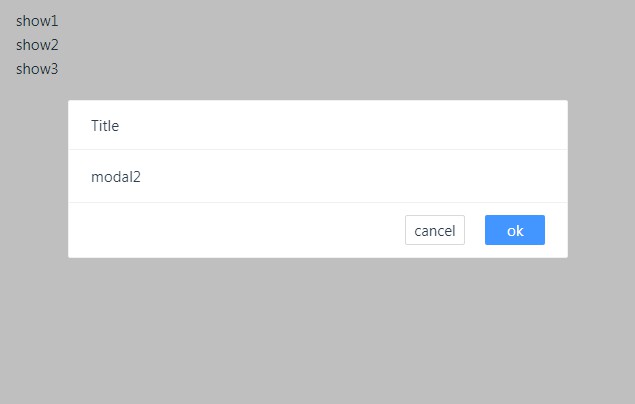
<a11y-dialog id="app-dialog" app-root="#app" @dialog-ref="assignDialogRef">
<h1 slot="title">Your dialog title</h1>
<div>
<p>Your content</p>
</div>
</a11y-dialog>
</div>
</template>
export default {
  name: 'YourComponent',

  data: () => ({
    dialog: null
  }),

  methods: {
    openDialog () {
      if (this.dialog) {
        this.dialog.show()
      }
    },

    assignDialogRef (dialog) {
      this.dialog = dialog
    }
  }
}
It's important to assign the direct reference to the dialog instance via @dialog-ref, otherwise there is no way to call its methods.
Alternatively, you can also import the component directly into your file without installing it first:
import { VueA11yDialog } from 'vue-a11y-dialog'
export default {
  name: 'YourComponent',

  components: {
    'a11y-dialog': VueA11yDialog
  },

  methods: {
    // ...
  }
}
API
All
a11y-dialoginstance methods are available, see their docs for more.
disable-native
- Property:
disable-native - Type:
Boolean - Default:
false - Description: Per default we're using the native
<dialog>element. However, if you want to disable that and use a<div role="dialog">instead, you can just do that by adding this attribute. This gives you full control (and responsibilites) over styling. Read thea11y-dialogStyling layer documentation for more information. - Usage:
<a11y-dialog disable-native>
  <!-- ... -->
</a11y-dialog>
id
- Property:
id - Type:
String - Required:
true - Description: The unique HTML
idattribute added to the dialog element, internally used by a11y-dialog to manipulate the dialog. - Usage:
<a11y-dialog id="main-dialog">
  <!-- ... -->
</a11y-dialog>
app-root
- Property:
appRoot - Type:
String,Array<String>— CSS Selector string. - Required:
true - Description: The selector(s)
a11y-dialogneeds to disable when the dialog is open. - Usage:
<a11y-dialog app-root="#app">
  <!-- ... -->
</a11y-dialog>
class-names
- Property:
class-names - Type:
Object - Required:
false - Default:
{} - Description: Object of classes for each HTML element of the dialog element. Keys are:
base,overlay,element,document,title,closeButton. See a11y-dialog docs for reference. - Usage:
<a11y-dialog :class-names="{ base: 'base-class', overlay: 'overlay-class' }">
  <!-- ... -->
</a11y-dialog>
title-id
- Property:
titleId - Type:
String - Required:
false - Default: Defaults to
id + '-title'. - Description: The HTML
idattribute of the dialog’s title element, used by assistive technologies to provide context and meaning to the dialog window. - Usage:
<a11y-dialog title-id="main-title">
  <!-- ... -->
</a11y-dialog>
close-button-label
- Property:
closeButtonLabel - Type:
String - Required:
false - Default:
'Close this dialog window' - Description: The HTML
aria-labelattribute of the close button, used by assistive technologies to provide extra meaning to the usual cross-mark. - Usage:
<a11y-dialog close-button-label="Close this super dialog">
  <!-- ... -->
</a11y-dialog>
role
- Property:
role - Type:
String - Required:
false - Default:
dialog - Description: The
roleattribute of the dialog element, eitherdialog(default) oralertdialogto make it a modal (preventing closing on click outside of ESC key). - Usage:
<a11y-dialog role="alertdialog">
  <!-- ... -->
</a11y-dialog>
Events
dialog-ref
- Returns: An
a11y-dialoginstance orundefined. - Description: This event emits the
a11y-dialoginstance once the component has been initialised. When it getsdestroyed, the event returnsundefined. This is needed to call instance methods of the dialog, e.g.this.dialog.show(). - Usage:
<a11y-dialog @dialog-ref="assignDialogRef">
  <!-- ... -->
</a11y-dialog>
export default {
  // ...
  methods: {
    assignDialogRef (dialog) {
      this.dialog = dialog
    }
  }
}
Slots
title
- Name:
title - Default:
\u00D7(×) - Description: The title of the dialog, mandatory in the document to provide context to assistive technology. Could be hidden with CSS (while remaining accessible).
- Usage:
<a11y-dialog>
  <h1 slot="title">Your dialog title</h1>
  <!-- ... -->
</a11y-dialog>
closeButtonContent
- Name:
closeButtonLabel - Default:
\u00D7(×) - Description: The string that is the inner HTML of the close button.
- Usage:
<a11y-dialog>
  <span slot="closeButtonContent">Close dialog</span>
  <!-- ... -->
</a11y-dialog>
Server-side Rendering
This is a client-only component; a11y-dialog won't render anything on the server and wait for your bundle to be executed on the client.