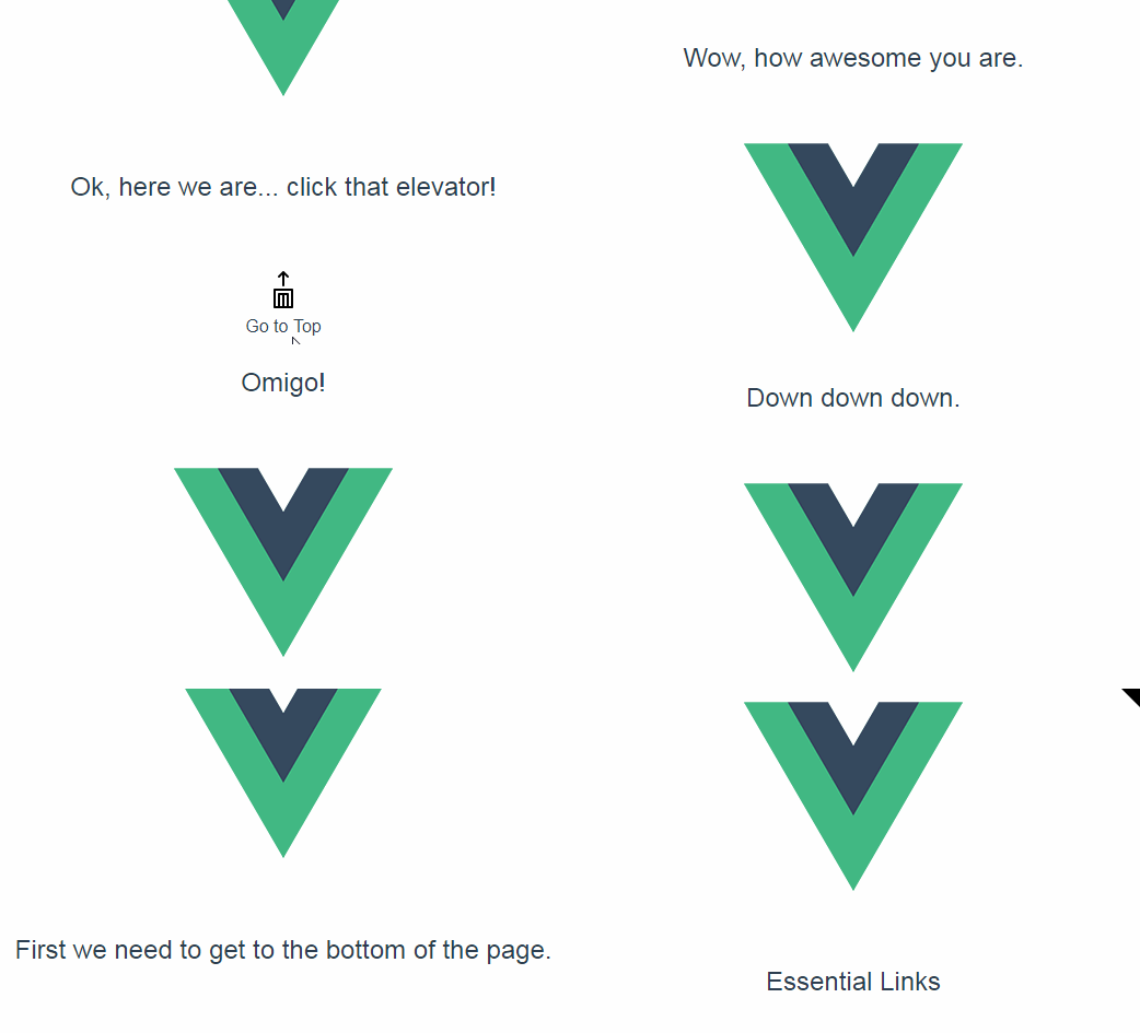
Vue Backtotop Component
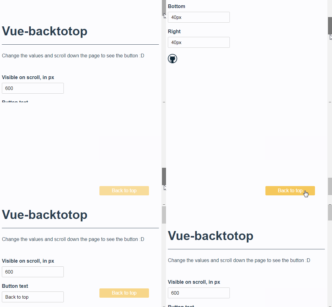
A Back-to-top component for Vue.js, which scroll page to the top when clicked.
Install via npm
npm install vue-backtotop --save
Import and use
Import for global usage
import Vue from 'vue'
import BackToTop from 'vue-backtotop'

Vue.use(BackToTop)
...
Or on a single component
import BackToTop from 'vue-backtotop'
...
},
components: { BackToTop }
...
Props
| Name | Type | Default | Description |
|---|---|---|---|
| text | String | 'Voltar ao topo | Text of back to top button |
| visibleoffset | String or Number | 600 | Where the component should visible when user scroll reach certain offset |
| bottom | String | 40px | Bottom position of the component |
| right | String | 30px | Right position of the component |
Events
| Name | Description |
|---|---|
| scrolled | Fired when page's scroll ends |
How to use
Currently, the vue-backtotop has a property named "text", that is the text which will be visible on button. The default value is "Voltar ao topo".
<back-to-top text="Back to top"></back-to-top>
The button to back to top become visible at window scroll at 600 > px. If you want to change this value, pass a property named "visibleOffset" with a number value.
<back-to-top text="Back to top" visibleoffset="500"></back-to-top>
You can also know when scroll ends
<back-to-top text="Back to top" @scrolled="myFunction"></back-to-top>
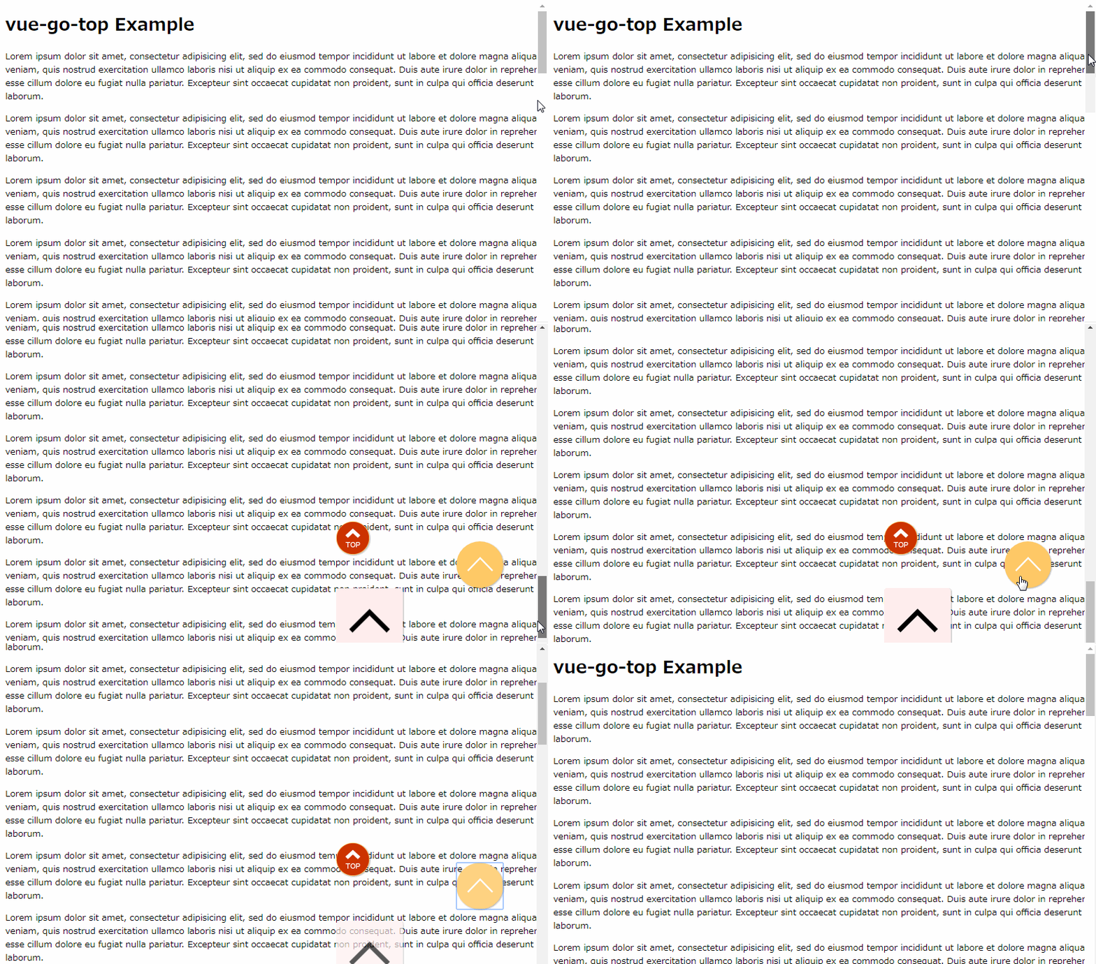
Now, it's possible to use your own html/vue component inside vue-backtotop component
<!-- in your template -->
<back-to-top bottom="50px" right="50px">
  <button type="button" class="btn btn-info btn-to-top"><i class="fa fa-chevron-up"></i></button>
</back-to-top>
/* in your css */
.btn-to-top {
  width: 60px;
  height: 60px;
  padding: 10px 16px;
  border-radius: 50%;
  font-size: 22px;
  line-height: 22px;
}
