vue-bs-modal
A Bootstrap style modal for Vue.js
Installation
npm install vue-bs-modal
Usage
In main.ts
import { createApp } from "vue";
import App from "./App.vue";
import Modal from "vue-bs-modal";

// you have to import bootstrap css.
import "bootstrap/dist/css/bootstrap.min.css";
// import bootstrap icons (this is not required, you can use your own icon class)
import "bootstrap-icons/font/bootstrap-icons.css";

const app = createApp(App);
app.use(Modal).mount("#app");
In components
confirmation modal:
 async beforeRouteLeave() {
    const confirmed = await this.$modal.confirm({
      title: "Unsaved Changes",
      message: "Are you sure you want to leave this page?",
    });
    return confirmed;
  }
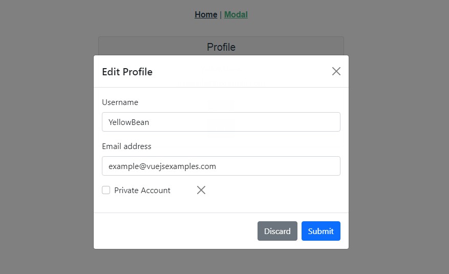
common modal:
 editProfile() {
      this.$modal
        .show({
          title: "Edit Profile",
          content: EditProfileComponent,
          rightBtnText: "Update",
          leftBtnText: "Discard",
          size: ModalSize.LARGE,
          // pass custom data as props to the EditProfileComponent.
          // the "modalRef" prop is passed to the content componet by default in case you want to close the modal inside your component.
          contentProps: {
            email: "[email protected]",
            username: "yellowbean"
          },
          center: true,
        })
        .then(({ confirmed, modalRef, data }) => {
          // confirmed will be true for right button click, false for left button or close button or backdrop click.
          // data will be the data field of the EditProfileComponent.
          if (confirmed) {
            // do something
          }

          // need to manually close the modal if you click the left/right button.
          // this is not required for confirmation dialog.
          modalRef.close();
        });
    },