vue-side-catalog
A vue-based side catalog component.
Install
npm install vue-side-catalog -S
Start
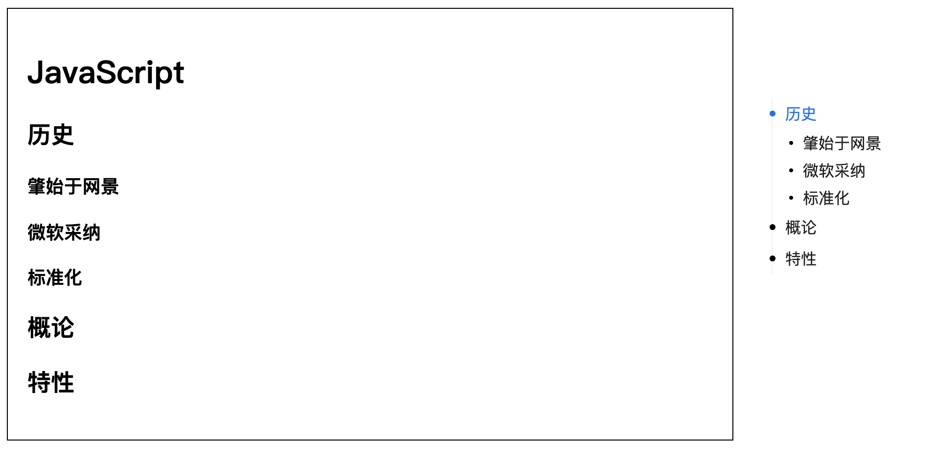
<template>
 <div id="app">
   <div class="demo">
      <h1>JavaScript</h1>
      <h2>历史</h2>
      <h3>肇始于网景</h3>
      <h3>微软采纳</h3>
      <h3>标准化</h3>
      <h2>概论</h2>
      <h2>特性</h2>
   </div>
  <side-catalog
    v-bind="catalogProps"
  ></side-catalog>
  </div>
</template>
import SideCatalog from 'vue-side-catalog'
import 'vue-side-catalog/lib/vue-side-catalog.css'
export default {
  components: {
    SideCatalog,
  },
  data() {
    return {
      catalogProps:{
         containerElementSelector: '.demo',
      },
    };
  },
}
Note: The
containerElementSelectorattribute is required and specifies the container of the article.
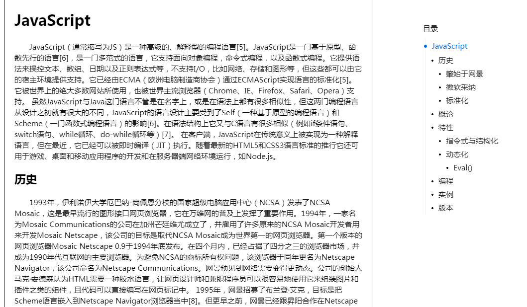
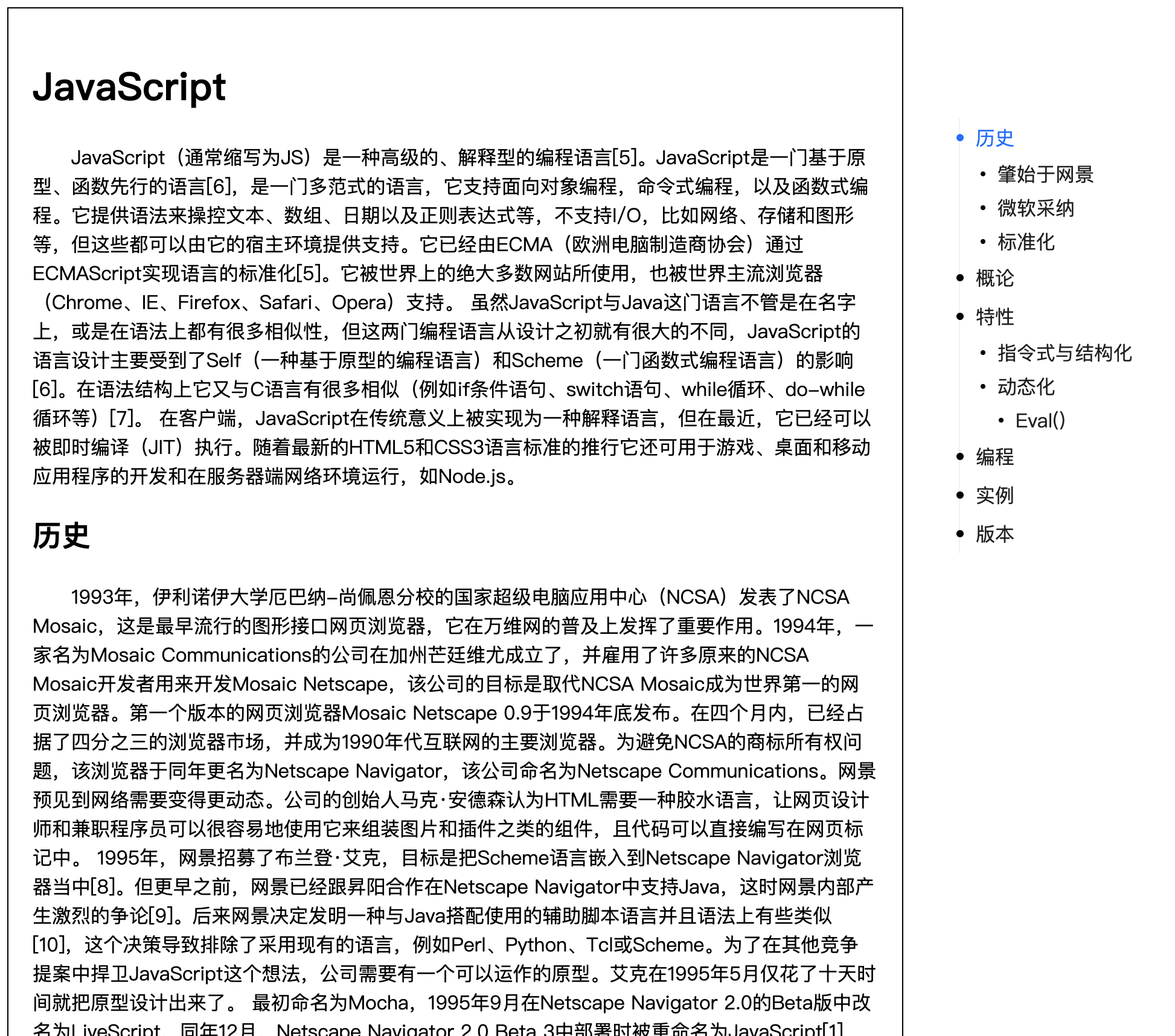
The effect is as follows:
Examples
Custom catalog labels
By default, the component will use the header tag of a direct subset of thecontainerElementSelector element as the directory content.,
The corresponding rule is:
-
h2=>First level directory -
h3=>Secondary directory -
h4=>Tertiary directory -
h5=>Fourth level directory
To modify this rule, you can use the headList attribute. The default value of this attribute is["h2", "h3", "h4", "h5"]corresponding to the above rule
Note: Custom title tags currently only support html tags that are a direct subset of the
containerElementSelectorelement
 data(){
    return {
      catalogProps:{
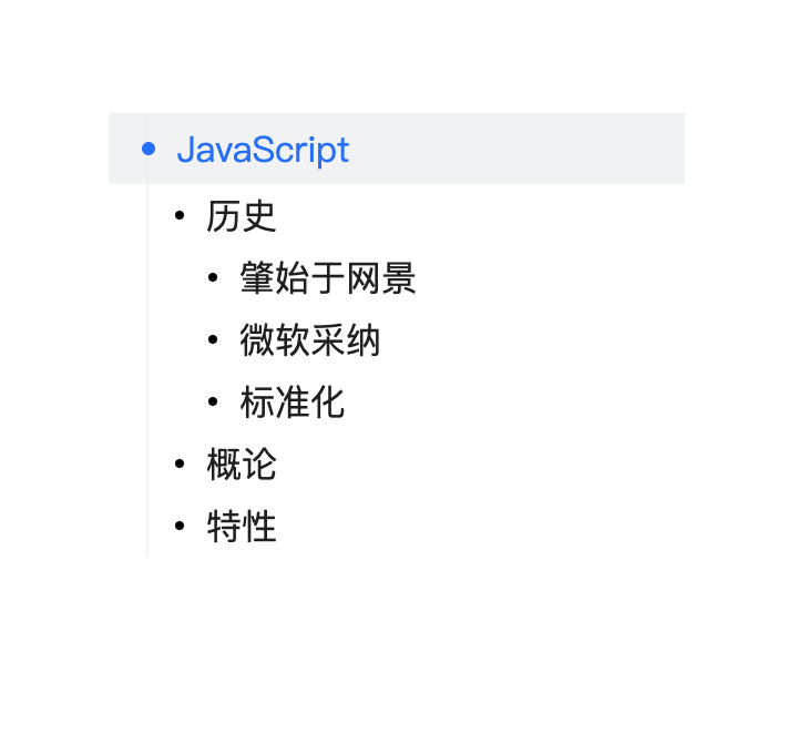
        headList: ["h1", "h2", "h3", "h4", "h5"], // make h1 a first-level directory
        // headList: ["h3", "h1", "p", "span"], // specifying different tags as directories
      },
    };
  },
h1 as first-level directory:
Custom catalog elements
Unlike the custom directory tags above, custom directory elements can support elements with ref attributes ofany level, as well as components
Requires refList properties
<template>
    <h1>JavaScript</h1>
    <h2 ref="t1">历史</h2>
    <h3 ref="t1-1">肇始于网景</h3>
    <h3 ref="t1-2">微软采纳</h3>
    <h3 ref="t1-3">标准化</h3>
    <h2 ref="t2">概论</h2>
    <h2 ref="t3">特性</h2>
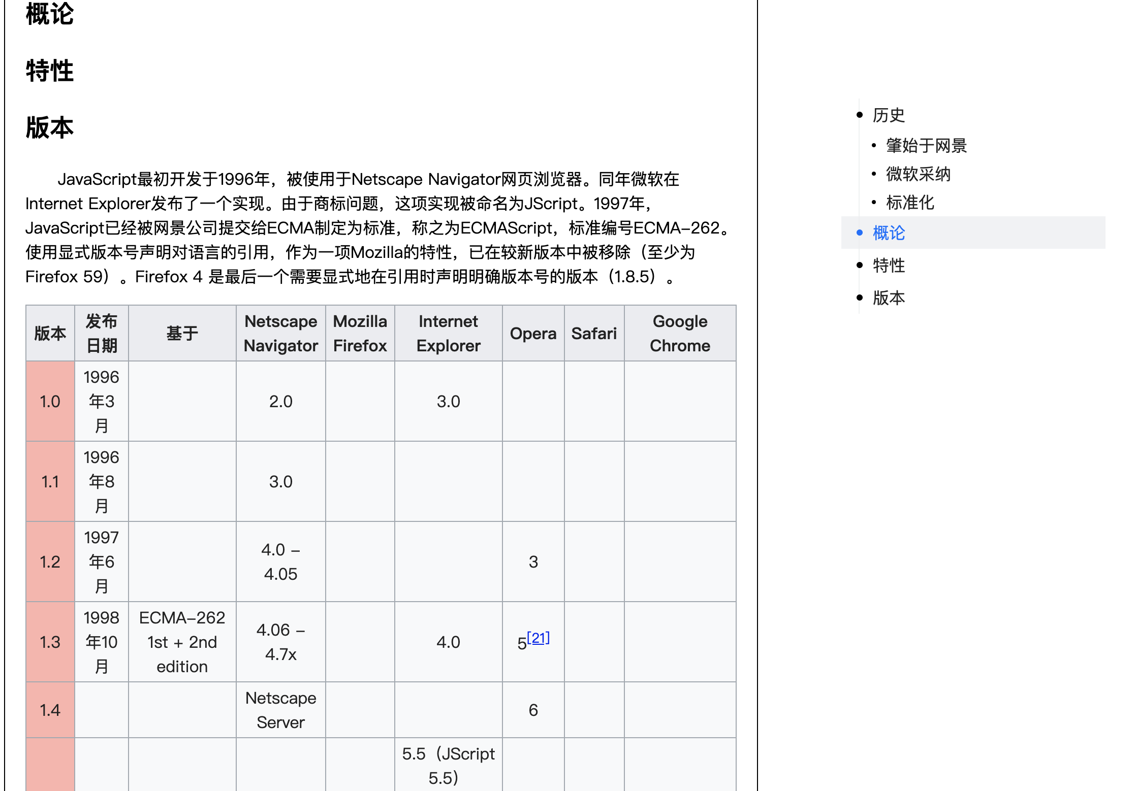
    <version ref="t4"/>
    <!-- ... -->
</template>
//...
import Version from './components/Version';
export default {
  components: {
    // ...
    Version,
  },
  data() {
    return {
      catalogProps:{
         containerElementSelector: '.demo',
         refList:[
          {
            ref: 't1'
          },
          {
            ref: 't1-1',
            level: 2 // designated as a secondary directory
          },
          {
            ref: 't1-2',
            level: 2
          },
          {
            ref: 't1-3',
            level: 2
          },
          {
            ref: 't2'
          },
          {
            ref: 't3'
          },
          {
            ref: 't4',
            title: '版本' // the component needs to set the title separately (the innerText is taken by default)
          },
        ]
      },
    };
  },
}
The effect is as follows:
Note: If
headListandrefListare set at the same time,headListwill be ignored.
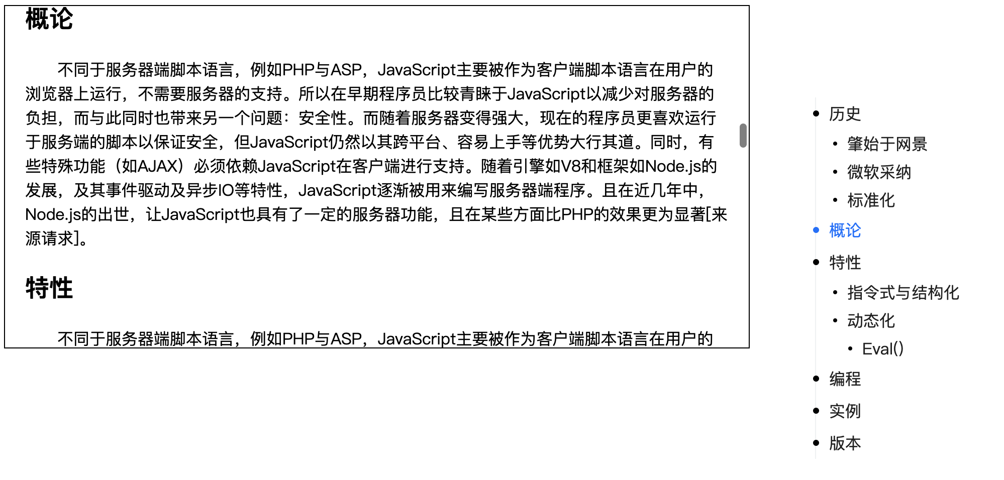
Specify element scroll
You can also use scrollElementSelector to generate a directory for the content of a fixed element. If this attribute is not specified, the scroll event ofWindow is listened to by default.
 data(){
    return {
      catalogProps:{
        scrollElementSelector: '.demo',
      },
    };
  },
.demo {
  height: 400px;
  overflow: auto;
}
效果如下图:
Props
| Name | Type | Default | Description |
|---|---|---|---|
| headList | Array |
["h2", "h3", "h4", "h5"] |
Assign tags to each level of the directory |
| refList | Array |
- | Specify the ref element for each level of the directory, each item of the array is an object, and contains two attributes
|
| containerElementSelector | String |
- | (essential)Specify the container for the article |
| scrollElementSelector | String |
Window |
Need to add a CSS selector for the scroll event, and listen to the scroll event of the Window by default |
| openDomWatch | Boolean |
false | Whether to enable dom monitoring. If there is a dom change in containerElementSelector, the offsetTop of each ref will be recalculated. |
Methods
| Name | Parameters | Description |
|---|---|---|
| initActive | - | Make the first line of the directory active |
| setRefList | - | Calculate the offsetTop of each level directory |
Slot
| Name | Description |
|---|---|
| - | Title of Directory |
