Iconsans
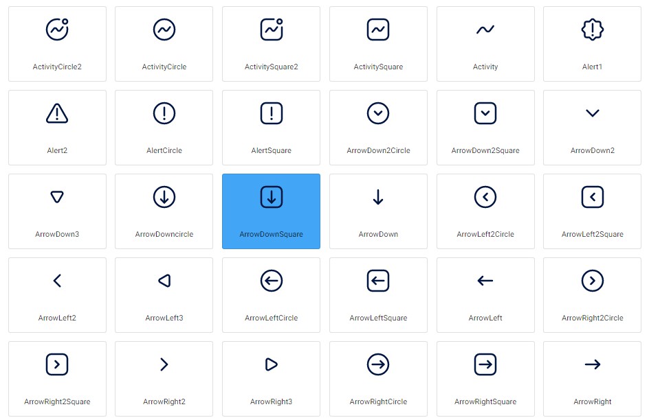
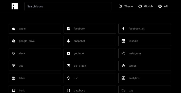
Iconsans is a collection of over 320 free icons designed for use in your next project. This package offers separate versions for Vue and React, making it easy for developers and designers to access a wide range of icons that can be used in a variety of applications.
Installation
To use iconsans in your Vue project:
npm install @iconsans/vue
To use iconsans in your React project:
npm install @iconsans/react
Usage
After installing iconsans, you can use it in your project by importing the icons you need. For example, if you want to use the “play” icon in your Vue project, you can import it like this:
<script setup lang="ts">
    import { Play } from "@iconsans/react";
</script>


<template>
    <Play />
</template>
In React, you can import the same icon like this:
import { Play } from "@iconsans/vue";

export default function App() {
  return <Play />;
}
Props
| Name | Type |
|---|---|
| Width | String,Number |
| Height | String,Number |
| Color | String |
Figma Design
The icons in iconsans were designed using Figma, and you can find the design file in the following link:
https://www.figma.com/community/file/1228322259720738019
You can use this design file to view the icons, modify them, or create your own custom icons based on the iconsans design.
License
iconsans is licensed under the MIT license, which means you are free to use it in your projects, both commercial and non-commercial. However, we do ask that you provide attribution to the iconsans project in your documentation and/or about page.
