vue-material-design-icons
This library is a collection of Vue single-file components to render Material
Design Icons, sourced from the MaterialDesign project.
It also includes some CSS that helps make the scaling of the icons a little
easier.
Getting started
-
Install the package
$ npm install --save vue-material-design-iconsOR
$ yarn add vue-material-design-icons -
Optional, but recommended Add the included stylesheet to your root JS
file, usuallyindex.jsormain.js:import 'vue-material-design-icons/styles.css' -
Import the icon, and declare it as a local component:
import MenuIcon from 'vue-material-design-icons/menu.vue'

components: {
  MenuIcon
}
OR
Declare it as a global component:
import MenuIcon from 'vue-material-design-icons/menu.vue'

Vue.component('menu-icon', MenuIcon)
Note Icon files are kebab cased, e.g.
checkbox-marked-circle.vue, and
their default name has-iconappended e.g.checkbox-marked-circle-icon. -
Then use it in your template code!
<menu-icon />
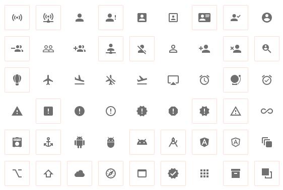
Icons
A list of the icons can be found at the
Material Design Icons website. The icons packaged here match the names
displayed on the website, such as ultra-high-definition, with the .vue
extension; that icon would be imported as
'vue-material-design-icons/ultra-high-definition.vue'.
Tips
-
Use
resolvein your Webpack config to clean up the imports:resolve: { alias : { "icons": path.resolve(__dirname, "node_modules/vue-material-design-icons") }, extensions: [ ".vue" ] }This will give you much shorter and more readable imports, like
import Android from 'icons/android', rather than
import Android from 'vue-material-design-icons/android.vue'. Much better!