vue-modaltor
A customizable modal component for vue.
Features
- no need to handle modal's height manually it extends as the content of modal increases .
- manage modal's size on different dimensions with one single attribute see responsive
- scrollable modal, modal will get scroll if content is more than current view page height see close-scroll
- modals has multiple parent animations parent-animation
- edit icon close svg or icon font parent-animation
- hide icon close parent-animation
Installation
npm install vue-modaltor --save
yarn add vue-modaltor
then you can import modaltor in
VUE2
import Vue from "vue";
import VueModalTor from "vue-modaltor/dist/vue-modaltor.common";
import "vue-modaltor/dist/vue-modaltor.css";

Vue.use(VueModalTor, {
    bgPanel: "#7957d5"  // add custome options
});
NUXT-SSR
in file /plugins/modal.js
import Vue from "vue"
import VueModalTor from "vue-modaltor/dist/vue-modaltor.common.js"
import "vue-modaltor/dist/vue-modaltor.css"
Vue.use(VueModalTor)
then add plugins part in nuxt.config.js
plugins: [
    "~/plugins/modal.js"
]
Also, can use CDN
And check it this issues
Example
<template>
<div>
<vue-modaltor :visible="open" @hide="open=false">
<template #header>
<!-- add your custom header -->
<div>
<i class="closeicon">x</i>
<p>add modal title or not</p>
</div>
</template>
<template #body>
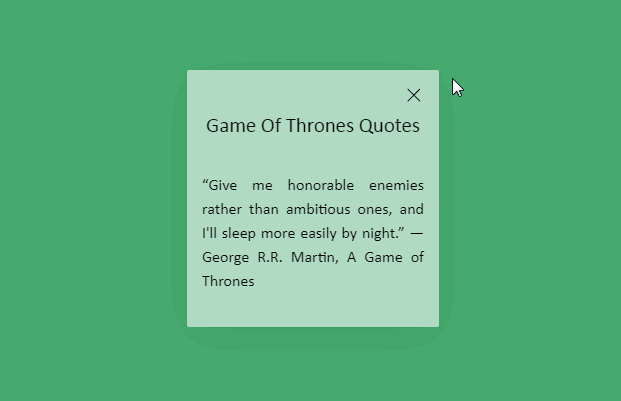
<p>
“Never forget what you are,
for surely the world will not.
Make it your strength. Then it can never be your weakness.
Armour yourself in it, and it will never be used to hurt you.
” ― George R.R. Martin, A Game of Thrones.
</p>
</template>
</vue-modaltor>
<button @click="open=true">modal-basic</button>
</div>
</template>
<script>
export default {
name: "YourComponentName",
data() {
return {
open: false
}
}
}
</script>
Props
<script>
  export default {
    props: {
      // this is for toggle show modal
      // :visible:false
      visible: {
        type: Boolean,
        required: false,
        default: false
      },
      // this is for responsive modal and
      // :resize-width='{1200:"50%",992:"70%",768:"90%"}'
      resizeWidth:{
        type:Object,
      },
      // this is for anaimating modal
      // :animation-panel='modal-slide-right'
      // :animation-panel='modal-slide-left'
      // :animation-panel='modal-slide-top'
      // :animation-panel='modal-slide-bottom'
      animationPanel:{
        type: String,
        required: false,
        default: 'modal-fade'
      },
      // this is for anaimating animationParent modal
      // :animation-parent='modal-scale'
      animationParent:{
        type: String,
        required: false,
        default: 'modal-fade'
      },
      // this is for bgcolor overlay
      bgOverlay:{
        type: String,
        required: false,
        default: '#fff'
      },
      // this is for bgcolor panel
      bgPanel:{
        type: String,
        required: false,
        default: '#fff'
      },
      //set default width modal
      // :default-width="'50%'"
      // :default-width="'495px'"
      // :default-width="'40em'"
      defaultWidth:{
        type: String,
        required: false,
        default: '50%'
      },
      // this is option for close scroll body when show modal
      // :close-scroll="false"  // if true close scroll body
      closeScroll:{
        type: Boolean,
        required: false,
        default: true
      }
    }
  }
</script>
Slots
#header
    - create your own header

#body
    - create your own body
TODO List
- [x] Add custom slot for header , body and footer