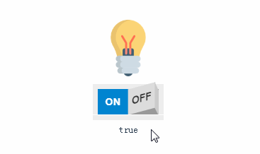
vue-rocker-switch
A customizable rocker switch component for Vue.js.
Installation
npm install vue-rocker-switch --save
Usage example
<template>
  <RockerSwitch />
</template>

<script>
// Import package
import RockerSwitch from "vue-rocker-switch";
// Import styles
import "vue-rocker-switch/dist/vue-rocker-switch.css";

export default {
  name: "App",
  components: {
    RockerSwitch
  }
};
</script>
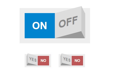
Props
| Prop | Description | Default value | Type |
|---|---|---|---|
| value | Boolean value attached to the rocker switcher. This will be used to initialize the component value too. | false |
Boolean |
| size | rocker switch size, it can be a string (small, medium and large) or a decimal number |
small |
String or Number |
| labelOn | Text of the On label |
On |
String or Number |
| labelOff | Text of the Off label |
Off |
String or Number |
| activeColorLabel | Text color used when the On label is active |
#fff |
String |
| inactiveColorLabel | Text color used when the Off label is inactive |
#333 |
String |
| backgroundColorOn | Background color of the On button |
#0084d0 |
String |
| backgroundColorOff | Background color of the Off button |
#bd5757 |
String |
| borderColor | Border color of the rocker switch | #eee |
String |
| toggle | Allow to the rocker switch to behave as a toggle switch | true |
Boolean |
Events
| Event | Description |
|---|---|
| change | Fires each time the rocker switch changes. |
Development setup
npm install
Compiles and hot-reloads for development
npm run serve
Compiles and minifies for production
npm run build
Lints and fixes files
npm run lint