Vue-smart-pagination
A data pagination component that splits any data into pages and has many settings.
All data is stored in an array and can have any values.
Installation
Install NPM package.
$ npm install vue-smart-pagination --save
Register the component globally in your main.js file.
import { PaginationControl, PaginationPage } from 'vue-smart-pagination'
Vue.component('PaginationControl', PaginationControl)
Vue.component('PaginationPage', PaginationPage)
Or register the component locally in your vue file.
import { PaginationControl, PaginationPage } from 'vue-smart-pagination'
components: {
    PaginationPage,
    PaginationControl
},
Usage
Vue-smart-pagination contains two main components:
PaginationPage - has content of the pages.
PaginationControl - has content controls.
Both components are registered globally after installing package.
Also we have props - :settings="settings” which has two main objects - PaginationControlSettings и PaginationPageSettings.
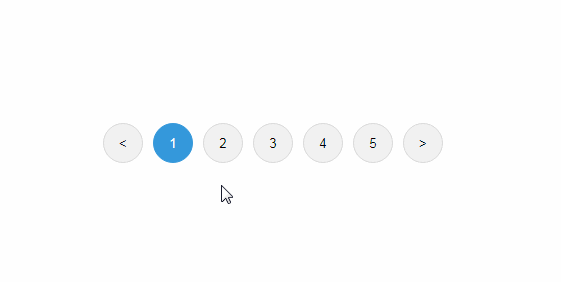
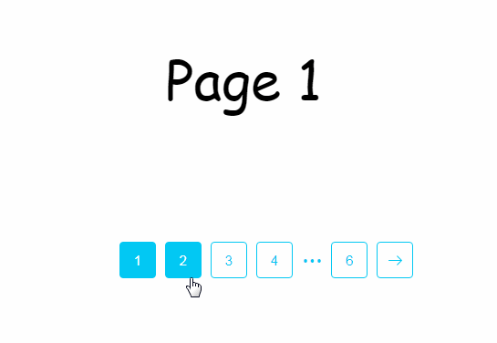
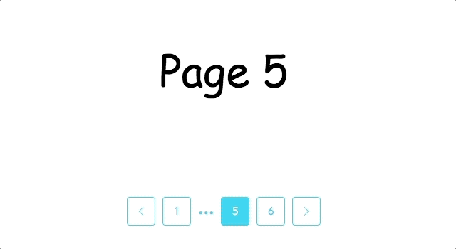
PaginationControlSettings contains settings related to buttons, arrows, dots and the start page.
PaginationPageSettings contains settings related to the page, the spinner and animation of the content change.
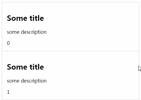
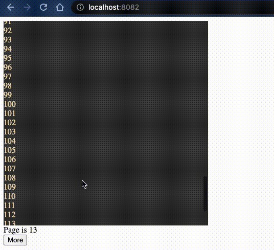
Array arrayData serves to output data to the page and is required to fill.
Example:
<template>
  <div id="app">
    <pagination-page :settings="settings">
      <div slot="page" slot-scope="item">
        <div>{{item.originalEvent.data}}</div>
      </div>
    </pagination-page>
    <pagination-control :settings="settings" />
  </div>
</template>

<script>
import { PaginationControl, PaginationPage } from 'vue-smart-pagination'

export default {
  name: 'App',
  components: {
    PaginationPage,
    PaginationControl
  },
  data: function () {
    return {
      arrayData: [
        {
          data: 'Page № 1'
        },
        {
          data: 'Page № 2'
        },
        {
          data: 'Page № 3'
        },
      ]
    }
  },
  computed: {
    settings: function () {
      return {
        arrayData: this.arrayData
      }
    }
  }
}
</script>
Adding Data to a Component:
In the array arrayData we add data and output them to the <pagination-page>. When referring to an array of elements, specify the originalEvent property to display the current data.
To display simple data, use <div>, and for components use <component>.
<div slot =" page "slot-scope =" item "> </ div> is required.
Example:
import testComponent from 'testComponent'

export default {
  components: {
    testComponent
  }
}
arrayData: [
  {
    data: 'apple',
    component: 'testComponent'
  }
]
<pagination-page :settings="settings">
  <div slot="page" slot-scope="item">
    <div>{{item.originalEvent.data}}</div>
    <components :is="item.originalEvent.component"></components>
  </div>
</pagination-page>
To display the pagination buttons, insert the pagination-control component into the template.
Example:
<pagination-control :settings="settings" />
Props
| Name | Type | All values | Default value | Description |
|---|---|---|---|---|
PaginationControlSettings: |
||||
| Buttons settings: | ||||
| controlClass | String | - | - | Common class to the parent block with pagination buttons. |
| controlStyle | String | square, circle, default | default | Style of pagination buttons. |
| maxButtons | Number | - | 5 | The maximum number of pagination buttons on the page. |
| allpageButtonsStyle | ||||
| background | String | - | #ffffff | Background color of buttons |
| borderColor | String | - | #02C8F3 | Border color of buttons |
| color | String | - | #02C8F3 | Color of buttons |
| backgroundHover | String | - | #02C8F3 | Background color of buttons when hovering |
| borderColorHover | String | - | #02C8F3 | Border color of buttons when hovering |
| colorHover | String | - | #ffffff | Color of buttons when hovering |
| fontFamily | String | - | Avenir | Font family of buttons |
| currentPageButtonStyle | ||||
| backgroundActive | String | - | #02C8F3 | Background color of active button |
| borderColorActive | String | - | #02C8F3 | Border color of active button |
| colorActive | String | - | #ffffff | Color of active button |
| Arrows settings: | ||||
| hideArrows | Boolean | true, false | false | Show or hide the arrows of pagination. |
| arrowSwitchHide | Boolean | true, false | false | Switches the mode of the arrows from disabled to full hiding. |
| arrowStyle | String | styleArrow-1, styleArrow-2, styleArrow-3 | styleArrow-2 | Styles icons of arrow. |
| arrowStyleColor | String | - | #02C8F3 | Color of arrow. |
| arrowStyleColorHover | String | - | #ffffff | Color of arrow when hovering. |
| Dots settings: | ||||
| controlDotsStyle | String | styleDots-1, styleDots-2, styleDots-3 | styleDots-1 | Styles of dots. |
| controlDotsColor | String | - | #02C8F3 | Color of dots. |
| pageStarted: | Number | - | 1 | Number of start page. |
PaginationPageSettings: |
||||
| Page settings: | ||||
| pageClass | String | - | - | Common class for all pages. |
| Spinner settings: | ||||
| spinner | Boolean | true, false | false | Show or hide loading spinner. |
| spinnerStyle | String | spinnerStyle-1, spinnerStyle-2, spinnerStyle-3 | spinnerStyle-3 | Styles for loading spinner. |
| spinnerColor | String | - | #ffffff | Color of loading spinner. |
| Animations settings: | ||||
| animationPage | String | fade, slide, bounce, default | default | Animation when switching pages. |
Methods
To call a custom method, when switching pages, in the
<pagination-control />component in the action callMethod, you must pass a user-defined function that is declared in the methods object.
Example:
<pagination-control @callMethod =" showText "/>
methods: {
  showText: function (e) {
    console.log (e)
  }
}
Browsers
Vue-smart-pagination has been successfully tested in browsers such as:
- Chrome (66.0)
- Safari (11.1)
- Opera (52.0)
- Firefox (59.0.2)
- Edge (16)