vue2-datepicker
A Datepicker Component For Vue2
Install
$ npm install vue2-datepicker --save
Usage
<script>
import DatePicker from 'vue2-datepicker'
export default {
components: { DatePicker },
data() {
return {
time1: '',
time2: '',
time3: '',
shortcuts: [
{
text: 'Today',
onClick: () => {
this.time3 = [ new Date(), new Date() ]
}
}
],
timePickerOptions:{
start: '00:00',
step: '00:30',
end: '23:30'
}
}
}
}
</script>
<template>
<div>
<date-picker v-model="time1" :first-day-of-week="1"></date-picker>
<date-picker v-model="time2" type="datetime" :time-picker-options="timePickerOptions"></date-picker>
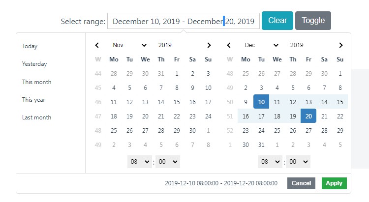
<date-picker v-model="time3" range :shortcuts="shortcuts"></date-picker>
</div>
</template>
Props
| Prop |
Type |
Default |
Description |
| type |
String |
'date' |
select datepicker or datetimepicker(date/datetime) |
| range |
Boolean |
false |
if true, the type is daterange or datetimerange |
| format |
String |
YYYY-MM-DD |
The parsing tokens are similar to the moment.js |
| lang |
String/Object |
zh |
Translation (en/zh/es/pt-br/fr/ru/de/it/cs)(custom) |
| clearable |
Boolean |
true |
if false, don't show the clear icon |
| confirm |
Boolean |
false |
if true, need click the button to change the value |
| editable |
Boolean |
true |
if false, user cann't type it |
| disabled |
Boolean |
false |
Disable the component |
| placeholder |
String |
|
input placeholder text |
| width |
String/Number |
210 |
input size |
| not-before |
String/Date |
'' |
Disable all dates before new Date(not-before) |
| not-after |
String/Date |
'' |
Disable all dates after new Date(not-after) |
| disabled-days |
Array/function |
[] |
Disable Days |
| shortcuts |
Boolean/Array |
true |
the shortcuts for the range picker |
| time-picker-options |
Object |
{} |
set timePickerOptions(start, step, end) |
| minute-step |
Number |
0 |
if > 0 don't show the second picker(0 - 60) |
| first-day-of-week |
Number |
7 |
set the first day of week (1-7) |
| input-class |
String |
'mx-input' |
the input class name |
| input-name |
String |
'date' |
the input name attr |
| confirm-text |
String |
'OK' |
the default text to display on confirm button |
| range-separator |
String |
'~' |
the range separator text |
lang
- String (en/zh/es/pt-br/fr/ru/de/it/cs)
- Object (custom)
<script>
export default {
  data() {
    return {
      value: '',
      lang: {
        days: ['Sun', 'Mon', 'Tue', 'Wed', 'Thu', 'Fri', 'Sat'],
        months: ['Jan', 'Feb', 'Mar', 'Apr', 'May', 'Jun', 'Jul', 'Aug', 'Sep', 'Oct', 'Nov', 'Dec'],
        pickers: ['next 7 days', 'next 30 days', 'previous 7 days', 'previous 30 days'],
        placeholder: {
          date: 'Select Date',
          dateRange: 'Select Date Range'
        }
      }
    }
  }
}
</script>

<template>
  <date-picker v-model="value" :lang="lang"></date-picker>
</template>
shortcuts
- true - show the default shortcuts
- false - hide the shortcuts
- Object[] - custom shortcuts, [{text, start, end}]
- Object[] - custom shortcuts, [{text, onClick}]
| Prop |
Type |
Description |
| text |
String |
Text |
| start |
Date |
Start Date |
| end |
Date |
End Date |
| onClick |
Function |
click handler |
time-picker-options
- Object[] - custom time-picker, [{start, step, end}]
| Prop |
Type |
Description |
| start |
String |
startTime (eg '00:00') |
| step |
String |
stepTime (eg '00:30') |
| end |
String |
endTime (eg '23:30') |
Events
| Name |
Description |
Callback Arguments |
| change |
When the value change |
the currentValue |
| input |
When the value change |
the currentValue |
| confirm |
When user click 'OK' button |
the currentValue |
| input-error |
When user type a invalid Date |
the input text |
Slots
| Name |
Description |
| calendar-icon |
custom the calender icon |
| header |
popup header |
| footer |
popup footer |
GitHub