Easy-DnD
Easy-DnD is a drag and drop implementation for Vue.js 2 that uses only standard mouse events instead of the HTML5 drag and drop API, which is impossible to work with. Think of it as a way to transfer data from some components to others using the mouse or support for a mouse assisted copy/cut - paste. It also allows for lists to be reordered by drag and drop.
These demos are meant to be pretty and reflect real life examples. For more barebones examples, see the manual.
The following demo features list reordering, drag and drop between two lists, custom drag images and custom feedback when inserting new items. It uses Vuetify components.
The following demo features drag and drop between a table and a list, custom drag images and a custom style for drop areas when the drop is allowed. It uses Vuetify components.
https://codesandbox.io/s/easy-dnd-demo-2-xnqbz

Overview
There are four components : Drag, Drop, DropMask and DropList.
The Drag component is meant to define an area from which data can be exported. The Drop component is meant to define an area into which data can be imported. Drop components can be nested forming hierarchies of arbitrary depth. The DropMask component is meant to create an island insensitive to drag and drop on top of a Drop component. The DropList component is a special kind of drop component that displays a list of items that supports dragging into and reordering.
Events
All events carry the current state of the drag operation by means of the following properties :
type: the type of the data being transfereddata: the data being transferedposition: the current position of the mouse cursortop: the foremost Drop component currently under the mouse cursor if anypreviousTop: for dragenter and dragleave, the previous value of top if anysource: the Drag component where the drag originated
Drag components emit the following events :
dragstart: triggered when a drag operation startsdragend: triggered when a drag operation terminates (whether successfuly or not)cut/copy: triggered when a drag operation completes successfuly on a Drop component that requires the data to be removed / copied
Drop components emit the following events :
dragenter: triggered when the mouse enters a Drop componentdragleave: triggered when the mouse leaves a Drop componentdragover: triggered when the mouse moves over a Drop componentdrop: triggered when a drop operation completes on a Drop component
DropList components emit the following events (in addition to the ones emitted by Drop components) :
insert: triggered when data is to be inserted into the list (properties :type,dataandindex)reorder: triggers when data needs to be reordered (properties :from,toandapply- apply is a function that applies the required reordering to the given array)
Data
Export : the data being exported when a drag operation originates from a Drag component is defined by mean of its data property.
Import : when a drag operation terminates in a Drop components, its drop event is triggered and the event carries the data to be imported.
Modes
A drag and drop can occur in several possible modes, depending on its effect on the origin of the drag :
copy(the default) : if the source of the drag is unaffected by the drag operation,cut: if the source of the drag is to be removed when the drag operation completes.
Drop components must declare what mode must be triggered when data is dropped into them using the mode property.
When a drag operation completes on a Drop component that declares the cut (respectively copy) mode, a cut (respectively copy) event is emitted on the Drag component from which the drag operation originated. This gives the opportunity to the surroundings of the Drag component to react to the drop that just happened, for example by removing the data that has been dropped in case of the cut event.
If a drag operation originates from a Drag components that doesn't declare a listener for the cut event, then dropping is forbidden on a Drop component that declares the cut mode.
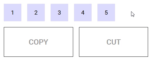
The following demo illustrates modes in action :
https://codesandbox.io/s/example-2-r8n1k
Types
A drag operation may have a type. The type is a data structure (can be a simple string) that defines the kind of data being transfered. The type of a drag operation is defined by the Drag component that initiates it using the type prop.
A Drop component is said to participate in a drag operation if it accepts its type (the default is to accept any type). The type(s) a Drop component accepts can be defined by mean of the accepts-type prop (can be a string, an array of strings or a function that takes the type as parameter and returns a boolean).
As far as Easy-DnD is concerned, if a Drop component doesn't accept the type of the current drag operation, it behaves like any other part of the page that is not sensitive to drag and drop. It is ignored during the drag, no special CSS classes are applied, no special cursors / drag images are displayed and no special events are triggered.
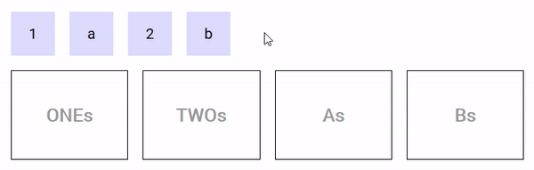
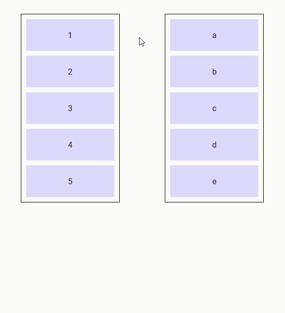
The following demo illustrates the use of types. There are two types in use : 'string' and 'number'. The Drag components that contain '1' and '2' are of type 'number', the ones containing 'a' and 'b' are of type 'string'. The two Drop components on the left accept numbers, the ones on the right accept strings. When you drag a number/string (respectively), only Drop components that accept numbers/strings (respectively) react (i.e. drag images, CSS classes, cursors are applied). The other ones are left alone.
https://codesandbox.io/s/example-3-g7io8
Restricting droppable data
Drop components can restrict the data they accept by mean of the accepts-data prop (a function that takes the data and type as parameter and returns a boolean).
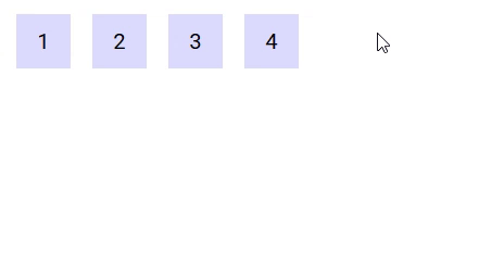
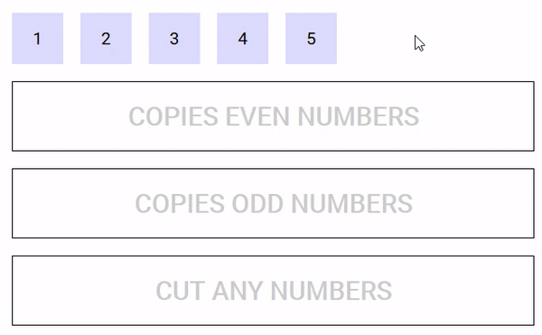
The following demo defines five Drag components that can be dragged into three Drop components, one that accepts even numbers, one that accepts odd numbers and one that accepts any number but removes them once the drag is complete.
https://codesandbox.io/s/easy-dnd-demo-fo078
Mouse cursor
If a drag isn't in progress, the cursor turns into grab when the mouse is over a Drag component. If a drag is in progress, the cursor turns into grabbing, unless it is over a Drop component that accepts the type of the current drag operation. Then, it turns into pointer if the Drop component accepts the data being dragged, and into not-allowed otherwise.
Drag image
During the drag, an image may move along the mouse cursor. Easy-DnD makes it so that this image is always on top of everything else.
Drag components provide the drag-image slot that can be used to set the default image displayed during the drag operation :
- if the slot isn't defined, the image is a clone of the Drag component.
- if the slot is defined and empty, there is no image.
- if the slot is not empty, a clone of its content is used.
Drop and DropList components provide the drag-image slot (props : data and type) that can be used to set the image to be displayed when the mouse is over them, if they participates in the current drag operation (i.e. accept its type) :
- if the slot isn't defined, the default image set by the Drag component is used.
- if the slot is defined and empty, there is no image.
- if the slot is not empty, a clone of its content is used.
DropList components additionaly provide the reordering-drag-image slot (prop : item subject to reordering) that behaves the same way as drag-image but controls the drag image to be displayed during list reordering.
The position of the drag image relative to the mouse cursor can be controlled by CSS using the transform property.
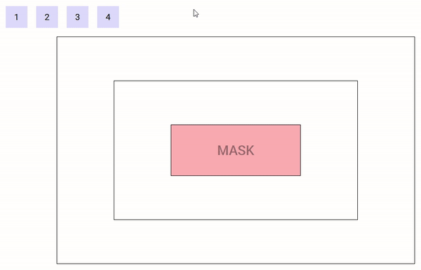
The following demo illustrate the use of custom drag images, nested Drop components and a mask :
https://codesandbox.io/s/example-4-6h8zy
CSS classes
A Drag component is assigned the class drag-in when the mouse is over it and a drag operation isn't in progress, drag-out otherwise. Depending on the mode of the Drop component currently under the mouse cursor, the source Drag component is also assigned the classes drag-mode-copy, drag-mode-cut and drag-mode-reordering.
During a drag operation, the Drop components on the page are assigned several CSS classes :
- for all Drop components :
type-allowedif the Drop component accepts the type of the drag operation,type-forbiddenotherwise - for the Drop components that participate in the drag operation (i.e. accepts its type) :
drop-inwhen the mouse is over one that is foremost at the current mouse position (remember Drop components can be nested),drop-outotherwisedrop-allowedwhen the Drop component accepts the data and the source of the drag accepts its mode,drop-forbiddenotherwise
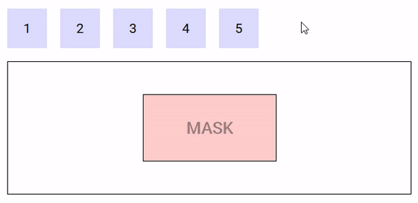
DropMask component
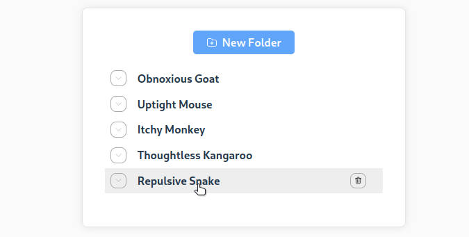
The following demo illustrates the use of a DropMask :
https://codesandbox.io/s/example-1-ngrlv
DropList component
The DropList component is a special Drop component so it inherits all the props and events of the Drop component. It can be used when the result of a drag operation is to import data into the component as an item in a list at a specific index or to allow the user to reorder a list of items using drag and drop.
Comparing to the Drop component, there is one more prop :
items: the array of items to be rendered
Comparing to the Drop component, there are two more events :
insert: emitted when the user drops data into the DropList. If no listener is provided for this event, the list cannot be inserted into.reorder: emitted when the user reorders the list. If no listener is provided for this event, the list cannot be reordered.
Comparing to the Drop component, there are three more slots :
item: used to render each list item. It has two properties,itemandreorder. Reorder is true when the item is the one subject to reordering. Don't forget to provide a key for the content of this slot !!feedback: used to render a placeholder to show the position where the new item would be inserted if the drag operation ended at the current mouse position. It has two properties :typeanddata. Don't forget to provide a key for the content of this slot !!reordering-drag-image: defines the drag image to be used when reordering the list (see drag image section above).
Keys on items and feedback are used to disallow the drop if it would create duplicates and result in errors.
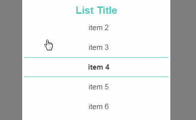
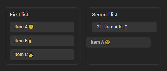
The following demo features drag and drop from one list to another and list reordering.
https://codesandbox.io/s/droplist-ozs8b
Tags
Drag and Drop components support the tag prop that can be used to control the HTML tag (or Vue component) that will serve as root of the template. In case of tags that are Vue components, all props, listeners and slots function as they normally would.
DragAwareMixin
A mixin is available to make components sensitive to drag operations. It adds the following computed fields to components that incorporate it, reflecting the current state of the drag :
dragInProgress: true if a drag operation is in progress, false otherwisedragType: the type of the current drag operationdragData: the data of the current drag operationdragPosition: the current position of the mouse relative to the documentdragSource: the Drag component from which the drag operation originateddragTop: the foremost Drop component under the mouse if any
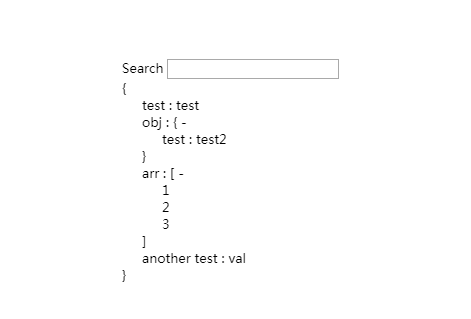
The following demo displays information about the current drag operation when it is in progress :
https://codesandbox.io/s/example-5-j8qo9