File Management with Preview
A versatile and user-friendly file management system built with Vue.js and TypeScript that allows for single and multiple file uploading with a preview feature. It allows you to select files and preview them, returning an array of selected files. You can provide custom design and override classes for your file component.
Features
- Single File Upload: Users can upload or change a single file.
- Multiple File Management: Easily manage multiple files.
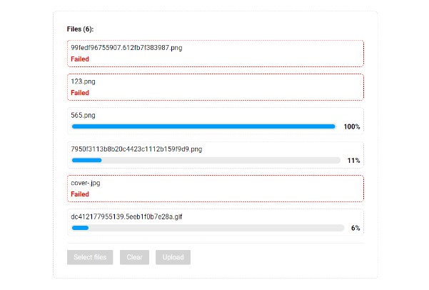
- File Preview: Provides a preview of uploaded files (e.g., images, videos, gifs).
- Responsive Design: Ensures a seamless experience on various devices.
Getting Started
Follow these instructions to set up and run the project on your local machine.
Prerequisites
Before you begin, make sure you have the following software installed:
- Node.js: https://nodejs.org/
- Vue CLI: https://cli.vuejs.org/
> npm install -D sass
Installation
To use this library, you can install it via npm:
> npm install file-upload-frontend
Make sure to check the library’s documentation for any additional setup or configuration steps.
Usage
To manage and preview files with this library, follow these steps:
Import the library into your file
// for CommonJS
const { SingleFileUpload, MultipleFileUpload } = require('file-upload-frontend')

OR
// for esModules
import { SingleFileUpload, MultipleFileUpload } from 'file-upload-frontend'
Now, you can use that imported component with adding your custom UI for file uploading. Here are some examples of how to use the imported component:
Single File Upload Management
<script lang="ts">
import { SingleFileUpload } from 'file-upload-frontend'

export default {
  components: {
    SingleFileUpload
  },
  data() {
    return {
      received: {} as Object,
      isUploading: false // it's a required thing to pass in component
    }
  },
  methods: {
    receiveFile(file: any) {
      this.received = file // here you will get the file object
    },
    uploadingStatus(isUploading: any) {
      this.isUploading = isUploading
      // add your uploading logic here and when you successfully uploaded the file, update the value of isUploading = false
    }
  }
}
</script>
Description
- In the below html code we provided default design for file management, you can modify this design according to your requirements.
- The
fileslot containingfileobject with keyspreviewType,previewUrl,previewName, andisDraggingfor showing preview. like,
file = file: {
  previewType: 'video',
  previewUrl: 'data:image/jpeg;base64,/9j/D1AAAACRsdW1pAAAD...',
  previewName: 'a152148640581.62d918f12a0b4.mp4',
  isDragging: false
}
-
previewType: – Type of the preview. like, file is image or video
-
previewUrl: – URL of the file preview
-
previewName: – Preview file name
-
isDragging: – You will get it true when you dragging the file on your design
-
props- :uploadBtn=”‘Upload'” – Provide text for save or upload file button, it will show default
Uploadif you are not using this props. - :progressBtn=”‘Uploading…'” – Provide text for button when file under the process, it will show default
Uploading...if you are not using this props. - :isUploading=”isUploading” – This is the
requiredprops. It will be defaultfalseand when you got the file and successfully uploaded that file, you need to make itfalseagain, as we are making ittrueon button click. - :accept=”‘image/jpg, image/jpeg, image/png, video/mp4, audio/mp3, application/zip'” – You can add frontend validation for selectiong the required type of file. By default it will select all the type of files.
- Dynamic icon images according to file types. When you give below described props, it will show your given image. (It’s not required, we will show default image according to file type)
- :pdfPreview=”‘../assets/images/pdf-icon.png'” – For pdf files
- :textPreview=”‘../assets/images/text-icon.png'” – For text files
- :audioPreview=”‘../assets/images/music-icon.png'” – For audio files
- :apkPreview=”‘../assets/images/apk-icon.png'” – For apk files
- :zipPreview=”‘../assets/images/zip-icon.png'” – For zip files
- :sqlPreview=”‘../assets/images/sql-icon.png'” – For sql files
- :filePreview=”‘../assets/images/file-icon.png'” – For showing when file type not matched
- :uploadBtn=”‘Upload'” – Provide text for save or upload file button, it will show default
-
emits- @uploading=”uploadingStatus” – You will get the uploading status of file.
- @file=”receiveFile” – It will give you the file object after clicking the button.
-
Note: As this library is only for showing preview from local storage, will not handle uploaded file view.
<div class="flex flex-wrap">
  <SingleFileUpload
    :uploadBtn="'Upload'"
    :progressBtn="'Uploading...'"
    :isUploading="isUploading"
    :accept="'image/jpg, image/jpeg, image/png, video/mp4, audio/mp3, application/zip'"
    @file="receiveFile"
    @uploading="uploadingStatus"
    :pdfPreview="'../assets/images/pdf-icon.png'"
    :textPreview="'../assets/images/text-icon.png'"
    :audioPreview="'../assets/images/music-icon.png'"
    :apkPreview="'../assets/images/apk-icon.png'"
    :zipPreview="'../assets/images/zip-icon.png'"
    :sqlPreview="'../assets/images/sql-icon.png'"
    :filePreview="'../assets/images/file-icon.png'"
  >
    <template v-slot="file">
      <div class="m-5">
        <div class="flex items-center justify-center">
          <!-- This block is for placeholder of your file, when there is no file in preview -->
          <label
            v-if="!file.file.previewUrl"
            for="dropzone-file"
            class="flex flex-col items-center justify-center w-full h-56 border-2 border-gray-300 border-dashed rounded-lg
                cursor-pointer bg-gray-50 dark:hover:bg-bray-800 dark:bg-gray-700 hover:bg-gray-100 dark:border-gray-600 dark:hover:border-gray-500 dark:hover:bg-gray-600"
          >
            <div class="flex flex-col items-center justify-center pt-5 pb-6 px-10">
              <svg
                class="w-8 h-8 mb-4 text-gray-500 dark:text-gray-400"
                aria-hidden="true"
                xmlns="http://www.w3.org/2000/svg"
                fill="none"
                viewBox="0 0 20 16"
              >
                <path
                  stroke="currentColor"
                  stroke-linecap="round"
                  stroke-linejoin="round"
                  stroke-width="2"
                  d="M13 13h3a3 3 0 0 0 0-6h-.025A5.56 5.56 0 0 0 16 6.5 5.5 5.5 0 0 0 5.207 5.021C5.137 5.017 5.071 5 5 5a4 4 0 0 0 0 8h2.167M10 15V6m0 0L8 8m2-2 2 2"
                />
              </svg>
              <p class="mb-2 text-sm text-gray-500 dark:text-gray-400">
                <span class="font-semibold">Click to upload</span> or drag and drop
              </p>
              <p class="text-xs text-gray-500 dark:text-gray-400">SVG, PNG, JPG or GIF</p>
            </div>
          </label>
          <!-- This block will shown when there is file in preview -->
          <div v-else>
            <div class="w-full h-64">
              <!-- This is for image preview -->
              <img
                v-if="file.file.previewType != 'video'"
                class="h-full w-full object-contain rounded-2xl"
                :src="file.file.previewUrl"
              />
              <!-- If preview type is video then you can show video preview -->
              <video v-else autoplay loop class="h-full w-full object-contain">
                <source :src="file.file.previewUrl" type="video/mp4" />
              </video>
            </div>
          </div>
        </div>
        <!-- Show the file name here -->
        <p class="flex items-center justify-center text-center w-3/4">
          {{ file.file ? file.file.previewName : '' }}
        </p>
      </div>
    </template>
  </SingleFileUpload>
</div>

Multiple File Upload Management
<script lang="ts">
import { MultipleFileUpload } from 'file-upload-frontend'

export default {
  components: {
    MultipleFileUpload
  },
  data() {
    return {
      receivedArray: [],
      isUploading: false // it's a required thing to pass in component
    }
  },
  methods: {
    receiveFilesArray(array: []) {
      this.receivedArray = array // here you will get all the files from preview
    },
    uploadingStatus(isUploading: any) {
      this.isUploading = isUploading
      // add your uploading logic here and when you successfully uploaded all the files, update the value of isUploading = false
    }
  }
}
</script>
Description
- In the below html code we provided default design for files management, you can modify this design according to your requirements.
- The
fileslot containingfileobject with keyspreviewType,previewUrl,previewName, andisDraggingfor showing preview. like,
file = file: {
  previewType: 'image',
  previewUrl: 'data:image/jpeg;base64,/9j/D1AAAACRsdW1pAAAD...',
  previewName: 'a152148640581.62d918f12a0b4.jpg',
  isDragging: false
}
-
previewType: – Type of the preview. like, file is image or video
-
previewUrl: – URL of the file preview
-
previewName: – Preview file name
-
isDragging: – You will get it true when you dragging the file on your design
-
props- :removeBtn=”‘remove'” – Provide text for remove button, it will show default
xif you are not using this props. - :uploadBtn=”‘Upload'” – Provide text for save or upload files button, it will show default
Uploadif you are not using this props. - :progressBtn=”‘Uploading…'” – Provide text for button when files under the process, it will show default
Uploading...if you are not using this props. - :isUploading=”isUploading” – This is the
requiredprops. It will be defaultfalseand when you got the array of files and successfully uploaded all the files, you need to make itfalseagain, as we are making ittrueon button click. - :accept=”‘image/jpg, image/jpeg, image/png, video/mp4, audio/mp3, application/zip'” – You can add frontend validation for selectiong the required type of file. By default it will select all the type of files.
- Dynamic icon images according to file types. When you give below described props, it will show your given image. (It’s not required, we will show default image according to file type)
- :pdfPreview=”‘../assets/images/pdf-icon.png'” – For pdf files
- :textPreview=”‘../assets/images/text-icon.png'” – For text files
- :audioPreview=”‘../assets/images/music-icon.png'” – For audio files
- :apkPreview=”‘../assets/images/apk-icon.png'” – For apk files
- :zipPreview=”‘../assets/images/zip-icon.png'” – For zip files
- :sqlPreview=”‘../assets/images/sql-icon.png'” – For sql files
- :filePreview=”‘../assets/images/file-icon.png'” – For showing when file type not matched
- :removeBtn=”‘remove'” – Provide text for remove button, it will show default
-
emits- @uploading=”uploadingStatus” – You will get the uploading status of files.
- @files=”receiveFilesArray” – It will give you the files array after clicking the button.
-
Note: As this library is only for showing preview from local storage, will not handle uploaded files view.
<div class="flex flex-wrap">
  <MultipleFileUpload
    :removeBtn="'remove'"
    :uploadBtn="'Upload'"
    :progressBtn="'Uploading...'"
    :isUploading="isUploading"
    :accept="'image/jpg, image/jpeg, image/png, video/mp4, audio/mp3, application/zip'"
    :pdfPreview="'../assets/images/pdf-icon.png'"
    :textPreview="'../assets/images/text-icon.png'"
    :audioPreview="'../assets/images/music-icon.png'"
    :apkPreview="'../assets/images/apk-icon.png'"
    :zipPreview="'../assets/images/zip-icon.png'"
    :sqlPreview="'../assets/images/sql-icon.png'"
    :filePreview="'../assets/images/file-icon.png'"
    @uploading="uploadingStatus"
    @files="receiveFilesArray"
  >
    <template v-slot="file">
      <div class="m-5">
        <div class="flex items-center justify-center">
          <!-- This block is for placeholder of your file, when there is no files in preview -->
          <label
            v-if="!file.file"
            for="dropzone-file"
            class="flex flex-col items-center justify-center w-full h-56 border-2 border-gray-300 border-dashed rounded-lg
                  cursor-pointer bg-gray-50 dark:hover:bg-bray-800 dark:bg-gray-700 hover:bg-gray-100 dark:border-gray-600 dark:hover:border-gray-500 dark:hover:bg-gray-600"
          >
            <div class="flex flex-col items-center justify-center pt-5 pb-6 px-10">
              <svg
                class="w-8 h-8 mb-4 text-gray-500 dark:text-gray-400"
                aria-hidden="true"
                xmlns="http://www.w3.org/2000/svg"
                fill="none"
                viewBox="0 0 20 16"
              >
                <path
                  stroke="currentColor"
                  stroke-linecap="round"
                  stroke-linejoin="round"
                  stroke-width="2"
                  d="M13 13h3a3 3 0 0 0 0-6h-.025A5.56 5.56 0 0 0 16 6.5 5.5 5.5 0 0 0 5.207 5.021C5.137 5.017 5.071 5 5 5a4 4 0 0 0 0 8h2.167M10 15V6m0 0L8 8m2-2 2 2"
                />
              </svg>
              <p class="mb-2 text-sm text-gray-500 dark:text-gray-400">
                <span class="font-semibold">Click to upload</span> or drag and drop
              </p>
              <p class="text-xs text-gray-500 dark:text-gray-400">SVG, PNG, JPG or GIF</p>
            </div>
          </label>
          <!-- This block will shown when there is file in preview -->
          <div v-else>
            <div class="w-full h-64">
              <!-- This is for image preview -->
              <img
                v-if="file.file.previewType != 'video'"
                class="h-full w-full object-contain rounded-2xl"
                :src="file.file.previewUrl"
              />
              <!-- If preview type is video then you can show video preview -->
              <video v-else autoplay loop class="h-full w-full object-contain">
                <source :src="file.file.previewUrl" type="video/mp4" />
              </video>
            </div>
          </div>
        </div>
        <!-- Show the file name here -->
        <p class="flex items-center justify-center text-center w-3/4">
          {{ file.file ? file.file.previewName : '' }}
        </p>
      </div>
    </template>
  </MultipleFileUpload>
</div>

- Also, you can over-ride all the classes for changing the UI as per your requirement.
Examples
We are providing some examples with design. so, you can easily take it and use it in your project.
Square View

Horizontal Long Square View

Circular View

Over-ride CSS
For over-riding the design of default buttons, you can over-ride it’s CSS by class name. For example.,
- Over-ride CSS of remove file button you can add it like,
.remove-btn {
  color: white;
  background-color: red;
  font-size: 25px;
  padding: 5px;
}
- Over-ride CSS of submit/upload file button you can add it like,
.upload-btn {
  color: white;
  background-color: rgb(51, 65, 85);
  font-size: 25px;
  padding: 5px 10px;
}
Contributing
We welcome contributions from the community. To contribute to this project, please follow these guidelines:
- Fork the repository.
- Create a new branch for your feature or bug fix.
- Make your changes and commit them.
- Push your changes to your fork.
- Submit a pull request with a clear description of your changes.
- Please ensure your code follows the project’s coding standards and includes appropriate documentation.
License
This project is licensed under the MIT.
Contact Information
If you have questions or need support, you can reach out to us at GitHub Profile.