UiSwitch
The UiSwitch component is a flexible alternative to the non existing but widely used “switch” type input.
Features ✨
- Vue 3
- Fully accessible
- Easily customisable with CSS
- Familiar input element experience
- Can be controlled or uncontrolled
- Renders a visually hidden input element
Props ⚙
| Name | Type | Default | Description |
|---|---|---|---|
| modelValue | Boolean |
undefined | Used internally by v-model |
| tag | String |
undefined | This is the root tag that will be rendered. Mainly for semantics or core web functionality. Preferably a HTMLElement |
| id | String |
button | This is useful if you want to control the internal <input/> with another element, mostly a <label> |
| required | Boolean |
undefined | This is used if the UiSwitch will be used as a required field in a form |
| readonly | Boolean |
undefined | This is adds the readonly attribute the the internal <input/> |
| disabled | Boolean |
undefined | This is used to completely disable the UiSwitch |
| validate | Function |
undefined | Use this prop if you wish to validate the current value of an input. The function is expected to return a String of an error message which will be set on the internal <input/> or true if the current value is accepted |
| initial | Boolean |
undefined | This is used to set the initial state when no v-model is used |
| height | [String, Number] |
undefined | This is used to set the height of the root element. This prop basically sets a the --ui-height CSS variable on the style attribute |
| width | [String, Number] |
undefined | This is used to set the width of the root element. This prop basically sets a the --ui-width CSS variable on the style attribute |
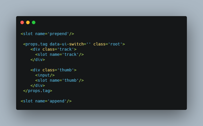
Structure ?
<slot name='prepend'/>

 <props.tag data-ui-switch='' class='root'>
    <div class='track'>
      <slot name='track'/>
    </div>

    <div class='thumb'>
      <input/>
      <slot name='thumb'/>
    </div>
 </props.tag>

<slot name='append'/>
Slots ?
| Name | Payload | Description |
|---|---|---|
| prepend |
|
Use this slot to render something else before the root component, commonly used for prepending a <label/> |
| track | Same as prepend | Use this slot to render anything inside the .track element |
| thumb | Same as prepend | Use this slot to render anything inside the .thumb element |
| default | Same as prepend | Use this slot to render anything inside the root element |
| append | Same as prepend | Use this slot to render something else after the root component, commonly used for appending a <label/> |
All slots are optional, and can accept multiple elements
Examples ?♀️
Simplest form
<div id='app'>
 <UiSwitch/>
</div>
With v-model
<div id='app'>
 <UiSwitch v-model='switch'/>
</div>
With an external <label>
<div id='app'>
 <label for='switch'>
  Toggle UiSwitch
 </label>

 <UiSwitch id='switch' v-model='switch'/>
</div>
With an internal <label> (prepend) and an internal validation message <span> (append)
<div id='app'>
 <UiSwitch id='switch'>
  <template v-slot:prepend='{active}'>
    <label for='switch'>
     Selected: {{active}}
    </label>
  </template>

  <template v-slot:append='{validation, toggle}'>
    <span v-if='validation.message' @click='toggle'>
     Error!
    </span>
  </template>
 </UiSwitch>
</div>
CSS variables
| Name | Default value | Description |
|---|---|---|
| –ui-height | 28px | Use this variable to set the root element’s height |
| –ui-width | 44px | Use this variable to set the root element’s width |
| –ui-track-height | 100% | Sets the height of the track |
| –ui-track-radius | 100% | Sets the border-radius of the track |
| –ui-track-background | #999 | Sets the background of the track |
| –ui-track-background-checked | #007bff | Sets the background of the track when the component is active |
| –ui-thumb-size | 25px | Sets the height and width of the .thumb element |
| –ui-thumb-radius | 50% | Sets the border-radius of the .thumb element |
| –ui-thumb-offset | 1.5px | The gap between the thumb and the edges |
| –ui-thumb-translatex |
|
Computes the active state transformation |
| –ui-thumb-background | #fff | The background of the thumb |