FlexDash: A Flexible Web IoT Dashboard
FlexDash is a dashboard that runs in the browser and is fully self-contained: feed it data over a websocket and save its config as a blob on the server and you have an IoT dashboard.
Special support for Node-RED is available in the form of a couple of FlexDash nodes in the node-red-contrib-flexdash npm package.
In more detail:
- The dashboard is built with Vue and Vuetify and uses web components to display typical IoT or home automation widgets: gauges, sparklines, plots, switches, data tables, etc.
- Serving up the dashboard is easy: it's just a bunch of static files. Editing and configuring the set of widgets is done directly in the browser.
- The dashboard connects to a server via a websocket or using socket.io, that's how it expects to be fed data. The data consists of simple json messages with a (hierarchical) topic and a payload. The widgets can then be hooked up to a specific topic and as data comes in for that topic it is displayed.
- The dashboard's configuration is saved over the websocket as a special topic. So the server should persist that topic's payload and replay it when a client connects.
- The dashboard is targeted to be used with Node-RED, but it is really very independent of Node-RED and could be hooked up to something as simple as a microcontroller, such as an esp32.
Getting started
The data you see is randomly generated internally, just enough to be able to play around a little. The demo includes help text that guides you through the dashboard as well as setting up data connections. Most widgets also include help text that becomes visible when editing an instantiation of the widget.
Concepts
There are a few core concepts in FlexDash that drive its functioning as well as user interface. This section explains each of them in some detail. It's probably best to read this after trying out the demo...
Topic tree
The topic tree is the concept used by FlexDash to organize data and, in particular, to link data sent by the server with widgets that display it. The topic tree is similar to pub/sub topics as used in MQTT, but not exactly.
The short description is that the server sends data using JSON messages that contain a topic property and a payload property. Each widget in the dashboard is then linked (you could say "subscribes to") a topic and displays the data in the payload. Topics are hierarchical using a slash as delimiter. A simple message might be something like:
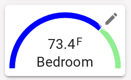
{ "topic": "sensors/house/bedroom/temperature", "payload": 65 }
And you might have a gauge widget whose value input is linked to that topic and then displays the last received temperature.
Arrays and objects
The topic tree does not have to contain just simple values, it can also contain arrays and objects. Unlike most pub/sub systems, a topic in FlexDash is really a path in a large JSON data structure and incoming messages insert or update data in that data structure. What this means is best described by example. Suppose the server sends a message like:
{ "topic": "sensors/house/bedroom",
  "payload": { "temperature": 65, "humidity": 43, "temp_color": "green", "temp_unit": "°F" }
}
Here the payload is an object and it replaces the subtree rooted at sensors/house/bedroom. The gauge in the previous example can still be bound to sensors/house/bedroom/temperature but in addition, the gauge's unit input can be bound to sensors/house/bedroom/temp_unit and its color input to sensors/house/bedroom/temp_color.
To display a time series plot the server might send a message like:
{ "topic": "timeseries/house/temperatures/data",
  "payload": [ [ 1623846600, 65, 72 ], [ 1623846900, 65.5, 73 ], ..., [ 1623889200, 68, 66 ] ]
}
This data consists of an array of "rows" where each row has a unix epoch timestamp (seconds since 1/1/1970) and two values. This type of data can be displayed by linking the input of a TimePlot widget to the above topic. The server can, in addition, send a second message with the names of the series being displayed, for example:
{ "topic": "timeseries/house/temperatures/series",
  "payload": [ "bedroom", "living room" ]
}
and this can be linked to the labels input of the TimePlot widget.
(For completeness sake it should be noted that a Gauge input linked to timeseries/house/temperatures/data/1/2 would show the value 73 as the /1/2 are interpreted as array indexes.)
Tabs, grids, panels, widgets
The FlexDash UI is organized hierarchically in tabs, grids, panels, and widgets. Panels are optional in that widgets can be placed directly into grids.
Tabs are full pages that display information. Each tab has an icon and/or a name and these are shown in the top-nav bar or the "hamburger button" activated left-nav on small devices.
Each tab can have one or multiple grids filled with widgets. Each grid spans the full width of the page and has variable height depending on the widgets it contains. The standard grid uses the relatively new CSS grid functionality configured as follows:
- each grid column has a minimum width and the browser places as many columns as fit the window and then expands all the columns just enough to fill the full window width.
- each grid row has a fixed height approx 1/2 of the column width.
- widgets can be configured to span multiple rows and columns.
- all widgets in a grid are in a 1-dimensional order, they are dropped into the grid in that order starting at the top-left corner and going across to the right and then wrapping to the next row.
- when widgets span columns this can cause gaps, for example, a large widget may not fit in the space left at the end of a row and wraps to the next row), small widgets that come later in the order are "moved up" by the browser to fill these gaps (to-do item: provide a UI option to turn this behavior off).
Overall the grid provides a "responsive" layout that reflows as needed on smaller displays yet uses the full width on larger ones. One constraint is that the grid always has at least as many columns as the widest widget. So if a grid has a 6-column wide widget that is the grid's narrowest configuration and may well be wider than a cell phone display, for example. The non-intuitive part here is that it's not just the wide widget that will exceed the width of the screen but the grid as a whole and thus other small widgets will be off-screen too (to-do item: figure out horizontal scrolling).
A widget is a display element that visualizes some data. It looks like a card in the UI and may have a title. A typical widget has a number of inputs that can be configured using the pencil edit icon in its top-right corner. Each input can have a static value, for example, setting the color to "red", or it can be linked/bound/subscribed to a topic as described in the previous section.
There is a special panel widget that can contain other widgets. The panel is an empty card that can be configured to contain a CSS grid with a specific number of columns and rows. This grid can then be filled just like the tabs' grid. The important difference is that the panel's CSS grid does not reflow or change with display size. Once configured to have a certain number of rows and columns and filled with an arrangement of widgets everything will stay exactly like that regardless of display or browser window resizing. This allows complex arrangements of widgets to be created that contain a number of visualizations and input elements whose placement relative to one another is important. Note that widgets placed into a panel do not have a card background: they sit flat in the panel's card.
(To be exact, the panel's grid columns and rows can expand slightly to fully fill the card, this happens as the outer grid's columns also expand slightly to fill the width of the page).
Iframes
In addition to the normal tabs, grids, and widgets it is possible to embed content from other sites into FlexDash using HTML IFrames. There are 3 different iframes to choose from: tab iframes, grid iframes and widget iframes.
Widget iframes are the simplest: they have a URL input and create an iframe the size of the widget into which the content from the URL is loaded.
Tab iframes are more complex in order to allow portions of sites with their own tabs to be embedded efficiently in FlexDash, this is particularly relevant to the std Node-RED dashboard. An iframe tab consists of a single iframe that takes up the entirety of the window below the top-nav bar. It is filled from a URL specified for the tab.
A special feature is that FlexDash provides two "iframe slots", which are used to embed multiple tabs of a site. The purpose of the slots is to avoid double navigation bars, i.e., the FlexDash top-nav and the embedded site's top-nav. This works particularly well with the std Node-RED dashboard because its top-nac can be disabled and it can be navigated using "hash navigation".
Without slots, if multiple tabs were created in FlexDash and each linked to a tab of the other site the web page would contain multiple copies of that other site, one for each such iframe tab. By using slots all the FlexDash tabs that embed the other site can use the same iframe slot, which means they actually display the same HTML iframe and cause the tab switch to happen by navigating the content of the iframe. The result is that there is only a single copy of the other site and switching from one of its tabs to another is efficient.
Live editing and undo
All editing in FlexDash is done live, i.e., changes occur immediately on the fully functioning dashboard. This makes it easy to try different settings and see the results. There is no "save" or "cancel" confirmation for anything. Instead, FlexDash has an undo button (in the top-nav on the right-hand side) which can quickly undo any mistake.
User input and Output events
User input such as toggling a switch widget also involves messages with topics, but these are not related to the topic tree above. Widgets that implement user input have one output which is linked to a topic. On user input the widget sends a JSON message with the configured topic and a payload representing the user's input to the server. The details of the payload depend on the widget.
The most tricky aspect of user input is the combination of direct visual feedback in FlexDash and the loop-back via the server showing effects of the action. It's easy to create situations that are confusing or misleading.
A trivial example is an ON button. When the user clicks the button the visual feedback consists of the button looking depressed for the brief duration of the click. Then a message goes to the server and causes some change and perhaps the server sends a message to FlexDash to turn a Stat widget from "OFF" to "ON". There's little to get confused by here.
A more tricky example is a toggle switch used to turn a light on/off, the reason being that the toggle is really both an indicator and an actuator: it shows the current state and it allows the user to change that state. When the user clicks on the toggle FlexDash shows the toggle moving from one state to the other so the user gets visual feedback. Then it sends a message to the server which must turn it back around to send the updated state back to FlexDash. This message will have no visual effect because it should essentially confirm the change that FlexDash has already performed. This loop-back is nevertheless required because other browser instances do not see the user action and need the message from the server to correctly reflect the new light switch state.
In the case of the toggle it would be possible to omit the local visual feedback because the loop-back through the server ought to happen in less than a second and so while the visual change of the switch might feel sluggish upon clicking it would be OK. But that is not the case for sliders or increment/decrement buttons on a numeric input. For this reason FlexDash widgets always provide immediate local visual feedback even though this risks being misleading if the message to the server gets lost.
Loading the dashboard
FlexDash consists of a bunch of static files that the browser loads. Once loaded, the web app then connects to a server (or multiple) to receive data and send user input. The FlexDash files can be hosted anywhere subject to a few constraints due to the various "same origin" policies enforced by browsers.
There are two hosted versions of FlexDash that can be accessed via tve/github.io/flexdash either using HTTP or using HTTPS. The details will probably undergo a few more changes in order to make everything more convenient...
Another recommended set-up is to serve the FlexDash files from the same server that will provide the data connection. When using Node-RED this can be done by enabling the static web server in the settings.js and unpacking the archive (oops, not readily available yet) in a directory.
The "same origin" policies cause the following constraints:
- If FlexDash is served by the same server that will also provide the data connection then everything is easy, "same server" means same protocol (http vs https), same hostname or IP address, and same port, if any of these differ it's not the "same origin".
- If FlexDash is served via HTTPS it is effectively impossible to establish a data connection via HTTP, instead, FlexDash has to be served via HTTP as well, or better yet, the data server should be upgraded to HTTPS.
- If FlexDash is served by a different server than the one it connects to for data the data server has to have CORS configured to allow the connection. Specifically, CORS needs to be configured to allow the server that serves up FlexDash as origin.
Details about CORS: CORS stands for Cross-Origin Resource Sharing and its purpose is to protect access to a data/API server. The primary threat is as follows. Suppose you access your data server using it's normal web app and, after logging in, your browser stores a login session cookie. You then happen to visit an innocuous looking web site but under the hood, invisible to you, the pages served by that web site connect from your browser to your data server and start to issue API commands. Because your server stored that cookie and includes the cookie in all requests to your data server these API commands will be authorized and potentially perform nefarious actions.
What configuring CORS entails is for your data server to tell the browser via a response header that it will accept a data connection / API calls from a web app served off a specific domain. So suppose your data server is https://my-node-red.example.com:1880 and you are using the hosted FlexDash from https://tve.github.com then the data server needs to respond with a Access-Control-Allowed-Origins:https://tve.github.com header (or alternatively the wildcard Access-Control-Allowed-Origins: *). If you use the FlexDash NPM module in Node-RED then it has support for the CORS configuration and is permissive by default.
Server connections, URL navigation, and saving the configuration
The text in this subsection is copied verbatim from the demo "guide", it needs to be rewritten.
When you brought up the dashboard it had no connection and established a "demo connection". The socket.io connection you added is only used as additional method for sending/receiving data. The dashboard configuration is not saved anywhere! So if you reload the browser you're back to demo square one.
FlexDash can connect to multiple servers to receive data and send user input but it uses only one connection to load its configuration from and save changes to. Since this connection is used to load the configuration it must be specified somehow when the dashboard is first loaded. This is accomplished by specifying a query string that configures the server connection from the get-go. For socket.io the query string has the form sio=http://example.com:1234/path, which, if running Node-Red locally might look as follows (FIXME: this example doesn't work due to http/https issues):
http://tve.github.io/flexdash/?sio=http://localhost:1880/io/flexdash/
To connect to a server using a plain websocket use a query string of the form ws=wss://example.com:2000/path.
It is also possible to open a specific tab at start-up (instead of the first tab) by appending a hash URL extension with the name or the icon name of the tab. E.g., append #mytab to the URL.
Persisting the configuration with Node-RED
To ensure that Node-RED persists the dashboard configuration a context store that uses the local filesystem instead of just memory may need to be enabled. The guide on working with context storage has some background, but the short is to locate the "contextStorage" setting in the `settings.js` and enable a context store with `localfilesystem`. The following example configuration provides a default memory context store and an optional persistent one:
contextStorage: {
    default: { module: "memory" },
    persistent: { module: "localfilesystem" }
},
After setting up the persistent context store its name needs to be entered into the FlexDash configuration node ("persistent" in the above example). After editing the settings Node-RED needs to be restarted for everything to take effect.
Once all the above is done do test the result! An easy way is to pull up the empty dashboard and inject one of the demo tabs. Then reload the browser and it should come right back with the dashboard that has the added demo tab. Then restart Node-RED and reload the browser again and you should still get the same dashboard with the added demo tab. If the demo tab is gone the localfilesystem context store didn't work.
At this point any changes made to the dashboard are persistent. The actual config can be found in the Node-RED admin UI using the context store panel and the global context variables.
Getting and creating panels and widgets
FlexDash comes with a small number of widgets built-in. In order to expand its functionality the following options are planned, from easiest to most complex... (All this is very preliminary and not yet worked out, it's really a "this is the plan" section!
Download ready-made widgets
All web components used in FlexDash (widgets are web components) are pre-processed and bundled. Published widgets you can download should consist of such a bundled file you can drop on your web server. Some details need to be worked out to tell FLexDash to load these widgets.
Assemble a panel
Sometimes custom functionality can be assembled using existing components creatively arranged in a panel. Just add a panel to your grid and then add widgets to that panel.
Write a custom panel
If a panel almost does it but you need some custom logic or more precise control over the visuals then you can write a custom panel-like widget, i.e., put together a few existing widgets and complement them with some custom logic. The Thermostat widget is an example that can be used as a starting point: its HTML template consists of stacking a few existing widgets and the Javascript code wires up all the inputs. This latter portion is a bit verbose and tedious, so this option is primarily useful if some custom logic is needed as well.
Write a custom widget
You can easily get started on a new widget by copying the source code file of an existing widget, making it available to FlexDash, and telling FlexDash to load it. The details of the last two steps need to be worked out but appear doable!
FlexDash will pre-process the source file and add the resulting widget to the palette so you can add it to a grid to test it out. If you change the widget source you can have FlexDash reload it.
The one gotcha with this method is that it's not great for "production" use after you finish working on your widget. The reason is that FlexDash will have to pre-process the source file each time it is loaded. For one widget this may be OK but as such source code widgets accumulate the lag will build up.
For "production" use you will need to pre-process and bundle the widget and use it just like you would use a downloaded widget (first section above).
Quick architecture overview (OUTDATED)
- FlexDash uses the Vue 2 web framework and the Vuetify component library for the UI, not much else. Moving to Vue 3 would be awesome but Vuetify doesn't support it yet, other component libraries for Vue don't either...
- At the very bottom layer of the UI are the widgets that show some data visualization. They are all loaded from
src/widgetsand are mostly pretty simple wrappers around some generic web component or some html/css/svg/... Writing new widgets is expected to be the main way to customize FlexDash. - The top-level component is in
src/Dash.vue, it manages the top-nav and plops down the appropriate grid for the selected tab. - Data connections are accessed via a network icon in the top-nav and the code is found in
src/connections. - The grid is in
src/grids/fixed-grid.vueand deals with laying out the widgets. It's a simple HTML grid currently. It also manages the editing, including the buttons in the toolbar at the top and dealing with cancel/save actions. - The grid is populated by widgets, the top level of that is
src/components/widget-edit.vuewhich implements the actual editing "drawer". It deals with figuring out the types of the inputs and producing the right input field. - Below that sits
src/components/widget-wrapper.vuewhich manages the live data feeds to the widgets. The configuration is passed down the component hierarchy but the data is bound by widget-wrapper to flow "directly" from the data store to the widget component. This data flow is reactive (like just about everything else) so widgets update as soon as new data shows up in the store. - The store is a simple object tree representing the topics and having data (payload) at the leaves. It is updated as data comes in from the server and any property of a widget can be bound to any value in the store (or be configured to a static value). Given the appropriate binding, it is thus possible to update the title, line thickness, color, or any propety of a widget by sending data from the server.
- The configuration of the dashboard is also held in the store under a top-level
$configkey. It consists of shallow denormalized arrays for tabs, grids, and widgets. Each entity has an ID and the hierarchy is connected by ID reference, e.g., a grid has an array of the widgets IDs it contains. The configuration for the demo mode can be found insrc/components/demo.vue. - There a start at unit tests in
tests/unitbut they haven't kept up.
Scripts
  npm run dev # start dev server
  npm run build # build for production
  npm run serve # locally preview production build