vue-toggle-btn
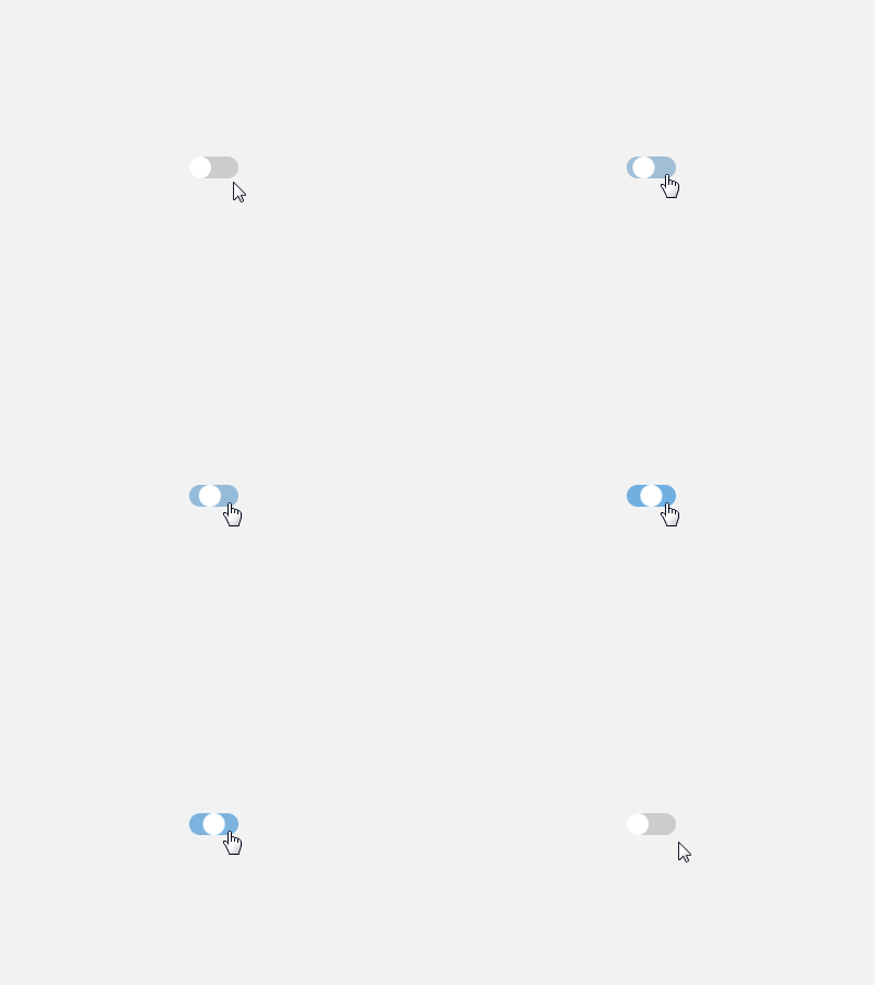
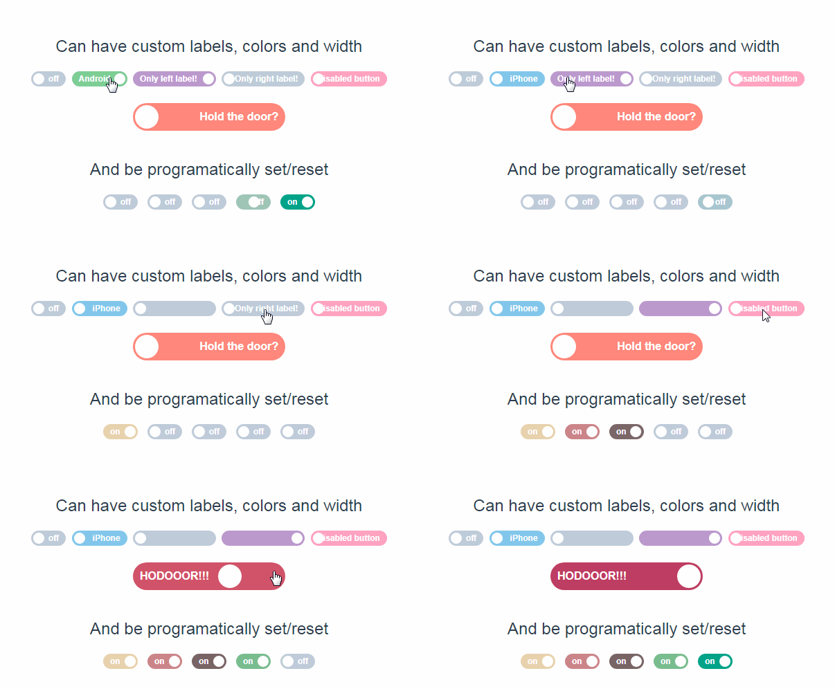
Vue.js Toggle Button - A dynamic, fully customizable toggle button aka toggle switch.
Usage
Install via NPM npm i vue-toggle-btn
Then require in your project:
var VueToggleBtn = require('vue-toggle-btn');
or ES6 syntax:
import VueToggleBtn from 'vue-toggle-btn';
Then you can register the component globally:
Vue.component('vue-toggle-btn', VueToggleBtn);
Or in your Vue component:
components: {
  ToggleBtn
}
You can then use the following selector anywhere in your project:
- To get up and running quick the package now supports rendering just the selector with default values
<vue-toggle-btn></vue-toggle-btn>
Properties
options is a full configuration object holding the toggle-button building blocks which are handle, track and isActive
| property | Type | Description |
|---|---|---|
| options | object | holds all toggle button style configurations |
| isActive | false | holds the current boolean state of the button - can be false or true |
| handle | object | holds all handle style configurations |
| track | object | holds all track style configurations |
handle
| property | Type | Default | Description |
|---|---|---|---|
| diameter | number | 30 | Sets the handle diameter (the round button moving) |
| color | string | #fff |
Sets the handle color |
| borderRadius | string | 50% |
Sets the handle border radius |
track
| property | Type | Default | Description |
|---|---|---|---|
| width | number | 70 | Sets the track width |
| height | number | 30 | Sets the track height |
| color | string | #ccc |
Sets the default track color |
| activeColor | string | #2196F3 |
Sets the active status track color(after toggled) |
| borderWidth | number | 0 | Sets the track border width |
| borderRadius | string | 34px |
Sets the track border radius |
events
| Event Name | Returns | Description |
|---|---|---|
| setIsActive | isActive |
Clicking the toggle button emits an its current isActive boolean state |
Listening to the event e.g:
<vue-toggle-btn @isActive="myLocalSetterFunction($event)"></vue-toggle-btn>
