vue-toastification
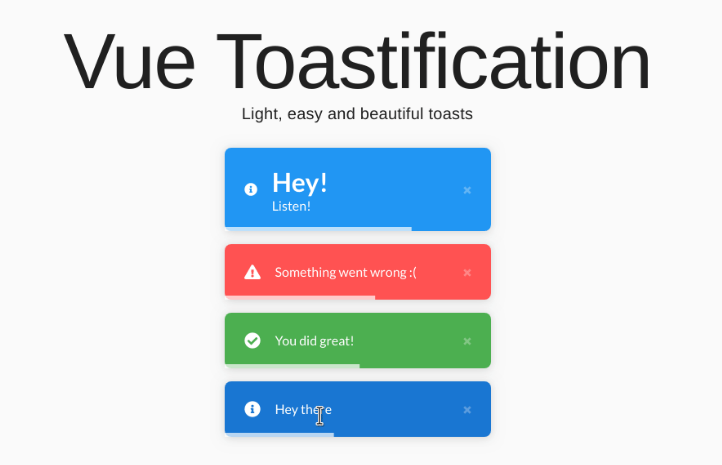
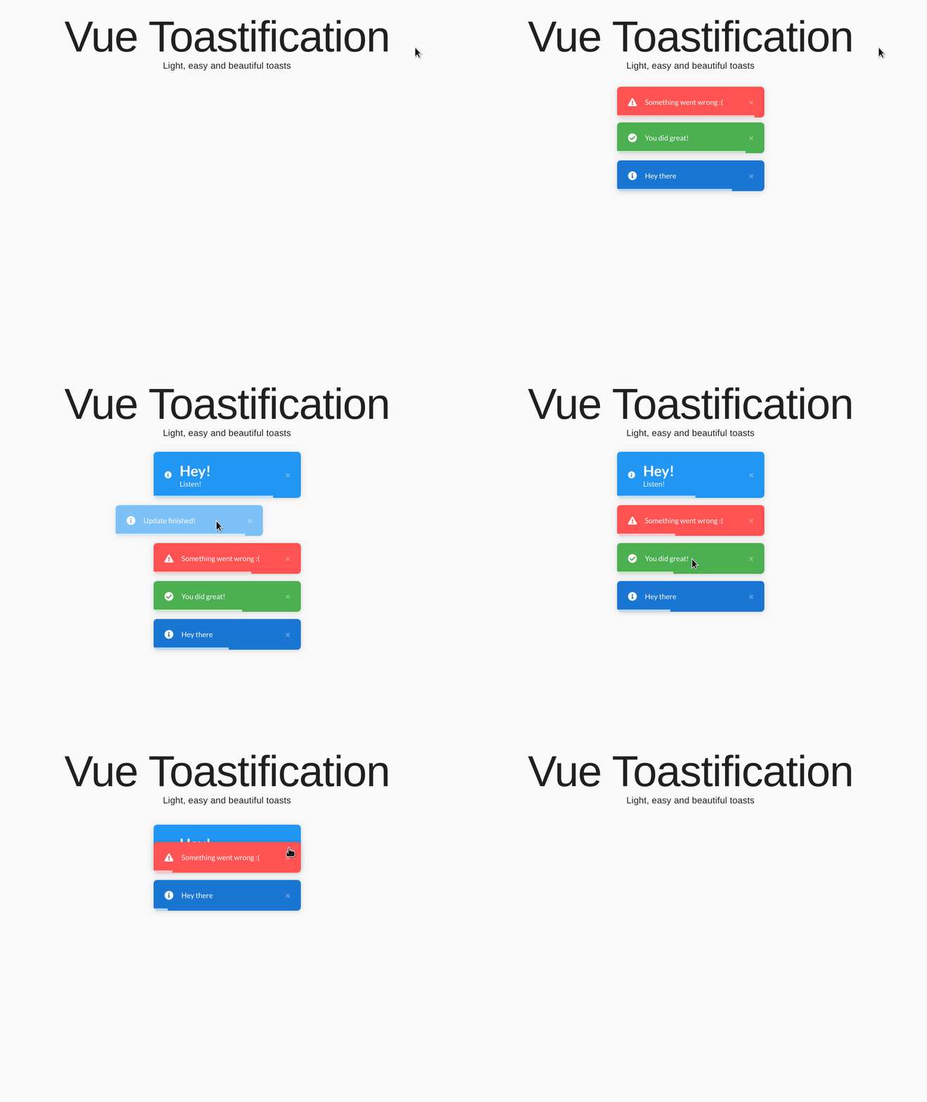
Vue notifications made easy,Light, easy and beautiful toasts.
Features
- Built-in Nuxt support
- Support for the new Composition API and Vue 3
- Generic registration allows it to be used inside any app, even React!
- Fully written in Typescript with full types support
- RTL support
- Easy to set up for real, you can make it work in less than 10sec!
- Customize everything
- Swipe to close ?
- Use your custom components or JSX as the toast body for endless possibilities!
- Create custom experiences with
onClose,onClick, andonMountedhooks - Custom toast filtering and enqueueing with lifecycle hooks
- Remove toasts programmatically
- Update toasts programmatically
- Define behavior per toast
- Pause toast when hovering and when the window loses focus ?
- Fancy progress bar to display the remaining time
- Use your themes and animations easily
- And much more!
Demo
Need some more convincing? Check out the demo
You can also check some examples.
Installation
$ yarn add vue-toastification
$ npm install --save vue-toastification
Usage
Plugin registration
Add it as a Vue plugin:
import Vue from "vue";
import Toast from "vue-toastification";
// Import the CSS or use your own!
import "vue-toastification/dist/index.css";

const options = {
    // You can set your default options here
};


Vue.use(Toast, options);
And then just call it in your components with
this.$toast("I'm a toast!");

// Or with options
this.$toast("My toast content", {
    timeout: 2000
});
// These options will override the options defined in the "Vue.use" plugin registration for this specific toast
Or reference in your Vuex store with
this._vm.$toast("I'm a toast!");

// Or with import
import Vue from "vue";

Vue.$toast("My toast content", {
    timeout: 2000
});
Nuxt registration
Vue Toastification comes with full Nuxt and Nuxt Typescript support.
Note: As a client library, Vue Toastification does not support SSR, so the object
$toastwill not be available on the server, only on the client.
To use it, register it as a Nuxt module:
// nuxt.config.js

export default {
  // ...
  modules: [
    // With default plugin options
    "vue-toastification/nuxt",

    // You can also pass plugin options
    ["vue-toastification/nuxt", {
      timeout: 1000,
      draggable: false
    }]
  ],

  // Or pass options through the "toast" key
  toast: {
    timeout: 2000,
    closeOnClick: false
  }
  // ...
}
If you are using Typescript with Nuxt, you may need to add "vue-toastification/nuxt" to your external types list to fully load them. e.g.:
// tsconfig.json

{
  "compilerOptions": {
    "types": [
      "vue-toastification/nuxt"
    ]
  }
}
Injecting the Toast CSS
By default, when you register the module within Nuxt it automatically injects the CSS required to display the toasts using the default vue-toastification/dist/index.css file.
If you have your own CSS file, you can instruct the module to inject it instead by providing its absolute path through the cssFile option. You can also disable CSS injection by setting cssFile: false:
// nuxt.config.js

export default {
  // ...
  modules: [
    "vue-toastification/nuxt",
  ],

  toast: {
    // Use your own CSS file
    cssFile: "path/to/your/file.scss",
    // Or disable CSS injection
    cssFile: false
  }
  // ...
}
If your CSS file is actually an SCSS or SASS file, just make sure that you have the correct loaders installed. See Nuxt docs on that.
Composition API registration
Vue Toastification comes with built-in support for the Composition API. It is fully optional and won't interfere with your usage if you do not use composition.
Composable plugins are a little different than regular Vue plugins as they rely on providers and injectors to work without access to the this keyword. Vue Toastification exposes two new functions to make that possible: provideToast and useToast.
Play with a live example here:
To access toasts inside setup, you first need to register the provider. To make the toasts available from anywhere within your application, set up the provider on the root component of your app:
// App.vue

// Import from vue-toastification/composition, not vue-toastification
import { provideToast } from "vue-toastification/composition";
// Also import the toast's css
import "vue-toastification/dist/index.css";

// Then, on the setup method
  setup() {
    // Pass the Plugin Options here
    provideToast({ timeout: 3000 });
    // This is similar to `Vue.use(Toast)`, but will not register `$toast` to the Vue instance.
  }
Then get access to the toast interface on your components with useToast:
// MyComponent.vue

import { useToast } from "vue-toastification/composition";
// ...

  setup() {
    // Same interface as this.$toast
    const toast = useToast();

    const showToast = () => toast.success("I'm a toast!");
    const clearToasts = () => toast.clear();
    return { showToast, clearToasts };
  }
Each call to provideToast will generate an independent version of the plugin available to its descendants through useToast. This means that if you call provideToast in multiple locations, each one will mount an independent toast container. useToast will always return the toast interface of the closest provideToast call in its parent component tree.
The toast interface returned by useToast can, however, point to an arbitrary plugin instance if you provide an eventBus to it. Event buses are Vue instances used to carry events between the interface and the plugin. They are automatically generated for you, but you can also specify your own when calling Vue.use(Toast) or provideToast():
// Create a new event bus
const eventBus = new Vue();

// Pass it to provideToast as a plugin option
provideToast({ eventBus });
// Or register with Vue.use
Vue.use(Toast, { eventBus });

// Get the interface of the closes parent plugin instance
const toast = useToast();
// Get the interface of an arbitrary plugin instance
const toast = useToast(eventBus);
Generic registration
Vue Toastification allows you to register it as a generic interface not bound to Vue as a plugin. That may be useful if you are using it in an app not written in Vue.
It still depends on Vue as a framework, but not on the root vue instance of your page.
Play with a live React.js demo here:
To register it, use the createToastInterface helper:
import { createToastInterface } from "vue-toastification";

const pluginOptions = {
  timeout: 4000
};

// Create the interface
const toast = createToastInterface(pluginOptions);

// Use it
toast.success("Standalone toasts!");
When you call createToastInterface, it will automatically mount the toast container and sets everything for you. It returns a toast interface and you can use it as you would with this.$toast.
createToastInterface may take a second, optional, Vue instance parameter. Use it to specify an optional parent Vue instance to the interface.
You can also create just the toast interface without mounting the plugin by passing just an event bus instance to createToastInterface. Event buses are simple Vue instances used to pass events around the plugin. They are created automatically, but you can specify your own if you need to get access to the interface elsewhere.
// Create a new event bus
const eventBus = new Vue();

// Mount plugin and return an interface
const toast1 = createToastInterface({ eventBus });

// Later retrieve a copy of that interface without mounting the plugin again
const toast2 = createToastInterface(eventBus);

// Note that on the second call just the eventBus was passed, not as an object but as
// a reference to the bus.
Positioning the Toast
By default, the toasts will be displayed at the top right corner of your screen, but you can set it manually using the position option.
You can use the type definitions or one of the allowed values: top-right, top-center, top-left, bottom-right, bottom-center, bottom-left.
import Toast, { POSITION } from "vue-toastification";

Vue.use(Toast, {
    // Setting the global default position
    position: POSITION.TOP_LEFT
});


// Or set it per toast
this.$toast("I'm a toast", { position: POSITION.BOTTOM_LEFT });
Toast types
Depending on the context, you may want to use toasts of different colors. You can easily do that by setting the type of toast to be displayed.
this.$toast("Default toast");
this.$toast.info("Info toast");
this.$toast.success("Success toast");
this.$toast.error("Error toast");
this.$toast.warning("Warning toast");

// You can also set the type programmatically when calling the default toast
import { TYPE } from "vue-toastification";

this.$toast("Also a success toast", {
    type: TYPE.SUCCESS  // or "success", "error", "default", "info" and "warning"
});
Setting the type only works when using this.$toast, it won't work when registering the plugin with Vue.use.
Setting the toast timeout
You can set for how long the toast will remain on the screen (in milliseconds) using the timeout option or disable it altogether by setting it to false
// 1 second
this.$toast("Quick toast", { timeout: 1000 });

// Or make the toast permanent until manually closed
this.$toast("Persistent toast", { timeout: false })

// Or set it when registering the plugin
Vue.use(Toast, { timeout: 2000 });
Using a custom component
Passing strings as the toast content is not enough? You can render anything inside the toast using custom components! Vue Toastification accepts both Vue Components and JSX templates as parameters.
When using custom components, the prop toastId containing the toast ID is always passed by default. Also, an event listener for close-toast is attached, so you can close the toast programmatically by emitting it from inside the component.
See an example with custom components in action:
Render a component
To use a Single File Component as content just pass it to the toast:
import MyComponent from "./MyComponent.vue";

this.$toast(MyComponent);
Close the toast using a custom component
When using custom components it is also possible to close the toast from within.
To do that, just emit the close-toast event
// MyComponent.vue

<template>
    <button @click="$emit('close-toast')">Close Toast</button>
</template>


// OtherFile.vue
import MyComponent from "./MyComponent.vue";


// This toast will be closed when the button inside it is clicked
this.$toast(MyComponent);
Render a JSX component
Sometimes you won't want to create a whole component just for a toast. In those cases, you can pass a JSX template to the Toast for it to render as a component
Note: Read this to learn how to enable JSX inside of Vue
const myJSX = (
    <div>
        <h1>My Title</h1>
        <span>My text</span>
    </div>
);

// Vue Toastification will generate the appropriate render function automatically.
this.$toast(myJSX);
Render a component with props and events
Usually, it is not enough to just render a simple component and you'll need to handle events or pass props. You can do that too!
Just pass the content in the format
{
    component: Component,
    props:  {
        propName: propValue  // Optional
    },
    listeners: {
        eventName: eventHandler  // Optional
    }
}
Props will be passed to the created component and the event listeners will be attached to it as well.
Note: Props passed are not reactive
const content = {
    // Your component or JSX template
    component: MyComponent,

    // Props are just regular props, but these won't be reactive
    props: {
        myProp: "abc",
        otherProp: 123
    },

    // Listeners will listen to and execute on event emission
    listeners: {
        click: () => console.log("Clicked!"),
        myEvent: myEventHandler
    }
};


this.$toast(content);
Dismiss toasts programmatically
When a toast is created, an ID is assigned to it. You can use it later to programmatically dismiss the toast.
You can also choose a custom ID (String or Number) for the toast during its creation.
// Get the toast ID on creation
const toastId = this.$toast("my toast");

// Dismiss it later
this.$toast.dismiss(toastId);

// Pass your custom ID to the toast
this.$toast("my other toast", { id: "my id" });
this.$toast.dismiss("my id");
Update toasts programmatically
You can update toasts contents and props programmatically using its ID.
The method signature is $toast.update(id, { content, options }, create) with content, options and create being optional. Updates override previous values.
create is a boolean, false by default. If true, a toast will be created if no matching toast with the id is found.
// Get the toast ID on creation
const toastId = this.$toast("Loading...");

// Update it later
this.$toast.update(toastId, { content: "Loaded!" });

// Pass your custom ID to the toast
this.$toast("my other toast", { id: "my id", timeout: false });
this.$toast.update("my id", { content: "Finished!", options: { timeout: 5000 } });
Note: The remaining timeout of the toast will be carried on updates. To reset the timeout, simply pass a
timeoutoption during the update. It can be the same as the one set during the toast creation.
Clear all toasts
You can also dismiss all toasts at once using clear.
this.$toast("my toast A");
this.$toast("my toast B");
this.$toast("my toast C");

// Dismiss all toasts
this.$toast.clear();
Styling
There are two ways to style your toast components. You can either add custom classes to the toast or containers and modify them using those or you can override the actual toast's SCSS when importing them.
Custom toast classes
this.$toast("my toast", {
    // For the actual toast, including different toast types:
    toastClassName: "my-custom-toast-class",

    // For the toast body when using strings or a custom component as content
    bodyClassName: ["custom-class-1", "custom-class-2"]
});
<style>
/* When setting CSS, remember that priority increases with specificity, so don't forget to select the exisiting classes as well */

    .Vue-Toastification__toast--default.my-custom-toast-class {
        background-color: red;
    }

    /* Applied to the toast body when using regular strings as content */
    .Vue-Toastification__toast-body.custom-class-1 {
        font-size: 30px;
    }

    /* Applied to a wrapper div when using a custom component as content */
    .Vue-Toastification__toast-component-body.custom-class-2 {
        width: 100%;
    }
</style>
These can also be defined when registering the vue plugin.
Note:
bodyClassNames applied to toasts that use a custom component are not applied to the custom component itself. Instead, they are applied to adivthat wraps the custom component.
Custom toast container classes
You can also add custom classes to the toast's containers. Keep in mind that here containers refer to the 6 divs that contain the toasts in the 6 possible toast positions (top-right, top-left, etc).
These classes can be defined during plugin initialization.
Vue.use(Toast, {
    // Can be either a string or an array of strings
    containerClassName: "my-container-class",
});
<style>
/* When setting CSS, remember that priority increases with specificity, so don't forget to select the exisiting classes as well */

    /* This will only affect the top-right container */
    .Vue-Toastification__container.top-right.my-container-class{
        top: 10em;
    }

    /* This will affect all 6 containers */
    .Vue-Toastification__container.my-container-class{
        position: relative;
    }
</style>
Override SCSS variables
There is a set of pre defined variables that you can override to change some basic styling.
If you have an SCSS loader in your project, simply create a file overriding the defaults
// yourMainScssFile.scss

// Override the variables or import a file that overrides them
$vt-color-success: white;
$vt-text-color-success: #000;

// Import the regular Vue Toastification stylesheets (or create your own)
@import "vue-toastification/src/scss/_variables";
@import "vue-toastification/src/scss/_toastContainer";
@import "vue-toastification/src/scss/_toast";
@import "vue-toastification/src/scss/_closeButton";
@import "vue-toastification/src/scss/_progressBar";
@import "vue-toastification/src/scss/_icon";
@import "vue-toastification/src/scss/animations/_bounce";
Then you import it when registering the plugin
import Vue from "vue";
import Toast from "vue-toastification";

// The magic is here
import "./yourMainScssFile.scss";

Vue.use(Toast);
Right to left support
Right to left layouts are also supported. It can be enabled per toast or globally through plugin options:
// Set RTL on individual toasts
this.$toast.success("!detrevnI", { rtl: true });

// Or globally
Vue.use(Toast, {
  rtl: true
});
Transitions
Vue Toastification comes with built-in transitions, but you can also customize your own.
Default Usage using the built-in bounce transition:
Vue.use(Toast, {
  transition: "Vue-Toastification__bounce",
  maxToasts: 20,
  newestOnTop: true
});
Some of the currently available built-in transitions are:
- Bounce (default): Set the transition property to "Vue-Toastification__bounce"
- Fade-In / Out: Set the transition property to "Vue-Toastification__fade"
- Slide-In / Out (Blurred): Set the transition property to "Vue-Toastification__slideBlurred"
However, new ones may be added so be sure to check the live demo page for the updated list.
Custom transitions
When registering the plugin you can use your custom transitions as the toasts' transitions. You can use both named transitions or the transition classes separately.
Vue Toastification uses Vue's built-in transition-group components, so read how they work before creating your own.
Note: You only need to implement the
enter-active,leave-activeandmovetransition classes.
We'll use the following transition in our examples:
@keyframes fadeIn {
  from {
    opacity: 0;
  }
  to {
    opacity: 1;
  }
}
@keyframes fadeOut {
  from {
    opacity: 1;
  }
  to {
    opacity: 0;
  }
}
.fade-enter-active {
  animation-name: fadeIn;
}
.fade-leave-active {
  animation-name: fadeOut;
}
.fade-move {
  transition-timing-function: ease-in-out;
  transition-property: all;
  transition-duration: 400ms;
}
Named transitions
To setup named transitions just pass the transition name.
Using the transition defined above, we can use it like so:
Vue.use(Toast, {
    transition: "fade"
});
Transition classes
You can also specify which entering, leaving and moving transitions to use. Please note that if you use custom transition classes you'll need to specify all 3 classes for it to work.
You can, however, use Vue Toastification's default "bounce" transition to fill the gaps. Its classes are Vue-Toastification__bounce-enter-active, Vue-Toastification__bounce-leave-active and Vue-Toastification__bounce-move.
Example using a mix of fade and bounce transitions:
Vue.use(Toast, {
    transition: {
        enter: "fade-enter-active",
        leave: "Vue-Toastification__bounce-leave-active",
        move: "fade-move"
    }
});
Transition durations
You can change transition timings with the transitionDuration option.
It can either be a number representing the transition duration for both enter and leave transitions, or you can specify both separately.
// Set both entering and leaving transitions to 500 ms
Vue.use(Toast, {
    transitionDuration: 500
});

// Set entering to 100 and leaving to 700
Vue.use(Toast, {
    transitionDuration: {
      enter: 100,
      leave: 700
    }
});
Toast Icons
By default, all toasts will come with a little icon to the left representing what the message is about. These are fully customizable as you'll see.
Disabling icons
You can entirely disable the icon from the toast by setting icon: false when either registering the plugin or creating toasts. Without the icon, the toast's content will fill its place and appear closer to the edge.
// Disable every toast's icon by default
Vue.use(Toast, {
    icon: false
});

// Disable icons per toast
this.$toast('No icon!', { icon: false });
Using custom icons
You can also use custom icons with the icon option. To do so, you'll probably need to install these icons in your app with an icon library, such as FontAwesome or Material Icons.
You can also install a Vue icon library with custom components, such as Vue FontAwesome.
Using them varies between icon libraries. You can either override icon classes with icon: "my-icon-class", pass a custom component / JSX, or you can set up more complex icon systems by passing an object. Let's look at the options with some examples:
// Using Font Awesome icons
this.$toast('Icons are awesome!', { icon: 'fas fa-rocket' });

// Using Material Icons
this.$toast('Material icons!', {
  icon: {
    iconClass: 'material-icons',  // Optional
    iconChildren: 'check_circle', // Optional
    iconTag: 'span'               // Optional
  }
});
As you can see, we can either just pass a string or define classes, children, and tags for our icons.
When you just pass a string, for example fas fa-rocket, the rendered component will look like:
<i class="fas fa-rocket"></i>
If your icon library supports that, then you're good to go!
Other libraries require you to define icons with ligatures. To support that, Vue Toastification allows you to construct your icon component through some options: iconClass, iconChildren and iconTag.
Taking the Material Icon example from above, the rendered component would look like:
<span class="material-icons">check_circle</span>
Both examples will have an extra class, Vue-Toastification__icon. You can see what it does here or you can override it with your CSS classes.
Close Button
You can modify the toast close buttons in 3 ways:
- Hide it
- Use a custom component instead of the standard one
- Add extra classes to it
Hiding the close button
To hide it, simply set closeButton to false when calling the toast or setting up the plugin
this.$toast('No close button', {
  closeButton: false
});
Only show the close button on hover
You can also hide the close button unless the toast is being hovered. To do so, set showCloseButtonOnHover to true when calling the toast or setting up the plugin
this.$toast('No close button', {
  showCloseButtonOnHover: true
});
Custom close button component
You can also use custom components as close buttons. It accepts Single File Components, JSX and tag names:
this.$toast('With a custom close component', {
  closeButton: MyComponent
});
Custom close button classes
The close button can be customized with custom classes. These can be either a single string or an array of strings
this.$toast('With custom classes', {
  closeButtonClassName: "my-button-class"
});
Presetting default toast options per type
If you want to unify the behavior throughout the application and Don't Repeat Yourself, you could extract the default behavior for each type of toast.
import Toast, { TYPE } from "vue-toastification";

const options = {
    toastDefaults: {
        // ToastOptions object for each type of toast
        [TYPE.ERROR]: {
            timeout: 10000,
            closeButton: false,
        },
        [TYPE.SUCCESS]: {
            timeout: 3000,
            hideProgressBar: true,
        }
    }
};


Vue.use(Toast, options);
Updating default options
Some options are only available when registering the plugin, like transition, maxToasts and others. If you need to update those options in runtime, there is a method you can call to update the default options:
const update = {
    transition: "my-transition"
};

this.$toast.updateDefaults(update);
Note:
updateDefaultswill do a shallow update on your default options.
You can use updateDefaults to update any of the default API options, but be careful as they are updated globally, so all new toasts will share the new defaults.
Custom toast filters
Some applications require custom logic to select which toasts to display and how to display them. To solve this issue, Vue Toastification provides you with two callback functions that give you fine control of your toasts. These are filterBeforeCreate and filterToasts.
filterBeforeCreate
Called just before toast creation, filterBeforeCreate allows you to edit toast props in runtime or discard toasts entirely.
It takes two parameters:
- The new toast's props
- A list of existing toasts
It must return the modified toast props, or false to discard the toast.
Example implementation of a preventDuplicates feature, which prevents toasts of the same type from appearing simultaneously:
// App.js

// Prevents toasts of the same type from appearing simultaneously, discarding duplicates
const filterBeforeCreate = (toast, toasts) => {
  if (toasts.filter(t => t.type === toast.type).length !== 0) {
    // Returning false discards the toast
    return false;
  }
  // You can modify the toast if you want
  return toast;
}

Vue.use(Toast, { filterBeforeCreate });
filterToasts
This callback enables you to filter created toasts from being rendered. It differs from filterBeforeCreate by allowing you to enqueue toasts, as opposed to the former, which allows you to discard them.
It takes the list of created toasts and must return a list of toasts to be rendered. Filtered toasts may be rendered later on.
Another example of preventDuplicates feature that enqueues toasts instead of discarding them:
// App.js

// Enqueues toasts of the same type, preventing duplicates
const filterToasts = (toasts) => {
  // Keep track of existing types
  const types = {};
  return toasts.reduce((aggToasts, toast) => {
    // Check if type was not seen before
    if (!types[toast.type]) {
      aggToasts.push(toast);
      types[toast.type] = true;
    }
    return aggToasts;
  }, []);
}

Vue.use(Toast, { filterToasts });
Custom toast containers
By default, all toasts are mounted to a div that is a direct child of document.body, but your application may require that toasts be mounted elsewhere for whatever reason. Vue Toastification allows you to do that by accepting a container plugin option. That option may be either an HTMLElement or a function that returns or resolves into an HTMLElement.
Existing nodes as toast containers
To use an existing node, simply pass it as the argument:
// App.js

const myContainer = document.querySelector('#my-container');

Vue.use(Toast, { container: myContainer });
You may also use a function that returns the node:
// App.js

const getContainer = () => document.querySelector('#my-container');

Vue.use(Toast, { container: getContainer });
Async nodes as toast containers
Sometimes your node may not exist by the time the plugin is initialized. This may happen if, for example, it is created by Vue. To dynamically mount your component, pass an async function that resolves into a node instead.
The example below uses the Mutation Observer API to test for a node identifiable by the ID toast-container:
// App.js

function asyncGetContainer() {
  return new Promise(resolve => {
    const observer = new MutationObserver(function(mutations, me) {
      const myContainer = document.getElementById("toast-container");
      if (myContainer) {
        me.disconnect();
        resolve(myContainer);
      }
    });
    observer.observe(document, {
      childList: true,
      subtree: true
    });
  });
}

Vue.use(Toast, { container: asyncGetContainer });
When setting up a container this way, all calls to this.$toast will still be executed successfully and the toasts will be displayed all at once when it is mounted.
API
Plugin registration (Vue.use)
| Option | Type | Default | Description |
|---|---|---|---|
| position | String | top-right |
Position of the toast on the screen. Can be any of top-right, top-center, top-left, bottom-right, bottom-center, bottom-left. |
| newestOnTop | Boolean | true |
Whether or not the newest toasts are placed on the top of the stack. |
| maxToasts | Number | 20 |
Maximum number of toasts on each stack at a time. Overflows wait until older toasts are dismissed to appear. |
| transition | String or Object | Vue-Toastification__bounce |
Name of the Vue Transition or object with classes to use. Only enter-active, leave-active and move are applied. |
| transitionDuration | Number or Object | 750 |
Duration of the transition. Can either be a positive integer for both enter and leave, or an object of shape {enter: Number, leave: Number}. |
| draggable | Boolean | true |
Whether or not the toast can be dismissed by being dragged to the side. |
| draggablePercent | Positive Number | 0.6 |
By how much of the toast width in percent (0 to 1) it must be dragged before being dismissed. |
| pauseOnFocusLoss | Boolean | true |
Whether or not the toast is paused when the window loses focus. |
| pauseOnHover | Boolean | true |
Whether or not the toast is paused when it is hovered by the mouse. |
| closeOnClick | Boolean | true |
Whether or not the toast is closed when clicked. |
| timeout | Positive Integer or false | 5000 |
How many milliseconds for the toast to be auto dismissed, or false to disable. |
| container | HTMLElement or function that returns/resolves into an HTMLElement | document.body |
Container where the toasts are mounted. |
| toastClassName | String or Array of Strings | [] |
Custom classes applied to the toast. |
| bodyClassName | String or Array of Strings | [] |
Custom classes applied to the body of the toast. |
| hideProgressBar | Boolean | false |
Whether or not the progress bar is hidden. |
| icon | Boolean, String, Object Vue Component or JSX | true |
Custom icon class to be used. When set to true, the icon is set automatically depending on the toast type and false disables the icon. Object shape is { iconClass: String, iconChildren: String, iconTag: String } |
| toastDefaults | Object | undefined |
Toast's defaults object for configuring default toast options for each toast type. |
| filterBeforeCreate | Function | NOOP |
Callback to filter toasts before their creation. Takes a toast and toasts argument and returns a toast or false |
| filterToasts | Function | NOOP |
Callback to filter created toasts. Takes a list of toasts argument and return a filtered list of toasts |
| closeButtonClassName | String or Array of Strings | [] |
Custom classes applied to the close button of the toast. |
| closeButton | false, Vue Component, JSX or HTML Tag name |
"button" |
Custom component that can be used as the close button. |
| showCloseButtonOnHover | Boolean | false |
Only shows the close button when hovering the toast. |
| containerClassName | String or Array of Strings | [] |
Extra CSS class or classes added to each of the Toast containers. |
| onMounted | Function (containerComponent) => void |
undefined |
Callback executed when the Toast container is mounted. Receives the container vue instance as a parameter. |
| accessibility | { toastRole?: string; closeButtonLabel?: string } |
{ toastRole: "alert", closeButtonLabel: "close" } |
Accessibility options. Define the role attribute of the toast body and the aria-label attribute of the close button. |
| rtl | Boolean | false |
Enables Right to Left layout. |
| eventBus | Vue Instance (new Vue()) |
auto generated | Vue instance used to pass events between the interface and the plugin instance. |
Toast (this.$toast)
| Parameter | Type | Required | Description |
|---|---|---|---|
| content | String, Vue Component, JSX or Object | Yes | Toast contents. It can either be a string, a Vue Component, a JSX template or an Object. The shape of the object and its properties are described here |
| options | Object | No | Toast options. Described here |
Toast Content Object
| Prop | Type | Required | Description |
|---|---|---|---|
| component | Vue Component or JSX | Yes | Component that will be rendered. |
| props | Object | No | propName: propValue pairs of props that will be passed to the component. These are not reactive |
| listeners | Object | No | eventName: eventHandler pairs of events that the component can emit. |
Toast Options Object
| Option | Type | Default | Description |
|---|---|---|---|
| id | Number or String | auto |
ID of the toast. |
| type | String | default |
Type of the toast. Can be any of success, error, default, info and warning |
| position | String | top-right |
Position of the toast on the screen. Can be any of top-right, top-center, top-left, bottom-right, bottom-center, bottom-left. |
| draggable | Boolean | true |
Whether or not the toast can be dismissed by being dragged to the side. |
| draggablePercent | Positive Number | 0.6 |
By how much of the toast width in percent (0 to 1) it must be dragged before being dismissed. |
| pauseOnFocusLoss | Boolean | true |
Whether or not the toast is paused when the window loses focus. |
| pauseOnHover | Boolean | true |
Whether or not the toast is paused when it is hovered by the mouse. |
| closeOnClick | Boolean | true |
Whether or not the toast is closed when clicked. |
| onClick | Function | NOOP |
Callback executed when the toast is clicked. A closeToast callback is passed as an argument to onClick when it is called. |
| onClose | Function | NOOP |
Callback executed when the toast is closed. |
| timeout | Positive Integer or false | 5000 |
How many milliseconds for the toast to be auto dismissed, or false to disable. |
| toastClassName | String or Array of Strings | [] |
Custom classes applied to the toast. |
| bodyClassName | String or Array of Strings | [] |
Custom classes applied to the body of the toast. |
| hideProgressBar | Boolean | false |
Whether or not the progress bar is hidden. |
| icon | Boolean, String, Object Vue Component or JSX | true |
Custom icon class to be used. When set to true, the icon is set automatically depending on the toast type and false disables the icon. Object shape is { iconClass: String, iconChildren: String, iconTag: String } |
| closeButtonClassName | String or Array of Strings | [] |
Custom classes applied to the close button of the toast. |
| closeButton | false, Vue Component, JSX or HTML Tag name |
"button" |
Custom component that can be used as the close button. |
| showCloseButtonOnHover | Boolean | false |
Only shows the close button when hovering the toast. |
| accessibility | { toastRole?: string; closeButtonLabel?: string } |
{ toastRole: "alert", closeButtonLabel: "close" } |
Accessibility options. Define the role attribute of the toast body and the aria-label attribute of the close button. |
| rtl | Boolean | false |
Enables Right to Left layout. |
