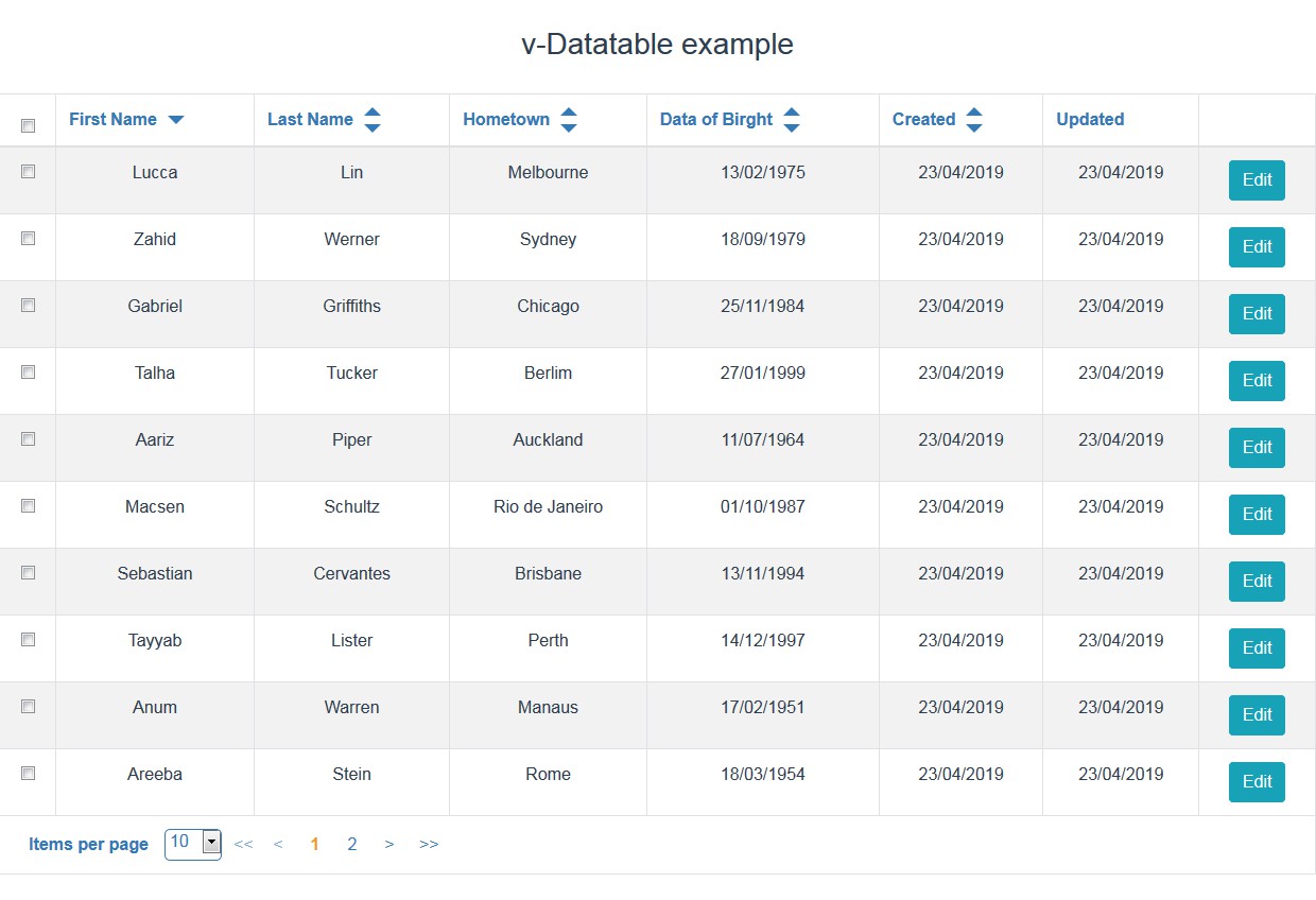
v-datatable-light
A lightweight vue datatable component with no dependencies.
Usage
<DataTable
  :header-fields="headerFields"
  :data="data"
/>
import { DataTable } from 'v-datatable-light'

export default {
  components: {
    DataTable
  }
}
DataTable Props
| Field | Type | Required | default | Description |
|---|---|---|---|---|
| headerFields | array | true | null | Definition of each column of the table. In each item of this array you will define how this column will behave. |
| data | array | true | null | Array of objects that will feed the datatable. |
| isLoading | boolean | false | false | Flag to indicate to datatable if the data is loading. If it is, your spinner slot will be show. |
| sortField | string | false | null | To indicate by which field the datatable is sorted for. |
| sort | string | false | null | To indicate by which direction the databale is sorted for ('asc' or 'desc'). |
| notFoundMsg | string | false | null | Message to by show when no data was found. |
| trackBy | string | false | 'id' | An unique id column used for checkbox column type to compare if a field is checked or not. |
| css | object | false | Structure | An object with attributes used to add css classes to DataTable internal elements. |
| tableHeight | string | false | null | Used to have fixed header in the table. |
| defaultColumnWidth | string | false | '150px' | Set the default column with, only used when 'tableHeight' prop is informed. |
DataTable Header Fields Props
| Name | Type | Required | Default | Description |
|---|---|---|---|---|
| name | string | true | null | Attribute that the DataTable will try to retrieve the value from the data item. |
| label | string | true | null | Attribute that the DataTable will show on the header for the column. |
| sortable | boolean | false | false | Define if that column will be sortable or not. In case the value is true, two arrows will be show on the header. |
| customElement | boolean | string | false | null |
| format | function | false | null | A function used to format a value in each line of the DataTable's body. |
| width | string | false | null | String used to define column width. Only used when 'tableHeight' props is informed. |
| __slot:actions | string | false | null | Used to create a new column to be used for buttons or any kind of action. You have to inform the slot 'actions' and it will be rendered inside each line. In case you want to use more than one action in the same table, you can inform different IDs for each one, and this ID will be used as the slot ID. The format would be: __slot:actions:myActionID, in this case myActionID is the slot ID |
| __slot:checkboxes | string | false | null | Used to create a column with a checkbox. Every time you check or uncheck an item an event is emited. |
DataTable Css Props Structure
| Name | Type | Required | Default | Description |
|---|---|---|---|---|
| table | string | false | '' | Applied on the table element. |
| thead | string | false | '' | Applied on the table thead element. |
| theadTr | string | false | '' | Applied on the table thead tr elements. |
| theadTh | string | false | '' | Applied on the table thead th elements. |
| tbody | string | false | '' | Applied on the table tbody element. |
| tbodyTr | string | false | '' | Applied on the table tbody tr elements. |
| tbodyTd | string | false | '' | Applied on the table tbody td elements. |
| tbodyTrSpinner | string | false | '' | Applied on the table tbody tr element when the spinner is displayed. |
| tbodyTdSpinner | string | false | '' | Applied on the table tbody td element when the spinner is displayed. |
| tfoot | string | false | '' | Applied on the table tfoot element. |
| tfootTr | string | false | '' | Applied on the table tfoot tr element. |
| tfootTd | string | false | '' | Applied on the table tfoot td element. |
| footer | string | false | '' | Applied on the table tfoot div element wrapping the slots. |
| thWrapper | string | false | '' | Applied on div inside the table thead th element wrapping the column header content. |
| thWrapperCheckboxes | string | false | '' | Applied on div inside the table thead th element wrapping the column header content when it is a checkbox. |
| arrowsWrapper | string | false | '' | Applied on div inside the table thead th element wrapping the arrows. |
| arrowUp | string | false | '' | Applied on div inside the table thead th element where the arrow up is draw. |
| arrowDown | string | false | '' | Applied on div inside the table thead th element where the arrow down is draw. |
| checkboxHeader | string | false | '' | Applied on the table thead checkbox element. |
| checkbox | string | false | '' | Applied on the table tbody checkbox elements. |
| notFoundTr | string | false | '' | Applied on the table tbody tr element when the data is empty. |
| notFoundTd | string | false | '' | Applied on the table tbody td element when the data is empty. |
Pagination Props
| Name | Type | Required | Default | Description |
|---|---|---|---|---|
| totalItems | number | true | null | Total of items in your storage. |
| itemsPerPage | number | false | 10 | Number of items displayed per page. |
| page | number | false | 1 | Current page index. |
| moveLastPage | boolean | false | true | Flag to show or not the button to move to the last page. |
| moveFirstPage | boolean | false | true | Flag to show or not the button to move to the first page. |
| moveNextPage | boolean | false | true | Flag to show or not the button to move to the next page. |
| movePreviousPage | boolean | false | true | Flag to show or not the button to move to the previous page. |
ItemsPerPageDropdown Props
| Name | Type | Required | Default | Description |
|---|---|---|---|---|
| listItemsPerPage | array | false | [10, 20, 30] | An array of numbers which the user will have the posibily to change how many items are displayed in the DataTable. |
| itemsPerPage | number | false | 10 | Current value of how many items are displayed on the DataTable. |
Installation
npm install v-datatable-light
Project setup
npm install
Compiles and hot-reloads for development
npm run serve
Compiles and minifies for production
npm run build
Run your tests
npm run test
Lints and fixes files
npm run lint