vue-autosuggest
Autosuggest component built for Vue.
Features
- WAI-ARIA complete autosuggest component built with the power of Vue.
- Full control over rendering with built in defaults or custom components for rendering.
- Easily integrate AJAX data fetching for list presentation.
- Supports multiple sections.
- No opinions on CSS, full control over styling.
- Rigorously tested.
Installation
This module is distributed via [npm][npm] which is bundled with [node][node] and
should be installed as one of your project's dependencies:
npm install --save vue-autosuggest
or
yarn add vue-autosuggest
Usage
Load VueAutosuggest into your vue app globally.
import VueAutosuggest from 'vue-autosuggest';
Vue.use(VueAutosuggest);
or locally inside a component:
import { VueAutosuggest } from 'vue-autosuggest';
export default {
  ...
  components: {
      VueAutosuggest
  }
  ...
};
Place the component into your app!
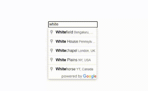
<vue-autosuggest
    :suggestions="[{data:['Frodo', 'Samwise', 'Gandalf', 'Galadriel', 'Faramir', 'Éowyn']}]"
    :onSelected="clickHandler"
    :inputProps="{id:'autosuggest__input', onInputChange: this.onInputChange, placeholder:'Do you feel lucky, punk?'}"
/>
For more advanced usage, check out the examples below, and explore the properties you can use.
Props
| Prop | Type | Required | Description |
|---|---|---|---|
suggestions |
Array | ✓ | Suggestions to be rendered. |
inputProps |
Object | ✓ | Add props to the <input>. |
sectionConfigs |
Object | Define multiple sections <input>. |
|
onSelected |
Function | ✓(*) | *If not using sectionConfigs[index].onSelected() then this will trigger. Must be implemented in either sectionConfigs prop or on root prop. |
inputProps
| Prop | Type | Required | Description |
|---|---|---|---|
id |
String | ✓ | id attribute on <input>. |
onInputChange |
Function | ✓ | Triggers everytime the <input> changes. |
onClick |
Function | Triggers everytime the <input> is clicked. |
|
initialValue |
String | Set some initial value for the <input>. |
|
| Any DOM Props | * | You can add any props to <input> as the component will v-bind inputProps. Similar to rest spread in JSX. See more details here: https://vuejs.org/v2/api/#v-bind |
sectionConfigs
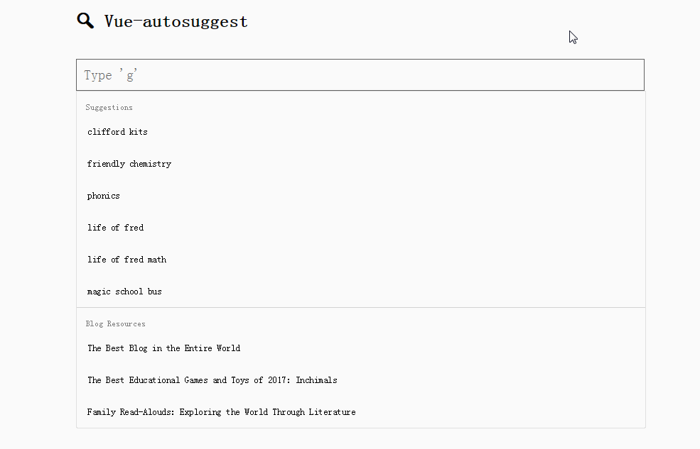
Multiple sections can be defined in the sectionConfigs prop which defines the control behavior for each section.
| Prop | Type | Required | Description |
|---|---|---|---|
onSelected |
Function | ✓ | Determine behavior for what should happen when a suggestion is selected. e.g. Submit a form, open a link, update a vue model, tweet at Ken Wheeler etc. |
type |
String | Vue component name for specifying which type to implement using Vue's <component :is="componentName"></component> functionality. See DefaultSection.vue for scaffolding a new type. You must declare your component in the scope of the app using Vue.component(). You can extend DefaultSection using extends. See UrlSection for an example. |
|
limit |
Number | Limit each section by some value. Default: Infinity |
Below we have defined a default section and a blog section. The blog section has a component type of url-section which corresponds to which component the Autosuggest loads. When type is not defined, Vue-autosuggest will use a built in DefaultSection.vue component.
sectionConfigs: {
    'default': {
        limit: 6,
        onSelected: function(item, originalInput) {
            console.log(item, originalInput, `Selected "${item.item}"`);
        }
    },
    'blog': {
        limit: 3,
        type: "url-section",
        onSelected: function() {
            console.log("url: " + item.item.url);
        }
    }
}