tiptap
A rich-text editor for Vue.js.
What means renderless?
With renderless components you'll have (almost) full control over markup and styling. I don't want to tell you what a menu should look like or where it should be rendered in the DOM. That's all up to you. There is also a good article about renderless components by Adam Wathan.
How is the data stored under the hood?
You can save your data as a raw HTML string or can get a JSON-serializable representation of your document. And of course, you can pass these two types back to the editor.
Examples
To check out some live examples, visit tiptap.scrumpy.io.
Installation
npm install tiptap
or
yarn add tiptap
Basic Setup
<template>
  <editor>
    <!-- Add HTML to the scoped slot called `content` -->
    <div slot="content" slot-scope="props">
      <p>Hi, I'm just a boring paragraph</p>
    </div>
  </editor>
</template>

<script>
// Import the editor
import { Editor } from 'tiptap'

export default {
  components: {
    Editor,
  },
}
</script>
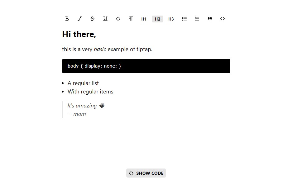
Editor Properties
| Property | Type | Default | Description |
|---|---|---|---|
editable |
Boolean |
true |
When set to false the editor is read-only. |
doc |
Object |
null |
The editor state object used by Prosemirror. You can also pass HTML to the content slot. When used both, the content slot will be ignored. |
watchDoc |
Boolean |
true |
If set to true the content gets updated whenever doc changes. |
extensions |
Array |
[] |
A list of extensions used, by the editor. This can be Nodes, Marks or Plugins. |
@init |
Object |
undefined |
This will return an Object with the current state and view of Prosemirror on init. |
@update |
Object |
undefined |
This will return an Object with the current state of Prosemirror, a getJSON() and getHTML() function on every change. |
Scoped Slots
| Name | Description |
|---|---|
editor |
Here the content will be rendered. |
menubar |
Here a menu bar will be rendered. |
menububble |
Here a menu bubble will be rendered. |
Slot Properties
The menubar and menububble slot will receive some properties.
| Property | Type | Description |
|---|---|---|
nodes |
Object |
A list of available nodes with active state and command. |
marks |
Object |
A list of available marks with active state and command. |
focused |
Boolean |
Whether the editor is focused. |
focus |
Function |
A function to focus the editor. |
Extensions
By default, the editor will only support paragraphs. Other nodes and marks are available as extensions. There is a package called tiptap-extensions with the most basic nodes, marks, and plugins.
Available Extensions
<template>
  <editor :extensions="extensions">
    <div slot="content" slot-scope="props">
      <h1>Yay Headlines!</h1>
      <p>All these <strong>cool tags</strong> are working now.</p>
    </div>
  </editor>
</template>

<script>
import { Editor } from 'tiptap'
import {
  // Nodes
  BlockquoteNode,
  BulletListNode,
  CodeBlockNode,
  CodeBlockHighlightNode,
  HardBreakNode,
  HeadingNode,
  ImageNode,
  ListItemNode,
  OrderedListNode,
  TodoItemNode,
  TodoListNode,

  // Marks
  BoldMark,
  CodeMark,
  ItalicMark,
  LinkMark,
  StrikeMark,
  UnderlineMark,

  // General Extensions
  HistoryExtension,
  PlaceholderExtension,
} from 'tiptap-extensions'

export default {
  components: {
    Editor,
  },
  data() {
    return {
      extensions: [
        new BlockquoteNode(),
        new BulletListNode(),
        new CodeBlockNode(),
        new HardBreakNode(),
        new HeadingNode({ maxLevel: 3 }),
        new ImageNode(),
        new ListItemNode(),
        new OrderedListNode(),
        new TodoItemNode(),
        new TodoListNode(),
        new BoldMark(),
        new CodeMark(),
        new ItalicMark(),
        new LinkMark(),
        new StrikeMark(),
        new UnderlineMark(),
        new HistoryExtension(),
        new PlaceholderExtension(),
      ],
    }
  },
}
</script>
Create Custom Extensions
The most powerful feature of tiptap is that you can create your own extensions. There are 3 types of extensions.
| Type | Description |
|---|---|
Extension |
The most basic type. It's useful to register some Prosemirror plugins or some input rules. |
Node |
Add a custom node. Nodes are block elements like a headline or a paragraph. |
Mark |
Add a custom mark. Marks are used to add extra styling or other information to inline content like a strong tag or links. |
Extension Class
| Method | Type | Default | Description |
|---|---|---|---|
get name() |
String |
null |
Define a name for your extension. |
get defaultOptions() |
Object |
{} |
Define some default options. The options are available as this.$options. |
get plugins() |
Array |
[] |
Define a list of Prosemirror plugins. |
keys({ schema }) |
Object |
null |
Define some keybindings. |
inputRules({ schema }) |
Array |
[] |
Define a list of input rules. |
Node|Mark Class
| Method | Type | Default | Description |
|---|---|---|---|
get name() |
String |
null |
Define a name for your node or mark. |
get defaultOptions() |
Object |
{} |
Define some default options. The options are available as this.$options. |
get schema() |
Object |
null |
Define a schema. |
get view() |
Object |
null |
Define a node view as a vue component. |
keys({ type, schema }) |
Object |
null |
Define some keybindings. |
command({ type, schema, attrs }) |
Object |
null |
Define a command. This is used for menus to convert to this node or mark. |
inputRules({ type, schema }) |
Array |
[] |
Define a list of input rules. |
get plugins() |
Array |
[] |
Define a list of Prosemirror plugins. |
Create a Node
Let's take a look at a real example. This is basically how the default blockquote node from tiptap-extensions looks like.
import { Node } from 'tiptap'
import { wrappingInputRule, setBlockType, wrapIn } from 'tiptap-commands'

export default class BlockquoteNode extends Node {

  // choose a unique name
  get name() {
    return 'blockquote'
  }

  // the prosemirror schema object
  // take a look at https://prosemirror.net/docs/guide/#schema for a detailed explanation
  get schema() {
    return {
      content: 'block+',
      group: 'block',
      defining: true,
      draggable: false,
      // define how the editor will detect your node from pasted HTML
      // every blockquote tag will be converted to this blockquote node
      parseDOM: [
        { tag: 'blockquote' },
      ],
      // this is how this node will be rendered
      // in this case a blockquote tag with a class called `awesome-blockquote` will be rendered
      // the '0' stands for its text content inside
      toDOM: () => ['blockquote', { class: 'awesome-blockquote' }, 0],
    }
  }

  // this command will be called from menus to add a blockquote
  // `type` is the prosemirror schema object for this blockquote
  // `schema` is a collection of all registered nodes and marks
  command({ type, schema }) {
    return wrapIn(type)
  }

  // here you can register some shortcuts
  // in this case you can create a blockquote with `ctrl` + `>`
  keys({ type }) {
    return {
      'Ctrl->': wrapIn(type),
    }
  }

  // a blockquote will be created when you are on a new line and type `>` followed by a space
  inputRules({ type }) {
    return [
      wrappingInputRule(/^\s*>\s$/, type),
    ]
  }

}
Create a Node as a Vue Component
The real power of the nodes comes in combination with Vue components. Let us build an iframe node, where you can change its URL (this can also be found in our examples).
import { Node } from 'tiptap'

export default class IframeNode extends Node {

  get name() {
    return 'iframe'
  }

  get schema() {
    return {
      // here you have to specify all values that can be stored in this node
      attrs: {
        src: {
          default: null,
        },
      },
      group: 'block',
      selectable: false,
      // parseDOM and toDOM is still required to make copy and paste work
      parseDOM: [{
        tag: 'iframe',
        getAttrs: dom => ({
          src: dom.getAttribute('src'),
        }),
      }],
      toDOM: node => ['iframe', {
        src: node.attrs.src,
        frameborder: 0,
        allowfullscreen: 'true',
      }],
    }
  }

  // return a vue component
  // this can be an object or an imported component
  get view() {
    return {
      // there are some props available
      // `node` is a Prosemirror Node Object
      // `updateAttrs` is a function to update attributes defined in `schema`
      // `editable` is the global editor prop whether the content can be edited
      props: ['node', 'updateAttrs', 'editable'],
      data() {
        return {
          // save the iframe src in a new variable because `this.node.attrs` is immutable
          url: this.node.attrs.src,
        }
      },
      methods: {
        onChange(event) {
          this.url = event.target.value

          // update the iframe url
          this.updateAttrs({
            src: this.url,
          })
        },
      },
      template: `
        <div class="iframe">
          <iframe class="iframe__embed" :src="url"></iframe>
          <input class="iframe__input" type="text" :value="url" @input="onChange" v-if="editable" />
        </div>
      `,
    }
  }

}
Building a Menu
This is a basic example of building a custom menu. A more advanced menu can be found at the examples page.
<template>
  <editor :extensions="extensions">
    <div slot="menubar" slot-scope="{ nodes, marks }">
      <div v-if="nodes && marks">
        <button :class="{ 'is-active': nodes.heading.active({ level: 1 }) }" @click="nodes.heading.command({ level: 1 })">
          H1
        </button>
        <button :class="{ 'is-active': marks.bold.active() }" @click="marks.bold.command()">
          Bold
        </button>
      </div>
    </div>
    <div slot="content" slot-scope="props">
      <p>This text can be made bold.</p>
    </div>
  </editor>
</template>

<script>
import { Editor } from 'tiptap'
import { HeadingNode, BoldMark } from 'tiptap-extensions'

export default {
  components: {
    Editor,
  },
  data() {
    return {
      extensions: [
        new HeadingNode({ maxLevel: 3 }),
        new BoldMark(),
      ],
    }
  },
}
</script>
Development Setup
Currently, only Yarn is supported for development because of a feature called workspaces we are using here.
# install dependencies
yarn install

# serve examples at localhost:3000
yarn start

# build dist files for packages
yarn build:packages

# build dist files for examples
yarn build:examples