vue-products-grid
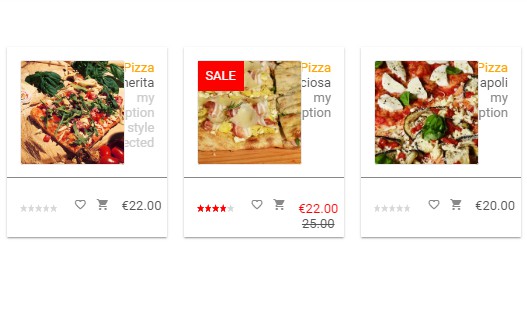
vue-products-grid is a responsive Vue component to create a products grid for ecommerce apps. Fully configurable with different options and reactive with full integration in your template/project (4 events emitted)
Features
- fully responsive grid ready (CSS) for desktop, laptop, mobile
- data mapping with your data structure
- many custom options for visual impact (colors, etc.)
- fullprice/sale price display
- sale box option (can be disabled)
- rating stars included with emit event (can be disabled)
- 1 configurable HTML toggle button with emit event (i.e. favorite item)
- 1 configurable HTML button with emit event (i.e. add to cart)
- 1 clickable area with emit event
- HTML injection available for some elements
Installation
npm install vue-products-grid
Usage
Import component
import ProductsGrid from 'vue-products-grid'
In template (for options and configuration see Docs below)
...
  <products-grid
    :items="items"
  />
...
* Remarks
Docs
vue-products-grid has many features and options that you can control in order to fit with your template/layout/app.
We designed the component in order to make compatible with a clean project so we decided to not include any dependency. For this reason you can add to any Vue project as is, without depending on third libraries, or simply using yours.
For any issue please open an issue on github repository.
The rating element has been forked and included in the component from the vue-star-rating component [https://github.com/craigh411/vue-star-rating] by craigh411.Props
| Prop | Required | Description | Type | Default |
|---|---|---|---|---|
| items | YES | Array of objects (see table below) |
Array | [] |
| mapping | NO | Objects for fields mapping | Object | |
| options | NO | Object for configuration purpose | Object |
items prop definition
items prop as array of objects requires a defined structure for each object. If your data don't match the following structure use mapping as described below
| Name | Description | Type | Notes |
|---|---|---|---|
| id | Product ID | String/Number | Converted to string by component |
| name | Product name | String* | injected HTML available |
| label | Product label (category, ecc) | String* | injected HTML available |
| abstract | Product abstract | String* | injected HTML available |
| image | Product image URL | URL/URI | |
| price | Product price | Number | float 2 decimals format applied |
| sale_price | Product sale price | Number | float 2 decimals format applied |
| rating | Product rating | Number | Integer or float |
| isfavorite | Product in the favorite user list | Boolean |
* With name, label and abstract fields you can inject HTML code directly
Example of HTML injection on title field:
items:[
  {
    id: '1',
    title: '<style color="red">My title</style>',
    ...
  },
  ...
]
Mapping prop definition
When your data don't match the items prop definition you can map your data structure directly without making any conversion and pass to the component with the mapping prop.
Mapping Fields example:
<template>
  ...
  <product-grid
    :items = "items"
    :mapping = "mapping" //your data structure mapping
    :options = "options"
    ...
  />
</template>
...
  data:()=>({
    ...
    //mapping data structure
    mapping: {
      id:   'your id field',
      name: 'your product name field',
      label: 'your label field',
      abstract: 'your abstract field'
      price: 'your price field',
      sale_price: 'your sale price field',
      image: 'your image field',
      isfavorite: 'your favorite field',
      rating: 'your rating field'
    },
  })
Configuration params for options prop
With the options object you can customize your grid widgets with the following params.
| Name | Description | Type | Default |
|---|---|---|---|
| color | background color | String | #fff |
| title_color | title color | String | #555 |
| text_color | all text color | String | #ccc |
| price | price color | String | #555 |
| sale_color | sale price color | String | #ff0000 |
| rating_color | rating stars color | String | #ffd055 |
| rating | show rating | Boolean | true |
| favorite | show favorite | Boolean | true |
| salebox | show SALE box if item is on sale | Boolean | false |
| currency | prepend currency to price | String | $ |
| elevation | add box shadow effect - '0' = no effect - '1 thru 3' = 3 box shadow effects available |
String | '1' |
| btn_1* | you can assign your html icon | String | <i class="material-icons">favorite_border</i>* |
| btn_1_on* | btn_1 toggle | String | <i class="material-icons">favorite</i>* |
| btn_2* | assign your icon html code | String | <i class="material-icons">shopping_cart</i>* |
Note
* to use default values you need to add the Google Material Icons to your project.
Example:
...
 data: ()=>({
    config : {
      color: '#fafafa',
      title_color: '#ff0000',
      ....
    }
 })
Events
vue-products-grid emits 4 events (this.$emit(...)) in order to get the following user actions:
- click on image or title
- click add to cart (shopping cart icon)
- click on rating (user set rating)
- click on favorite icon (add to favorite)
The above events needs to be declared in the component bindings to connect your template. Your template needs to have the functions declared in the binding in the methods section (see complete examble below)
| Event | Required | Description | Type | Return |
|---|---|---|---|---|
| @widgetSelected | NO | Clicked on image or title | Function | Object (product) |
| @widgetClick | NO | Click on btn_2 | Function | Object (product) |
| @widgetRating | NO | Set rating click | Function | -Integer (rating): rating selected by user -Object (product): product clicked |
| @widgetFavorite | NO | Click on btn_1 | Function | -Object (product): product clicked - Boolean (true/false): product favorite -Integer (index): index of the items array |
You can assign your custom logic to each emitted event. Example : you can change the add to cart event emitted behavior to open the single product page instead to add to cart logic.
Full Example
<template>
  <products-grid
     :items="items"
     :options="options"
     @widgetSelected="set_preview"
     @widgetClick="add_to_cart"
     @widgetRating="set_rating"
     @widgetFavorite="set_favorite"
   />
</template>
<script>
import ProductsGrid from 'vue-products-grid.vue'
export default {
  name: "test",
  components:{
    ProductsGrid
  },
  data: () => ({
    //sample data
    items: [
      { _id: "1", product: "Margherita", fullprice: 22, sale: 0 , category: "Sliced Pizza" , description: "<span style='color:#ccc'>my description width a style injected</span>" ,image: "https://storage.googleapis.com/ghostfood-539ae.appspot.com/images/pizza_2.jpg" , fav: false},
      { _id: "2", product: "Capricciosa", fullprice: 25, sale: 22 , category: "Sliced Pizza" , description: "my description" , image: "https://storage.googleapis.com/ghostfood-539ae.appspot.com/images/pizza_3.jpg" , fav: false , stars: 3.5},
      { _id: "3", product: "Napoli", fullprice: 20, sale: 0 , category: "Sliced Pizza" , description: "my description" , image: "https://storage.googleapis.com/ghostfood-539ae.appspot.com/images/pizza_4.jpg" , fav: false },
      { _id: "3", product: "Salame Piccante", fullprice: 19, sale: 0 , category: "Sliced Pizza" , description: "my description" ,image: "https://storage.googleapis.com/ghostfood-539ae.appspot.com/images/pizza_5.jpg" , fav: false }
    ],
    //mapping fields
    mapping: {
      id:   '_id',
      name: 'product',
      label: 'category',
      abstract: 'description',
      price: 'fullprice',
      sale_price: 'sale',
      image: 'image',
      isfavorite: 'fav',
      rating: 'stars'
    },
    //sample configuration
    options: {
      color: "#fff",
      title_color: "#555",
      text_color: "#ccc",
      price_color: "#555",
      sale_color: "#ff0000",
      icons_color: "#888",
      rating_color: "#ff0000",
      elevation: "1",
      rating: true,
      favorite: true,
      currency: "€",
      salebox: true,
      elevation: '1',
      btn_1: '<i class="material-icons">favorite_border</i>',
      btn_1_on: '<i class="material-icons">favorite</i>',
      btn_2: '<i class="material-icons">shopping_cart</i>',
    },
  }),
  methods: {
    set_preview(product) {
      //.. do your logic ...
      console.log("clicked product=>", product);
    },
    add_to_cart(product) {
      //.. do your logic ...
      console.log("add_to_cart product=>", product);
    },
    set_rating(rating, product) {
      //.. do your logic ...
      console.log("rating=>", rating, "product=>", product);
    },
    set_favorite(product, status, index) {
      //.. do your logic ...
      this.items[index].isfavorite = status;
      console.log("favorite product=>", product, "status=>", status);
    }
  }
};
</script>
Roadmap
- add themes options (predefined themes)
Notes
Development or demo Component uses Google Material Design icons. If you don't have any icons library you can add to your index.html
<link href="https://fonts.googleapis.com/css?family=Roboto:100,300,400,500,700,900|Material+Icons" rel="stylesheet">


