TRVLPicker
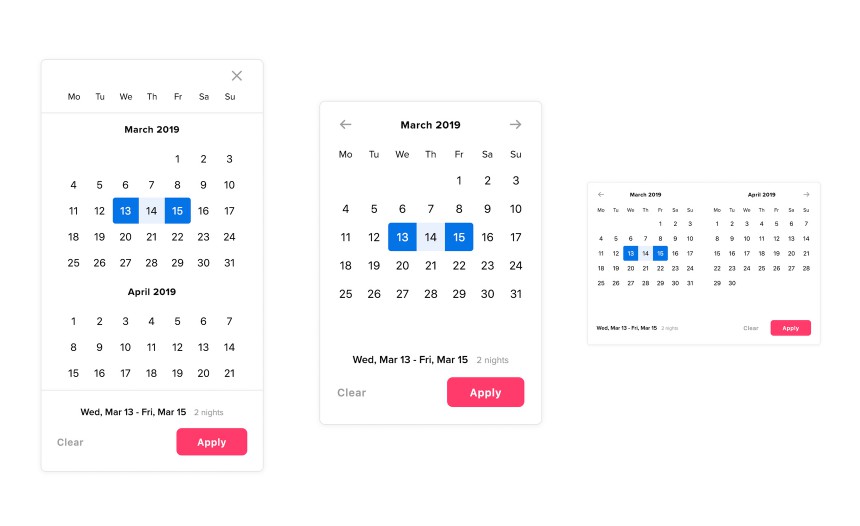
TRVLPicker is a responsive Vue.js datepicker component. From mobile to desktop it has a full-screen vertical layout, a single month layout, a double month layout, and a triple month layout.
Install
npm install @trvl/picker
import TRVLPicker from '@trvl/picker'

export default {
    // …
    components: {
        TRVLPicker,
    },
    // …
}
Usage
Basic
In its most basic form, TRVLPicker only requires the checkin and checkout props.
Both should be a Date object and have a sync modifier:
<template>
    <TRVLPicker
        :checkin.sync="checkin"
        :checkout.sync="checkout"
    />
</template>

<script>
    import TRVLPicker from '@trvl/picker'

    export default {
        components: {
            TRVLPicker,
        },
        data() {
            return {
                checkin: new Date(2019, 2, 13),
                checkout: new Date(2019, 2, 15),
            }
        },
    }
</script>
Advanced
To ensure a correct positioning of the datepicker in the full-screen layout it makes use of a Portal. Although not required, it is recommended to place a Portal target element outside your Vue app:
<body>
    <div id="app">
        …
    </div>

    <div id="portal"></div>
</body>
Props
| Prop | Type | Default | Description |
|---|---|---|---|
breakpointSingle |
Number | 580 |
Point at which the layout goes to a single month layout |
breakpointDouble |
Number | 740 |
Point at which the layout goes to a double month layout |
breakpointTriple |
Number | 0 (disabled) |
Point at which the layout goes to a triple month layout |
checkin |
Date | Check-in date | |
checkout |
Date | Check-out date | |
maxDate |
Date | new Date() + 1 year |
Last possible check-out date |
maxStay |
Number | 30 |
Maximum date range in days |
minDate |
Date | new Date() |
First posssible check-in date |
portal |
String | portal |
The ID of the portal |
Slots
All slots are optional, but the checkin and checkout slots are highly recommended so as to customize their appearance.
Check-in
The template used for the check-in button.
<template slot="checkin" slot-scope="{ isActive, value }">
    <div :class="{ active: isActive }">
        <label for="checkin">Check-in</label>
        <input id="checkin" type="text" :value="value">
    </div>
</template>
The following data is available in the slot-scope:
| Data | Type | Description |
|---|---|---|
isActive |
Boolean | Whether the check-in input is active |
value |
Date | The raw check-in value |
Check-out
The template used for the check-out button.
<template slot="checkout" slot-scope="{ isActive, value }">
    <div :class="{ active: isActive }">
        <label for="checkout">Check-in</label>
        <input id="checkout" type="text" :value="value">
    </div>
</template>
The following data is available in the slot-scope:
| Data | Type | Description |
|---|---|---|
isActive |
Boolean | Whether the check-out input is active |
value |
Date | The raw check-out value |
Close
The template used for the close button in the vertical layout.
<template slot="close">
    <icon name="close" />
</template>
Next
The template used for the navigation button to go to the next month.
<template slot="next">
    <icon name="next" />
</template>
Previous
The template used for the navigation button to go to the previous month.
<template slot="previous">
    <icon name="previous" />
</template>
Methods
By adding a ref to the datepicker a couple of methods can be accessed:
<template>
    <TRVLPicker
        ref="picker"
        …
    />
</template>

<script>
    export default {
        mounted() {
            this.$refs.picker.callMethod()
        },
    }
</script>
| Method | Parameters | Description |
|---|---|---|
close |
Close the datepicker | |
open |
checkin | checkout |
Open the datepicker on the given input (defaults to checkin) |
Events
| Event | Description |
|---|---|
close |
The datepicker is closed |
open |
The datepicker is opened |
Contributing
# Project setup
npm install

# Compiles and hot-reloads for development
npm run serve

# Compiles and minifies for production
npm run build

# Lints and fixes files
npm run lint

# Runs unit tests
npm run test:unit